The Festival of Festivals
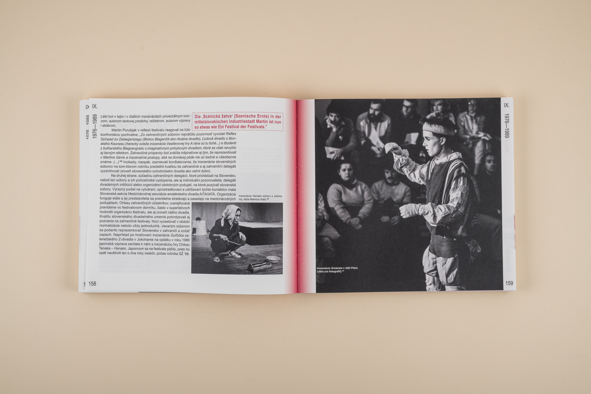
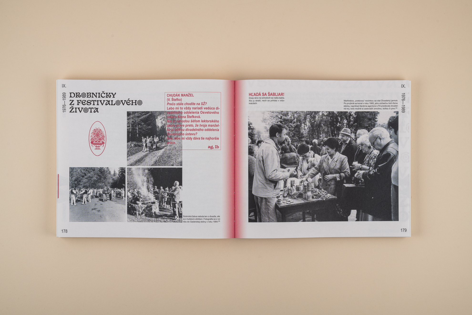
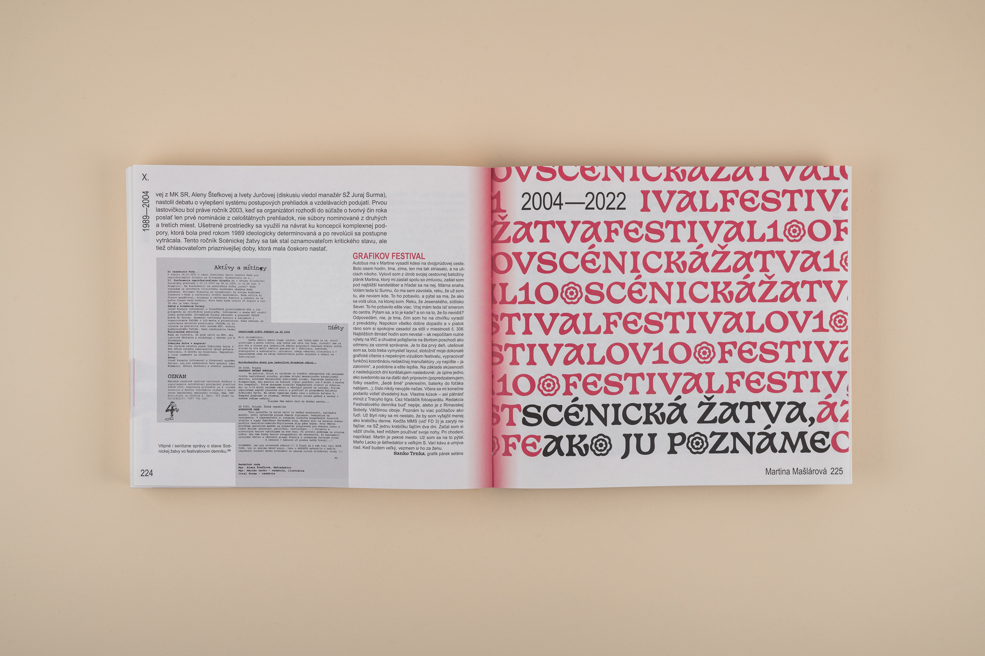
Annual publication about 100 years of volunteer theater in Slovakia, focused on the history of the competitive show Scénická Žatva. Both the layout and the typography of the form reflect the focus on volunteer theater. The basic Arial Narrow font is chosen to underline the popularity. Completed with a distinctive, but freely available Basteleur font, where the letter "O" has been replaced by the current logo of Scénická Žatva. The material solution also responds to the element of folkliness – unfinished binding, raw cardboard on the cover, and ordinary paper inside. Layouting into a single block into which other content elements slide somewhat clumsily supports this "bottom-up" concept.
editorial design
art direction
photo retouch
printing techniques
client Národné osvetové centrum
cultural and educational facility
2022
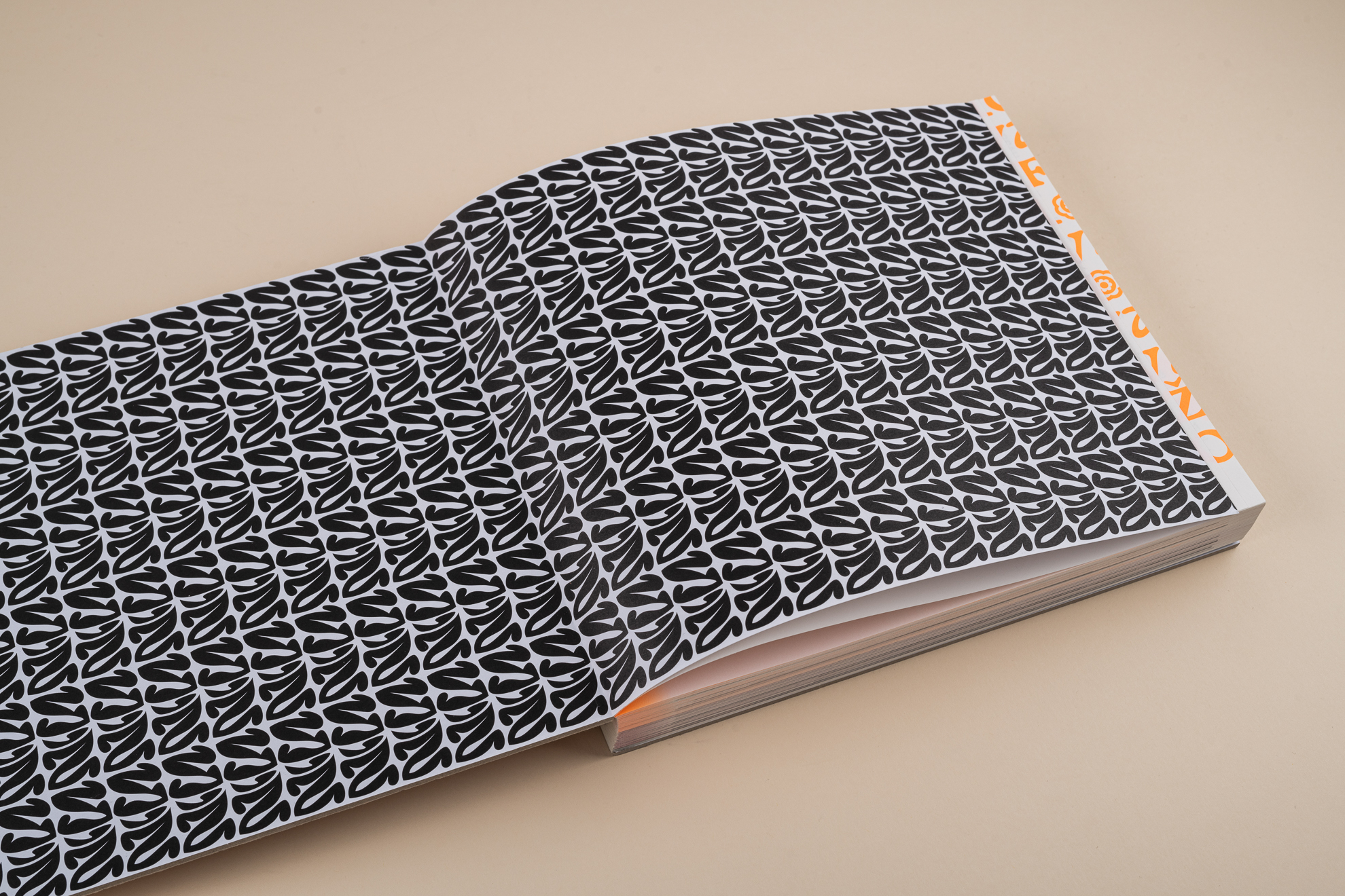
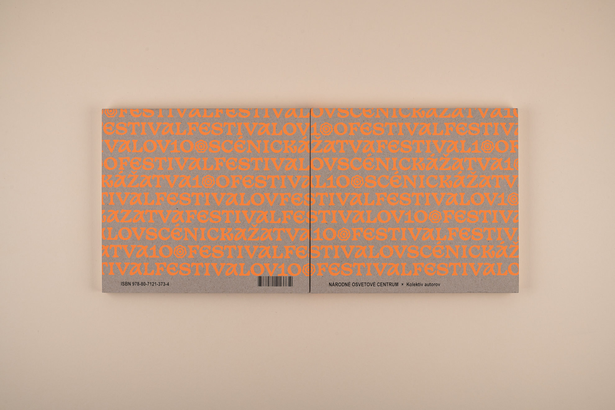
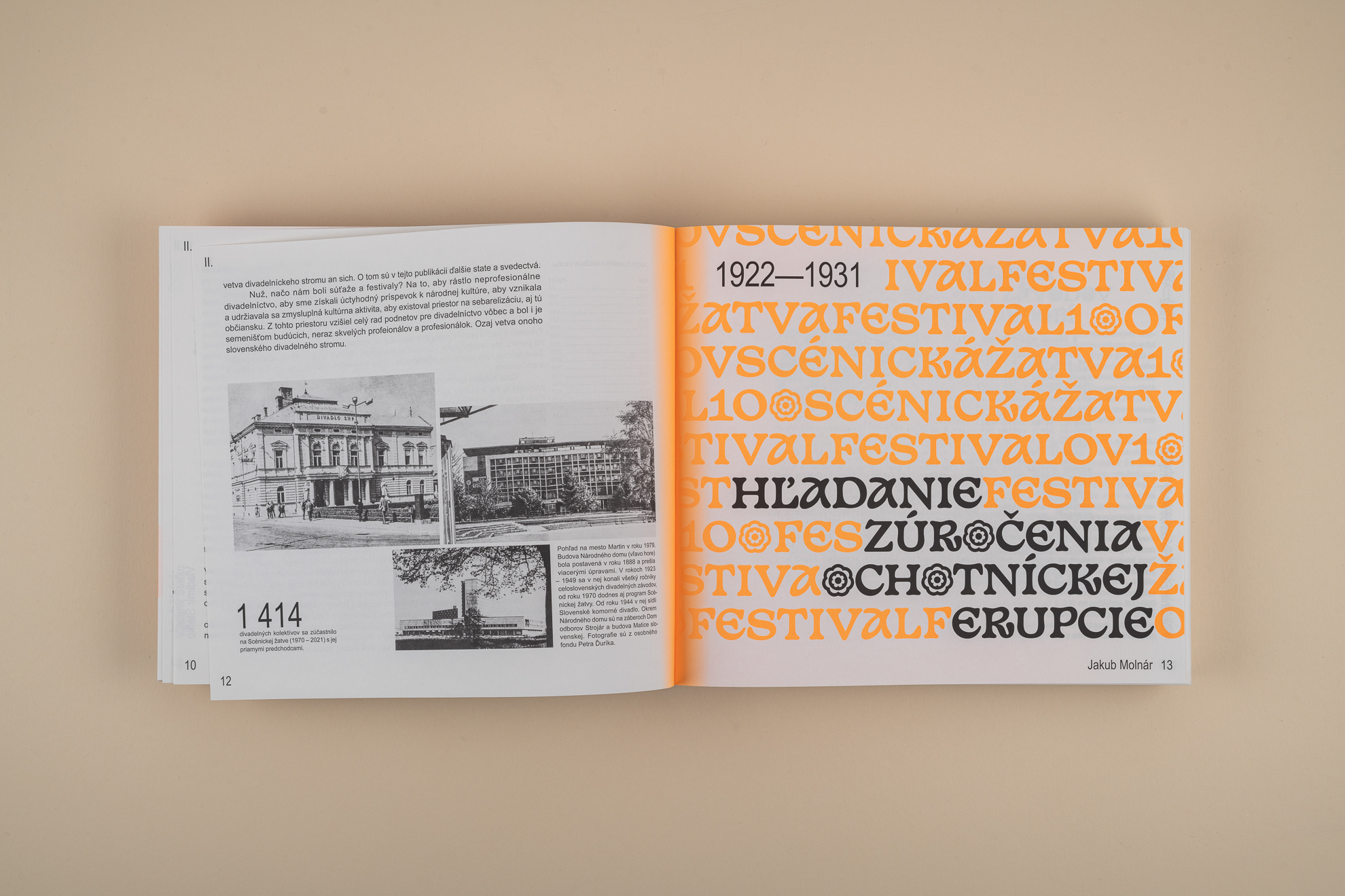
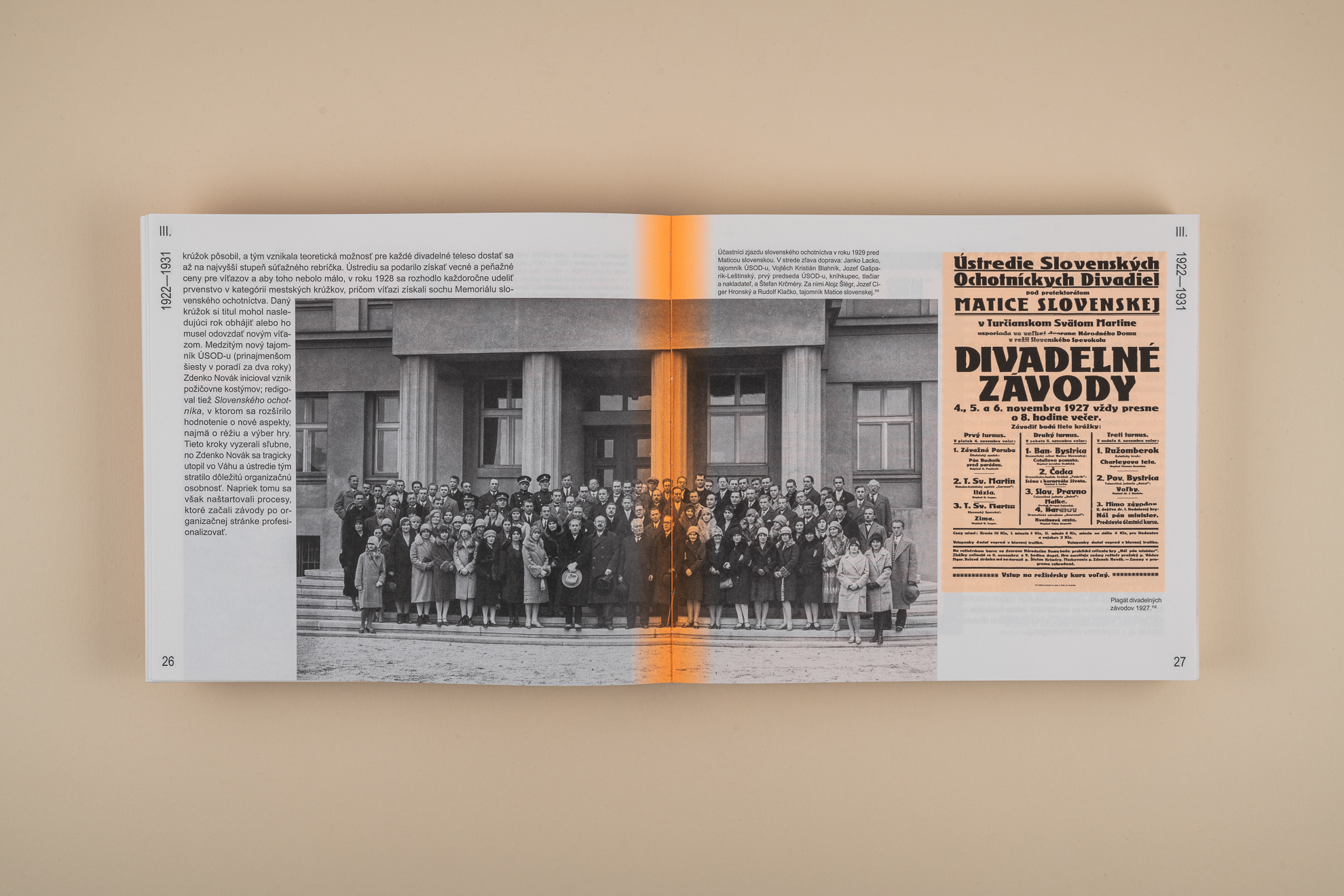
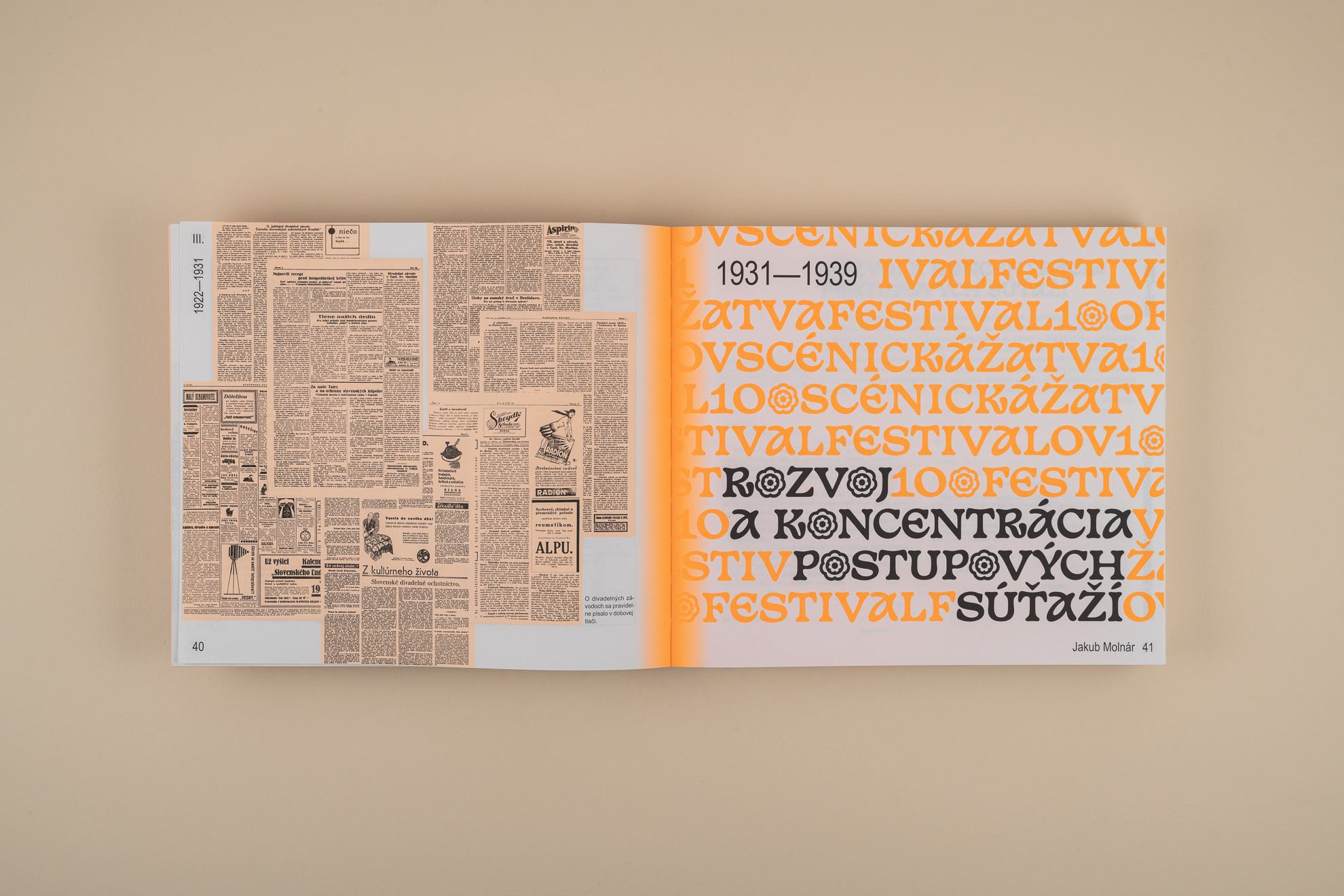
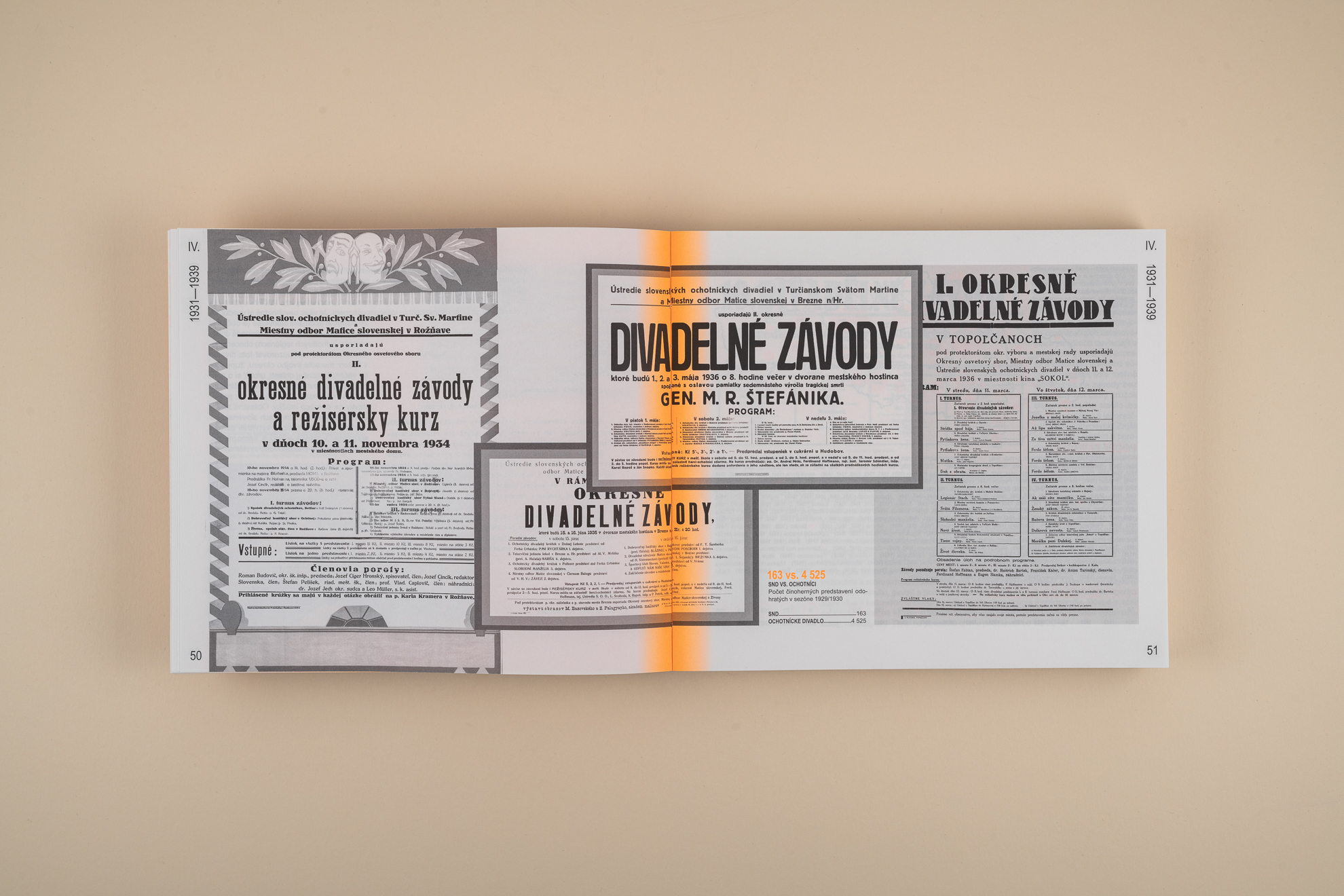
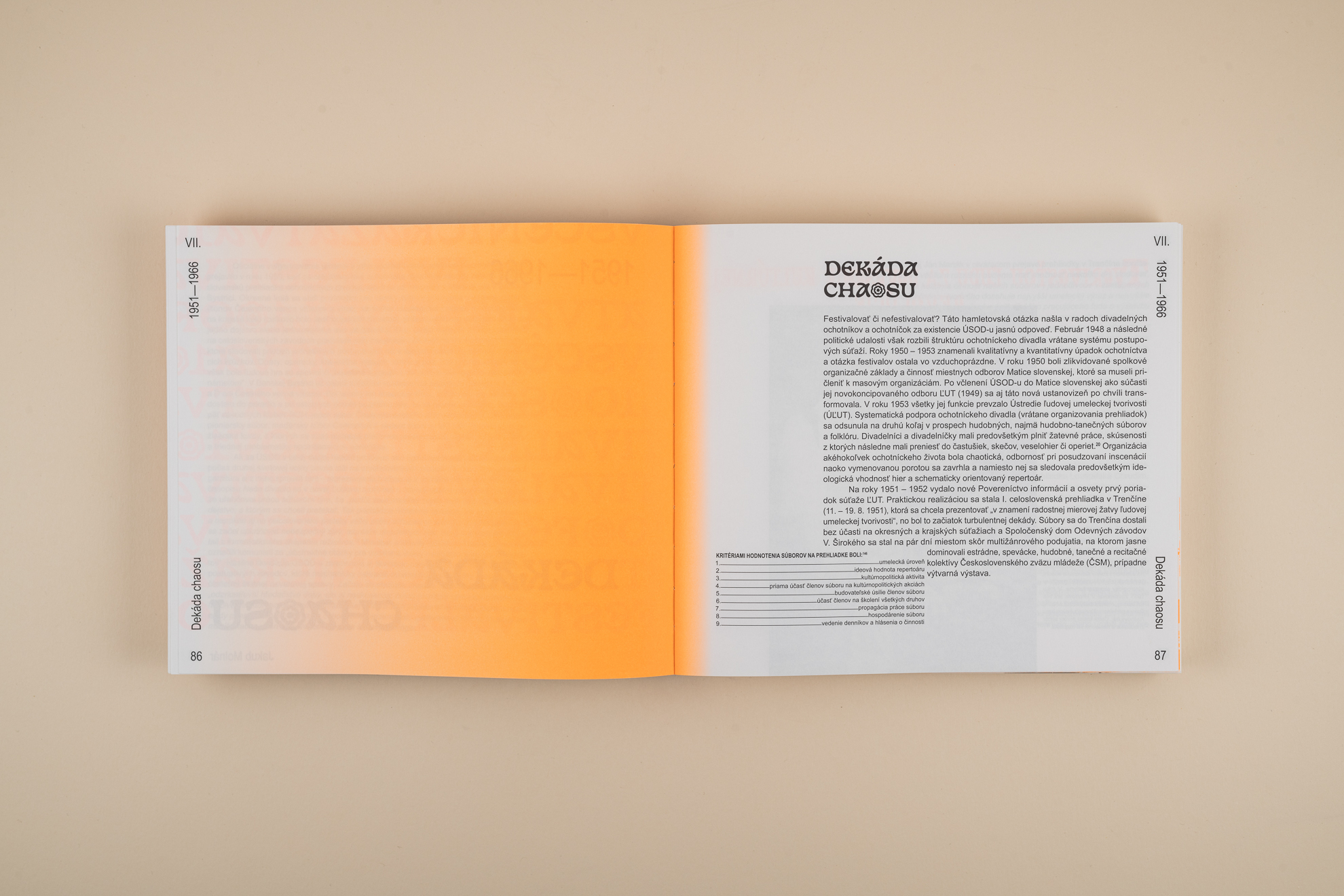
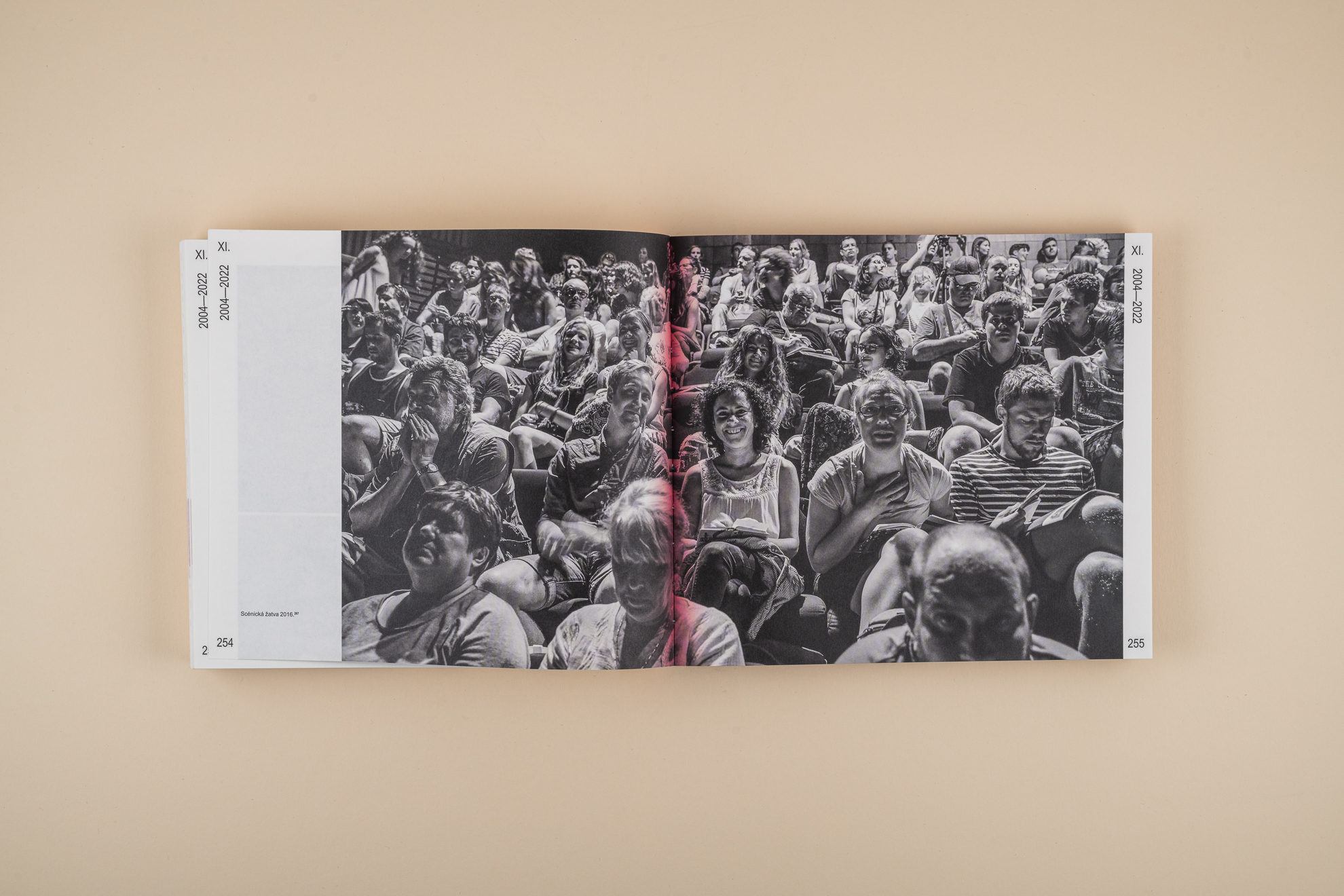
The content was divided editorially into the period from the beginnings to the normalization years and from there to the present. The color reflects this concept. The first, black and white period, is highlighted in neon orange. It forms an accent against black and white materials. In the next period, it also uses color photographs and materials, replacing orange with violet-pink. Thanks to this, the publication is easy to navigate even from the outside.
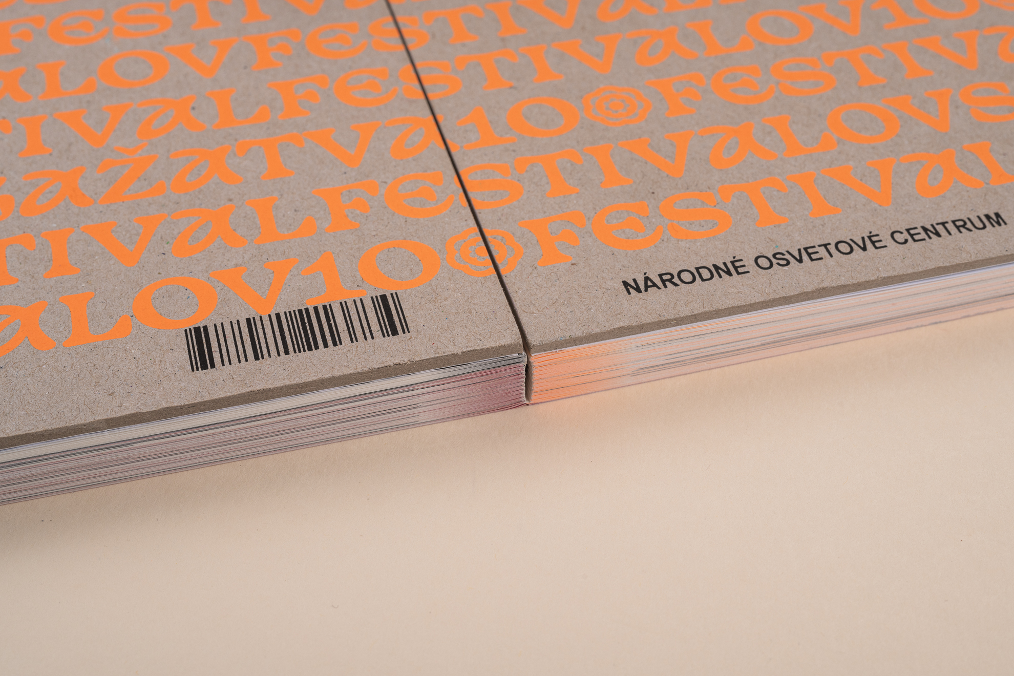
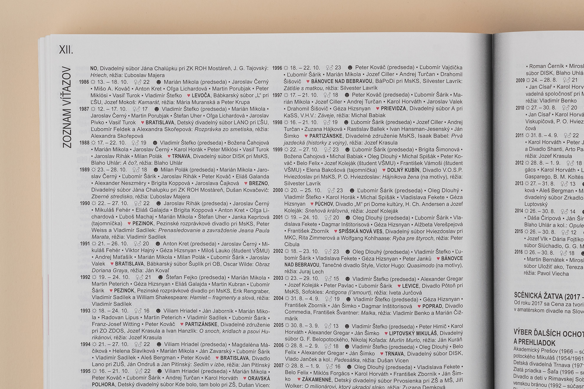
FESTIVAL FESTIVALOV
2022
client Národné osvetové centrum
typefaces Arial, Basteleur
paper Munken Print
print Tiskárna Helbich
promo photo © Nora & Jakub Čaprnka
More projects
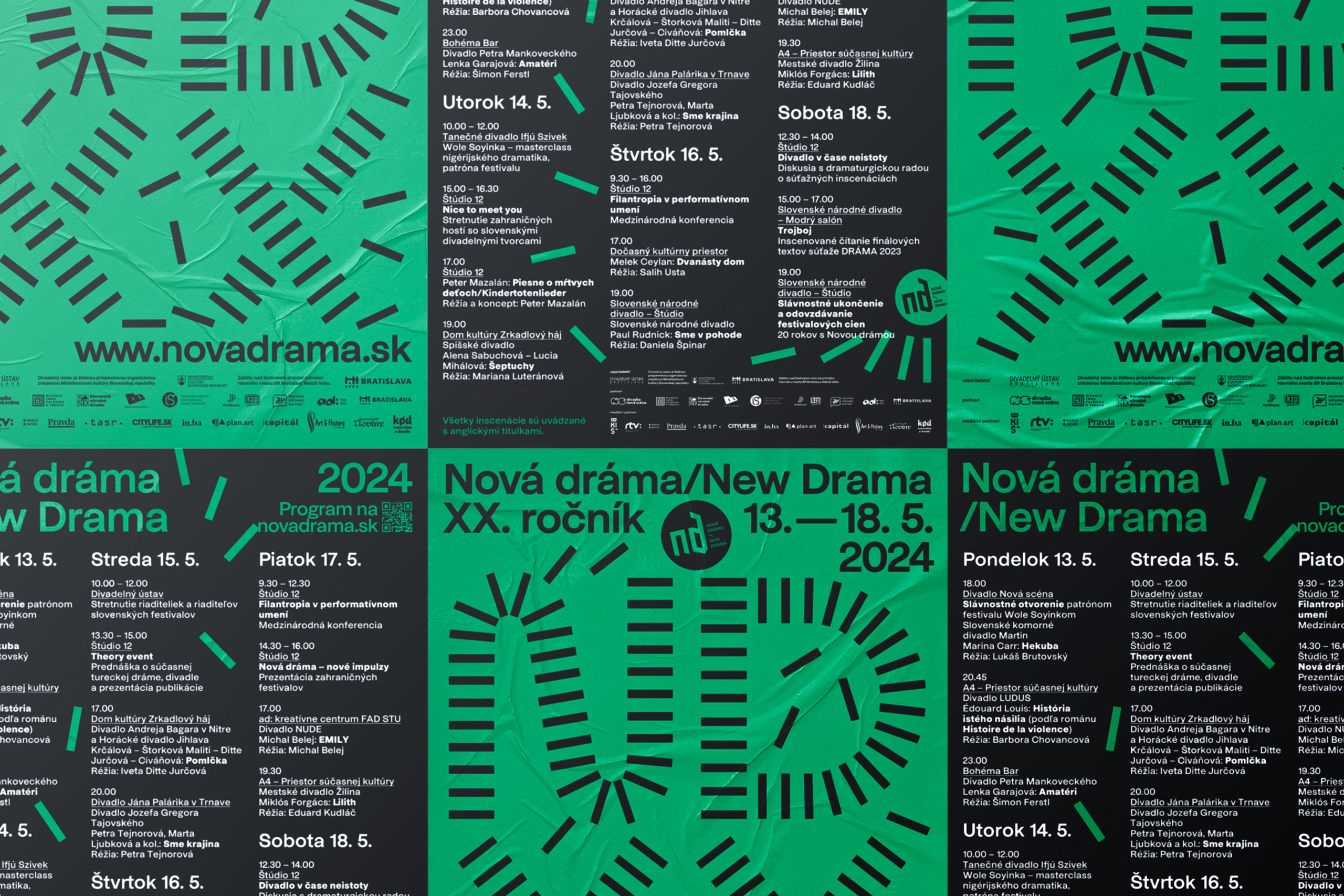
New Drama 2024visual identity

GrandPrix Awardsaward design
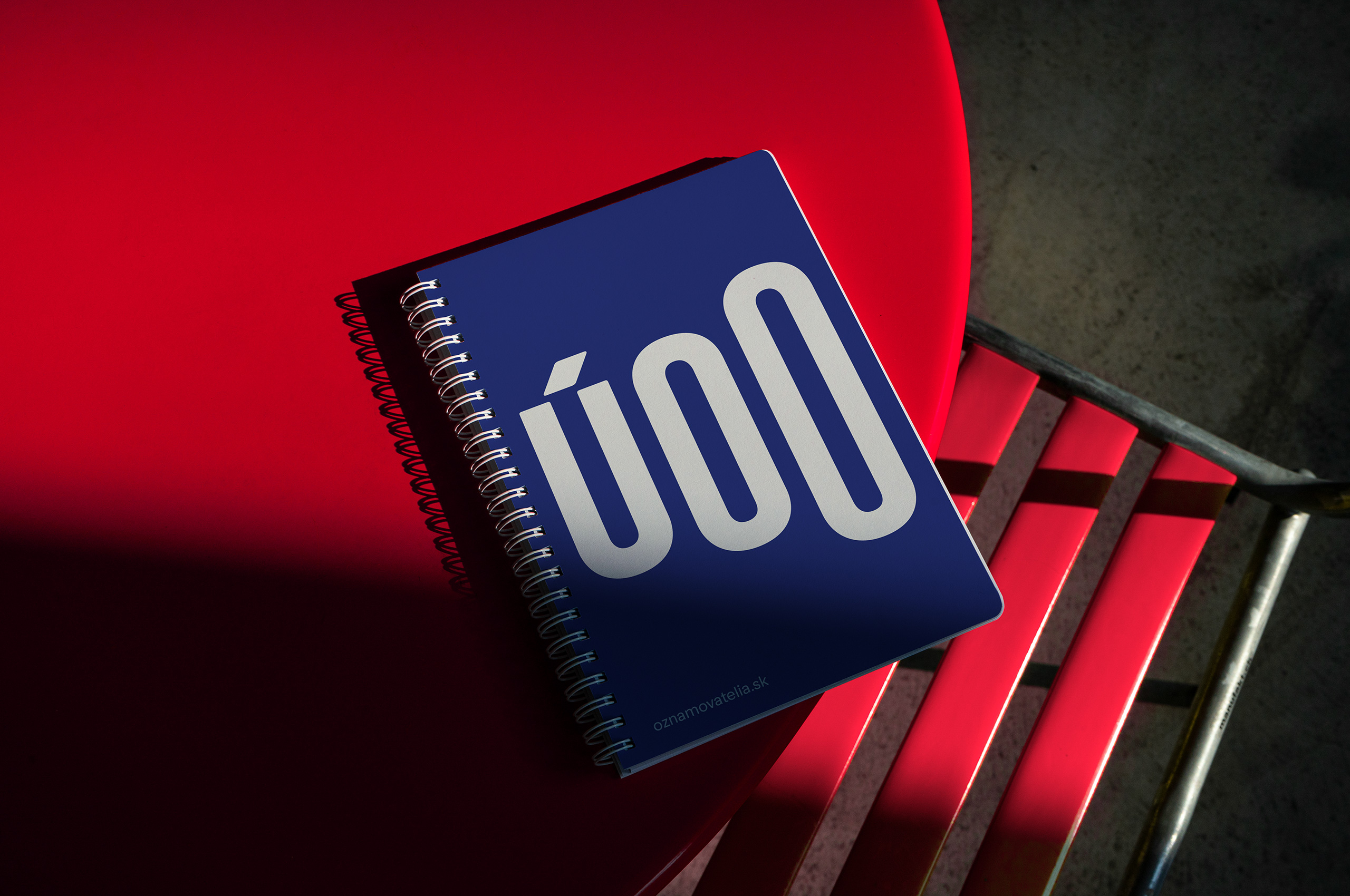
Whistleblower Officebrand identity
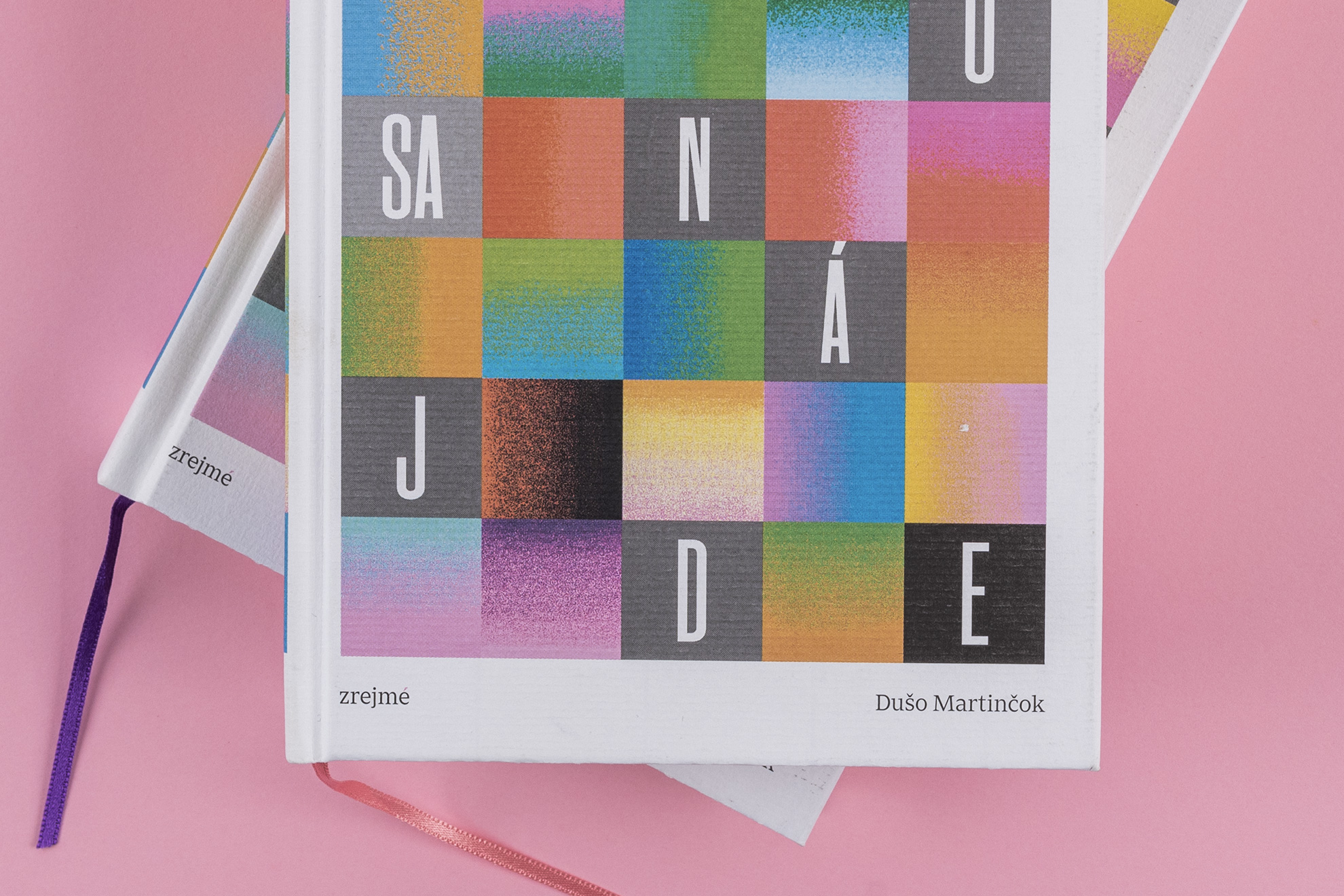
Niekto sa nájdeeditorial design
Technical Networksbrand identity

New Drama 2022visual identity

Giraffe Bakeryeditorial design
New Beats on the Blockpackaging
Century of Theatrevisual identity
Piata loďvisual identity
Slovak Dancevisual identity

Green Dramaeditorial design
New Drama 2019visual identity
Bábky na medzieditorial design
Toddler Punkeditorial design
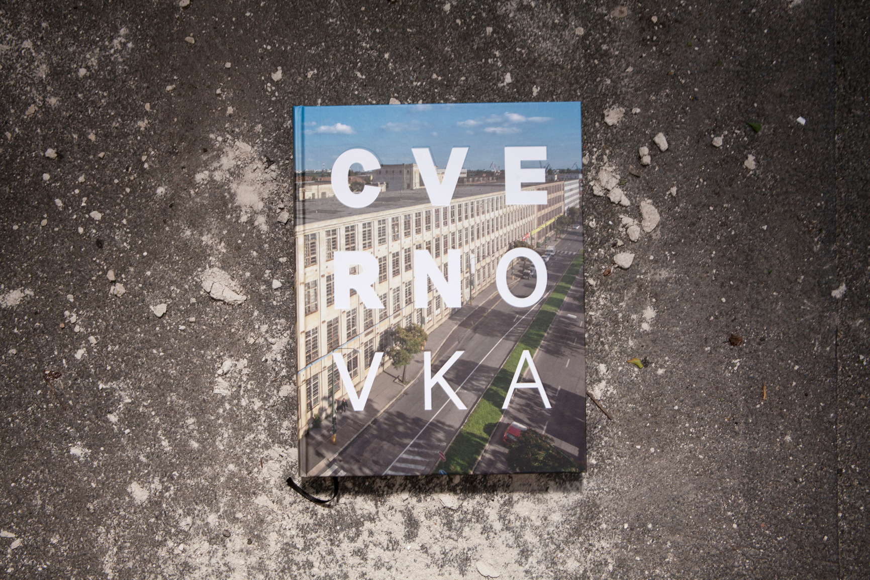
Cvernovkaeditorial design
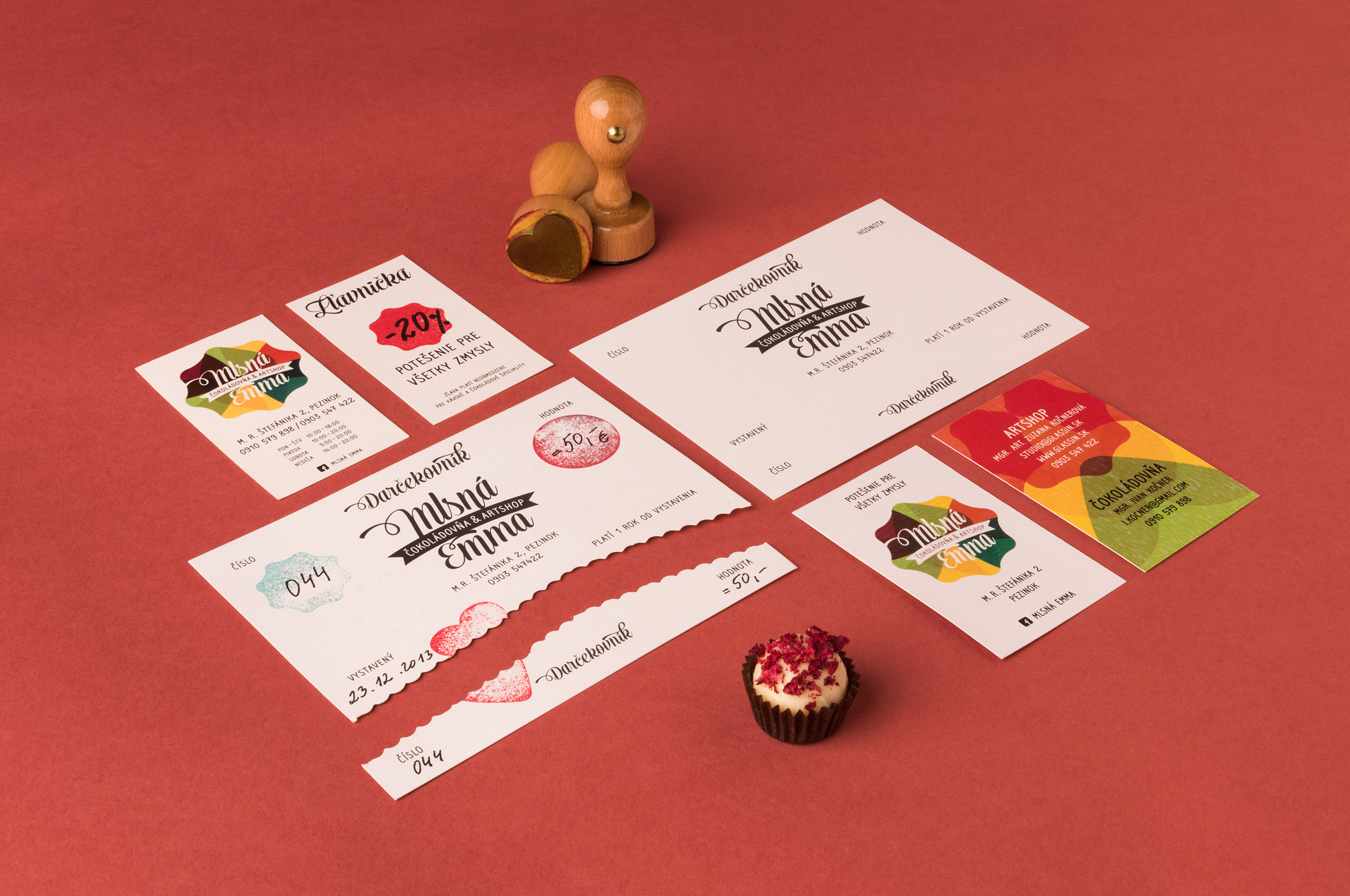
Mlsná Emmabrand identity
get in touch at hey@mrmeadow.studio