New Drama 2022
The identity of the theatre festival of contemporary drama reflects the phenomenon of the so-called cancel culture, the culture of erasure. Particularly the focus on hate speech in public discourse, the rise of ideological extremism and freedom of speech. The typeface – as the main element of identity – uses a combination of direct word censorship (the so-called bleep censor, with online hate speech characters such as $&#%!*) forming various seemingly unpleasant expressions or exclamations.
White-black-red colour scheme is given by the festival section Focus Austria. This also records the motif of hate speech, which gains in power of expression and stands out in the visual smog of the street and of online space. Posters, citylights, rollups, various web and print advertisements, stickers, T-shirts, tags, invitations, festival newspapers, diplomas and the main award were processed.
visual identity
editorial design
print & online
motion
award design
client Theatre Institute Bratislava
theatre institute
2022


Instead of the traditional A5 bulletin, a festival newspaper was produced for the first time. Shorten physical version (containing brief programme, a map of the venues and the accompanying programme) was followed by an expanded bi-lingual version, accessible online using QR code. The newspaper also included sentences in the Ukrainian language, as the festival also responded to freshly launched full-scale war of Russia against Ukraine. The winged phrase of the Ukrainian defenders on Snake Island was paraphrased, transformed for the purposes of promoting the theatre.


As with every year, it was necessary to transfer the visual identity into the form of physical product and produce the GrandPrix award. The formal basis is derived from popular playground toys, where children can mix and match different images by turning the elements. The award consisted of an outer frame, in which were set plywood squares with cut-out painted letters on a rotating rod. The last frame was used to identify the winners.

The winner is encouraged to play with the letters and their composition. It can completely censor (cancel culture) or, through the creation of incomprehensible statements, get to exact information about the winner. It is made by laser, without colour. The entire award has a size of approximately 50 x 50 cm, the used materials are plywood, metal rods and paint.


NOVÁ DRÁMA/NEW DRAMA
2022
client Theatre Institute Bratislava
collab Daniel Tichý
award execution by Manum
typeface Space Grotesk
award photo © Michal Líner
promo photo © Nora & Jakub Čaprnka
More projects

Bratislava-Nové Mestobrand identity
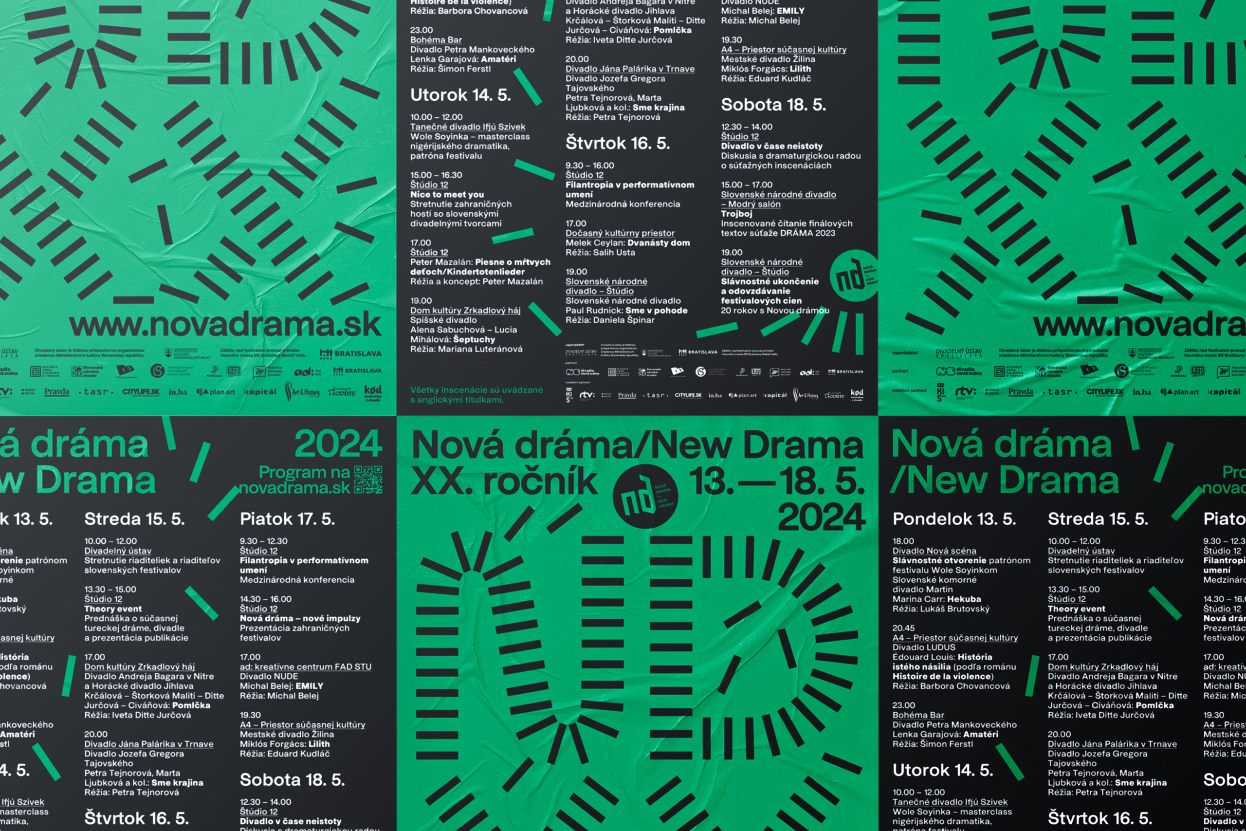
New Drama 2024visual identity

GrandPrix Awardsaward design
Whistleblower Officebrand identity

Nacuckybrand identity
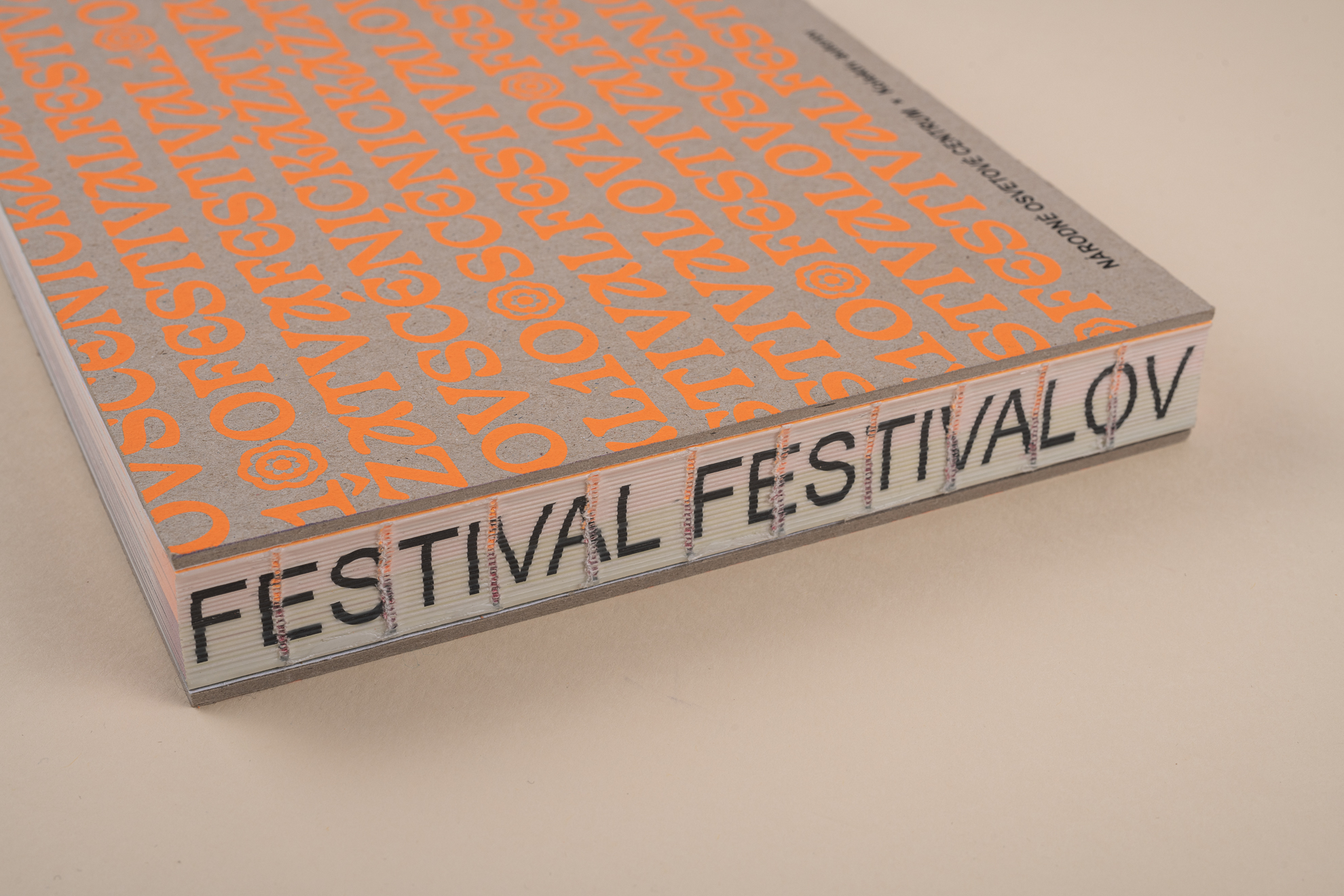
Festival festivaloveditorial design
Technical Networksbrand identity

Knižnica Bratislavabrand identity
Niekto sa nájdeeditorial design

Giraffe Bakeryeditorial design
New Beats on the Blockpackaging
Century of Theatrevisual identity
Piata loďvisual identity
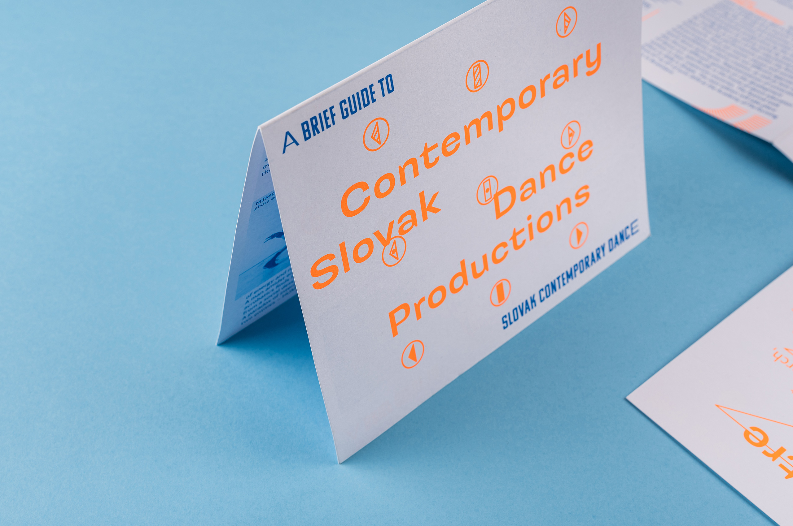
Slovak Dancevisual identity

Green Dramaeditorial design
New Drama 2019visual identity
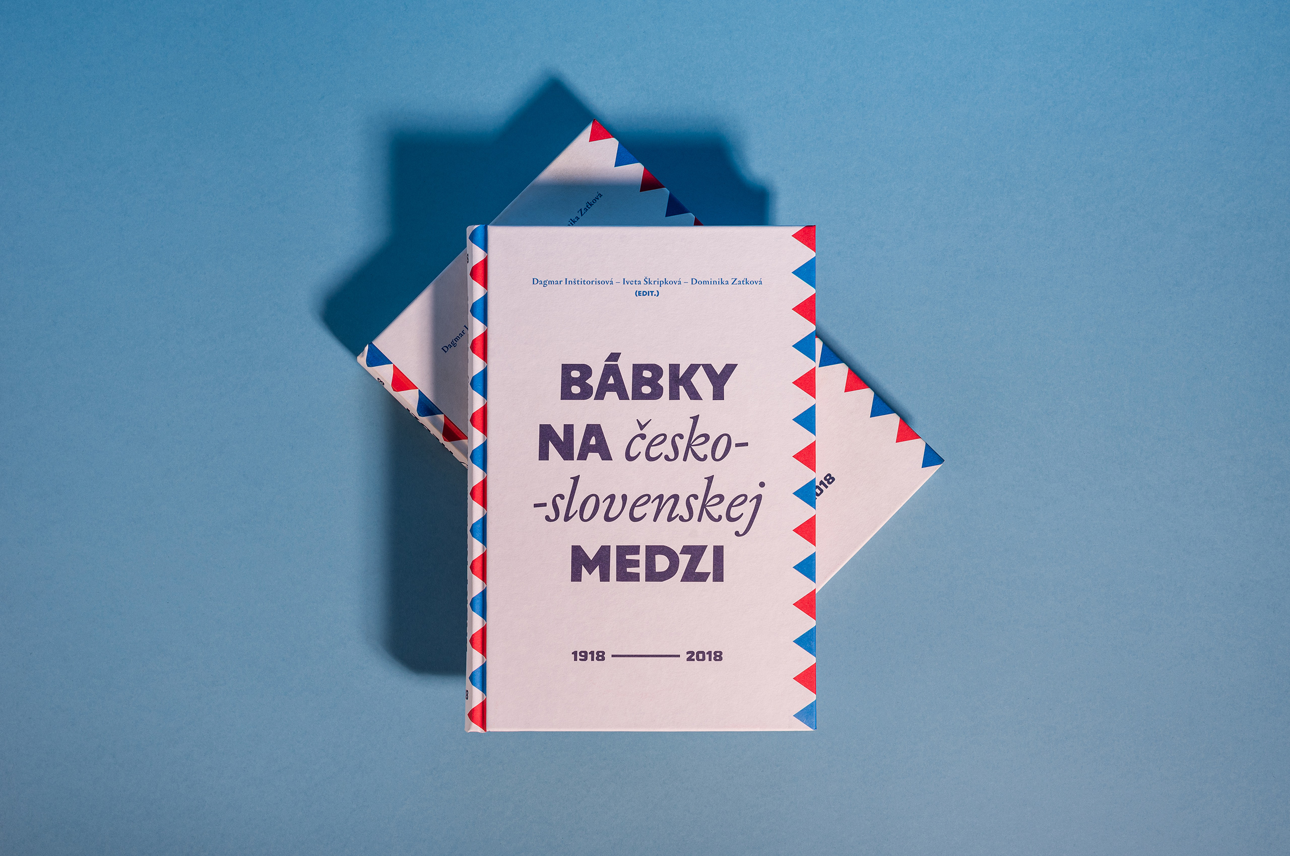
Bábky na medzieditorial design
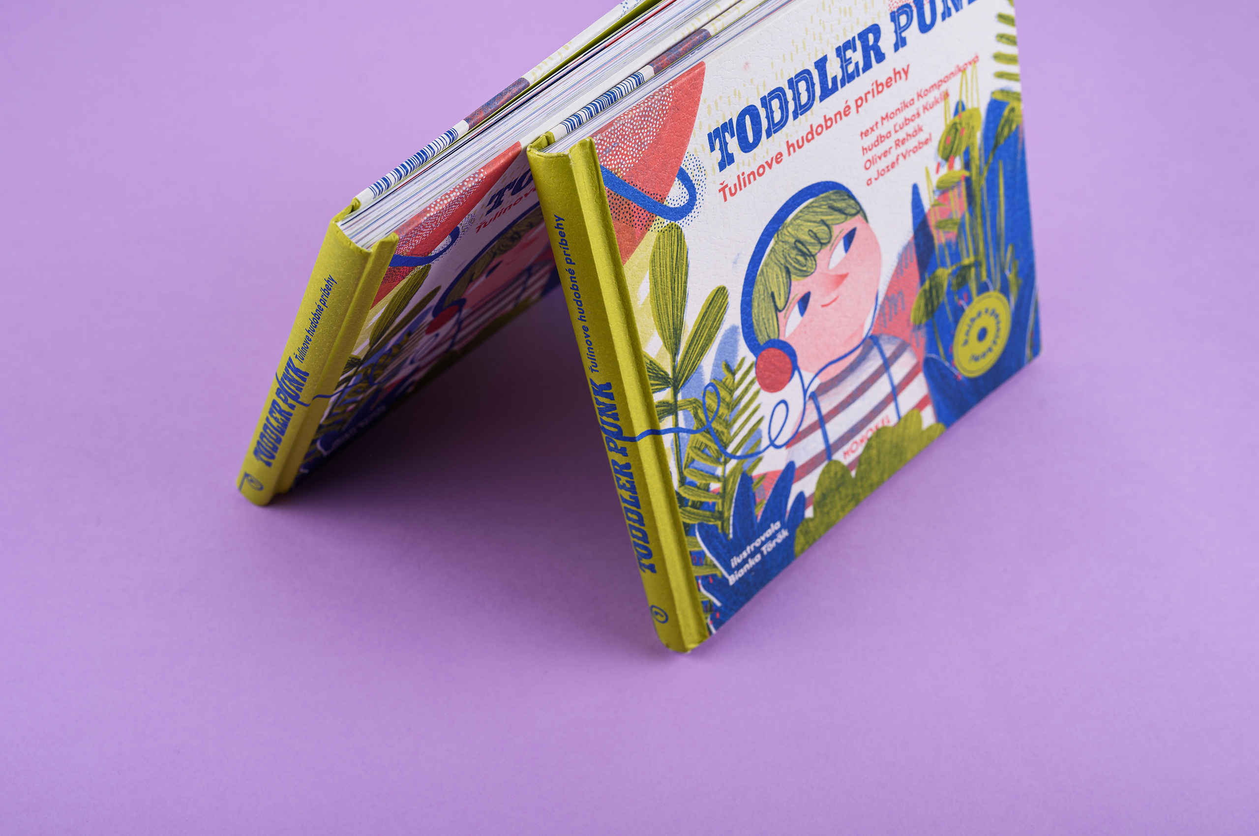
Toddler Punkeditorial design
Cvernovkaeditorial design
Mlsná Emmabrand identity
Let’s create something meaningful!
Mr Meadow would be pleased to discuss your project.
Get in touch at hey@mrmeadow.studio