Bratislava-Nové Mesto
The winning logotype and visual identity design for a Bratislava city district. This district brings together a number of stories, nationalities, age groups, places or interests, which naturally made connecting the main idea. It is important to support the motif of connection with the given district so that the citizen has a legitimate sense of connection – with the local authority, neighbours, activities, services, public space. The typographic logo is complemented by the graphic symbol of the conjunction (along with the variable slogan “It connects us”), which, in addition to connecting words, also supports the meaning of the city’s location point – I am here, I belong here. The identity is supported by graphic elements, a colour palette and photographs and illustrations. The conjunction system here works to divide areas, shift them and sort information. The important part of identity are original graphic elements, mainly based on the details of the unique architecture of the Nové Mesto district. Inspired by the high concentration of unconventional morphology of the iconic district architecture, these equally unconventional graphic elements serve as cutouts for photos or information boxes.
logotype
brand identity
print & online
design manual
client Bratislava-Nové Mesto
urban district
2025
⁕ public open-call
(winnig proposal)


BRATISLAVA-NOVÉ MESTO
2025
client Bratislava-Nové Mesto
typeface Sans Plomb, Grato Grotesk
collab Katarína Kyselicová
More projects
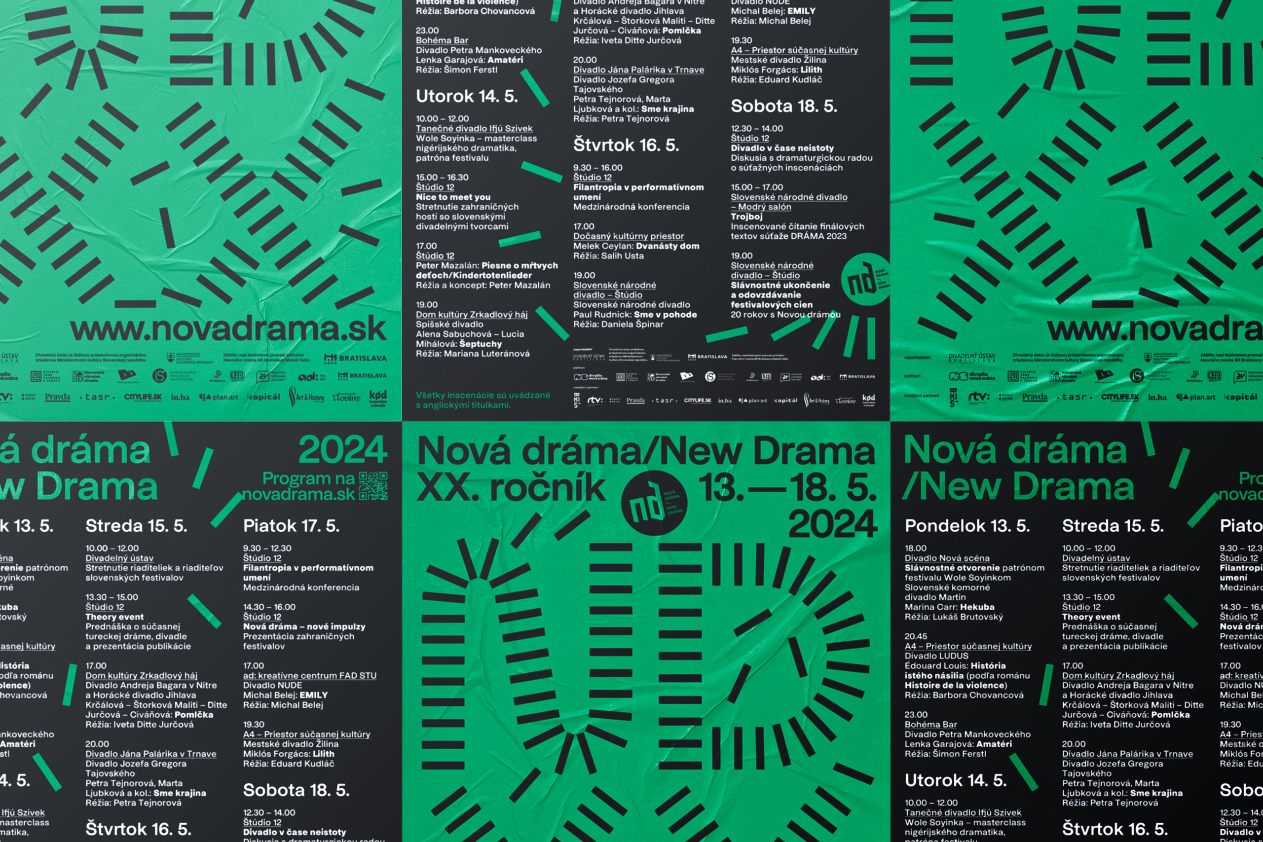
New Drama 2024visual identity
GrandPrix Awardsaward design
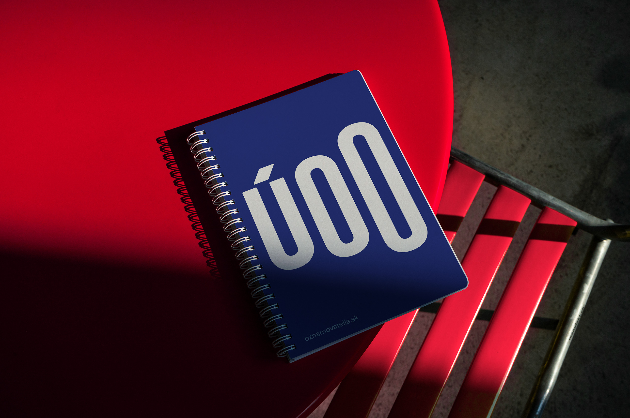
Whistleblower Officebrand identity

Nacuckybrand identity
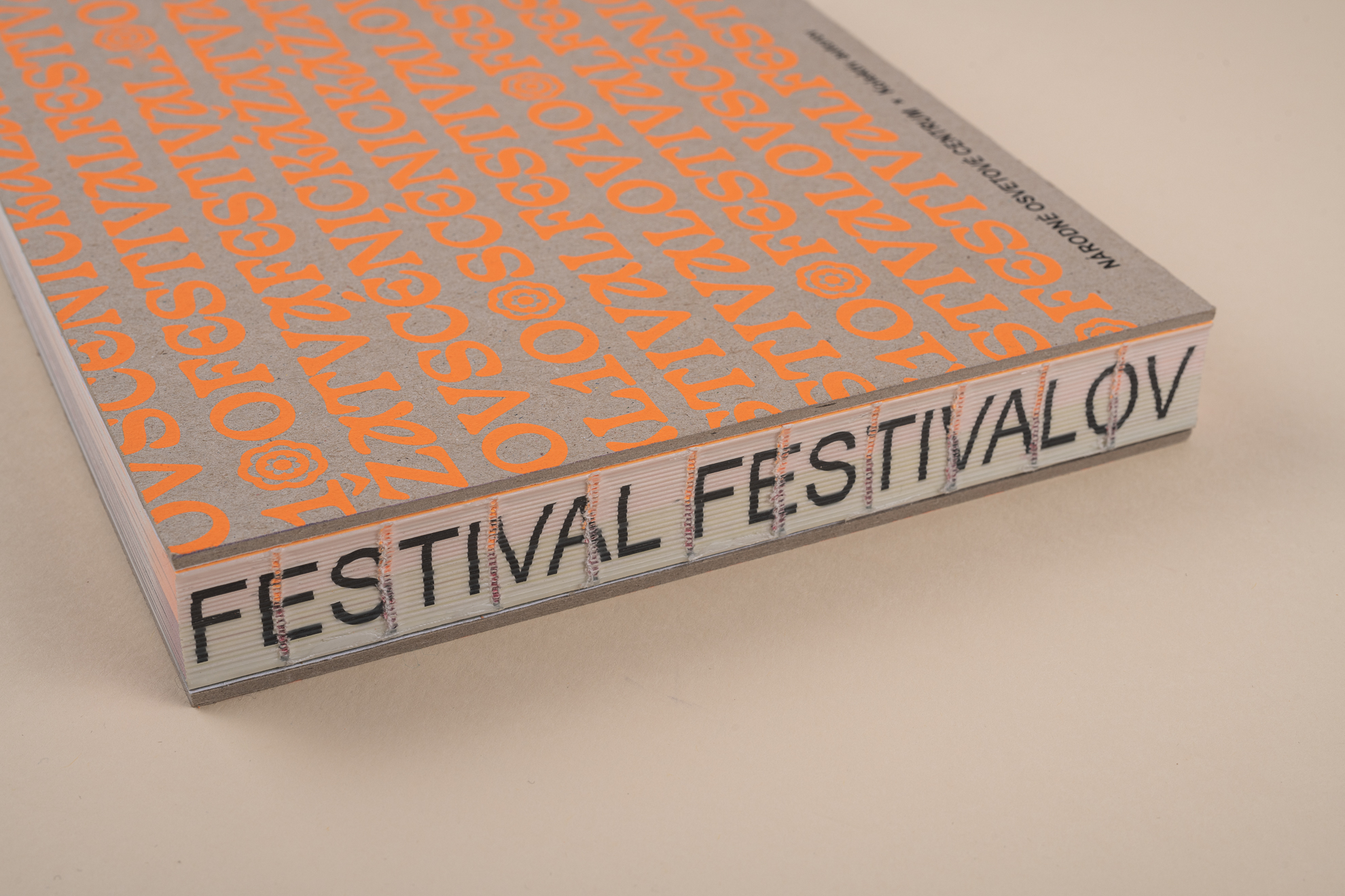
Festival festivaloveditorial design
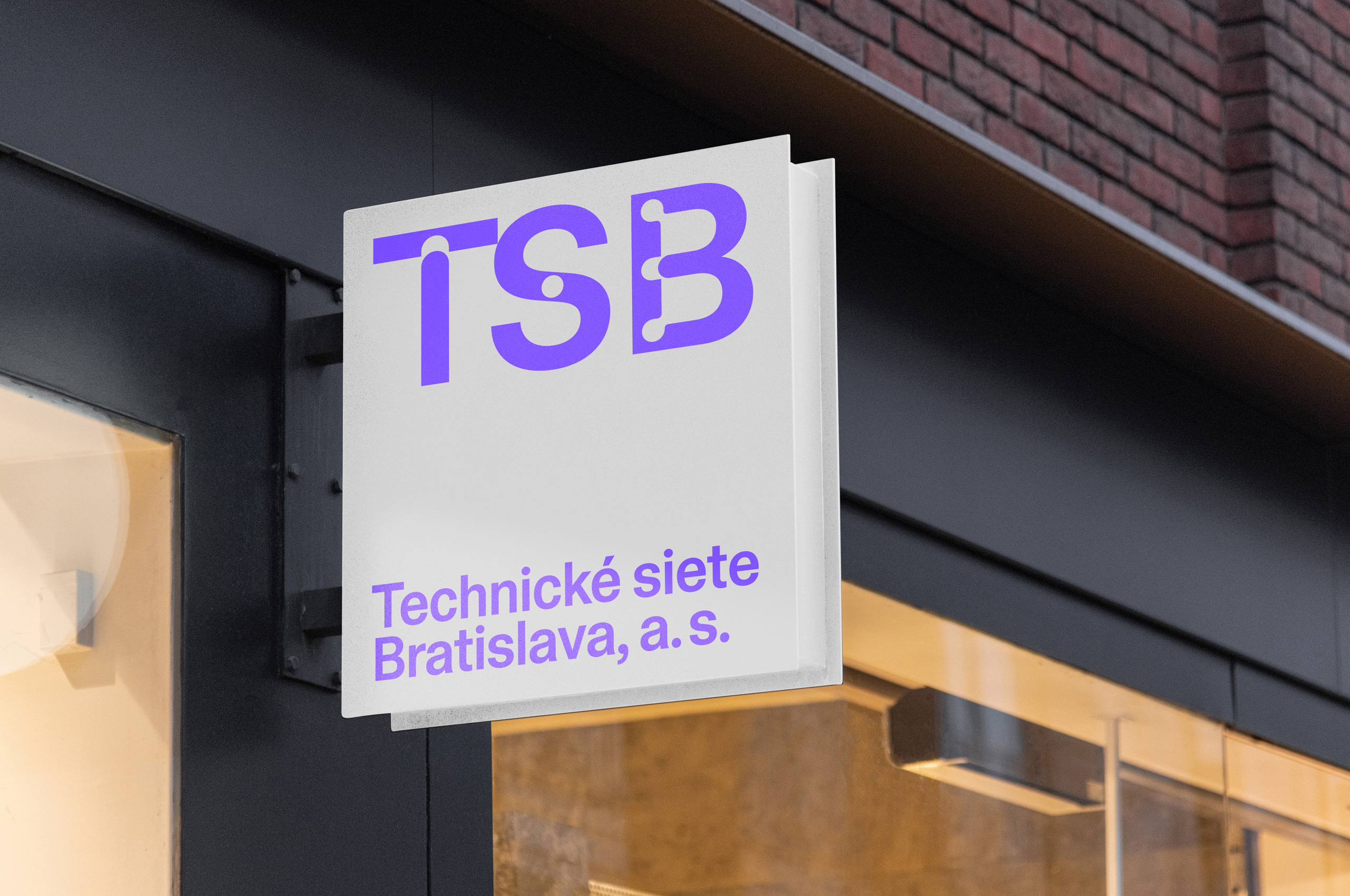
Technical Networksbrand identity

Knižnica Bratislavabrand identity

New Drama 2022visual identity
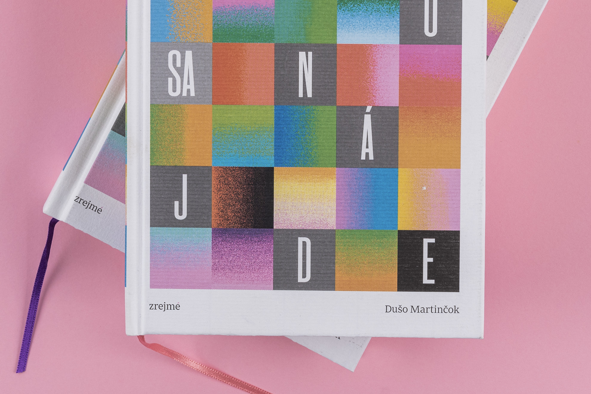
Niekto sa nájdeeditorial design

Giraffe Bakeryeditorial design
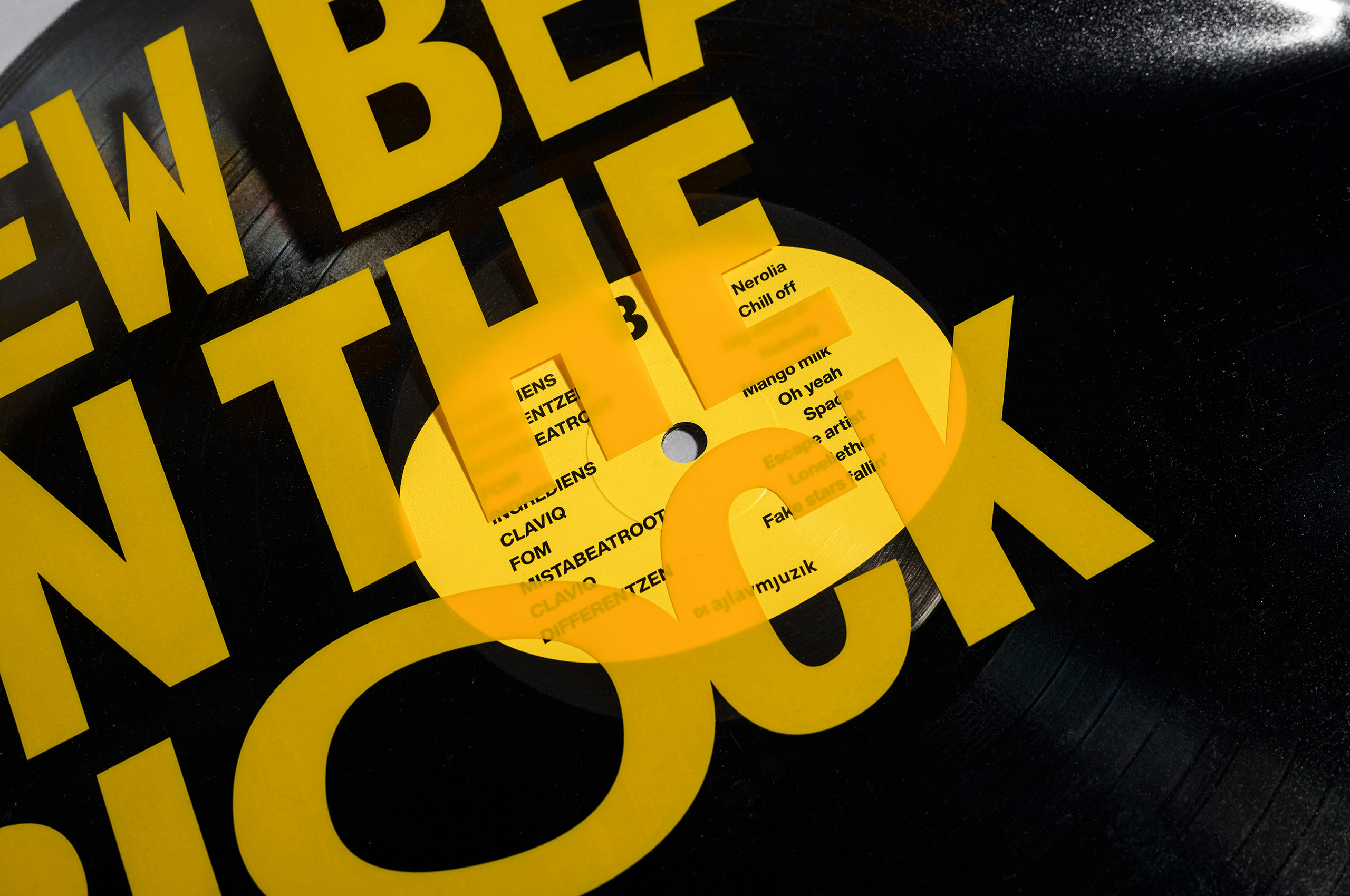
New Beats on the Blockpackaging
Century of Theatrevisual identity
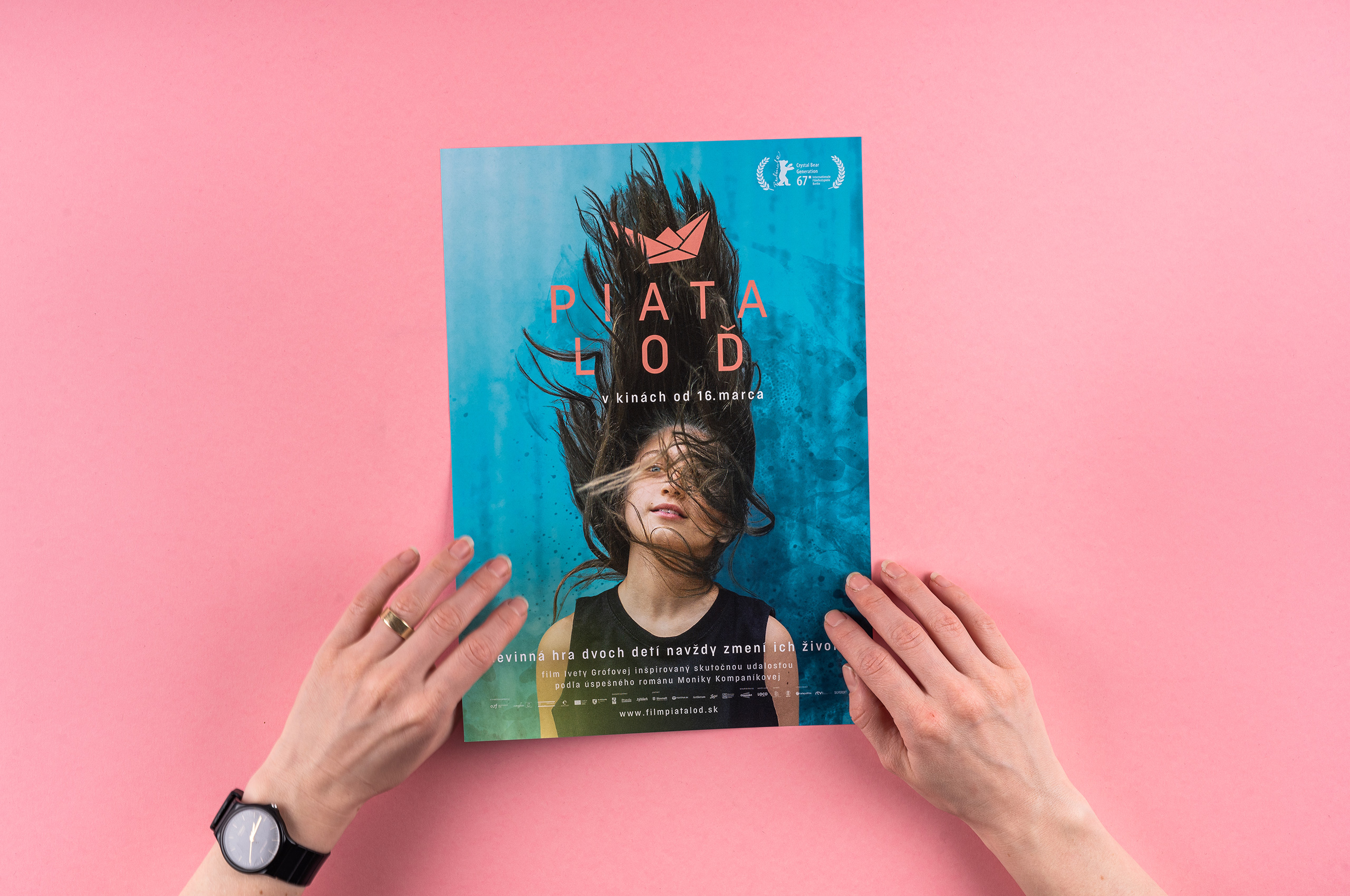
Piata loďvisual identity
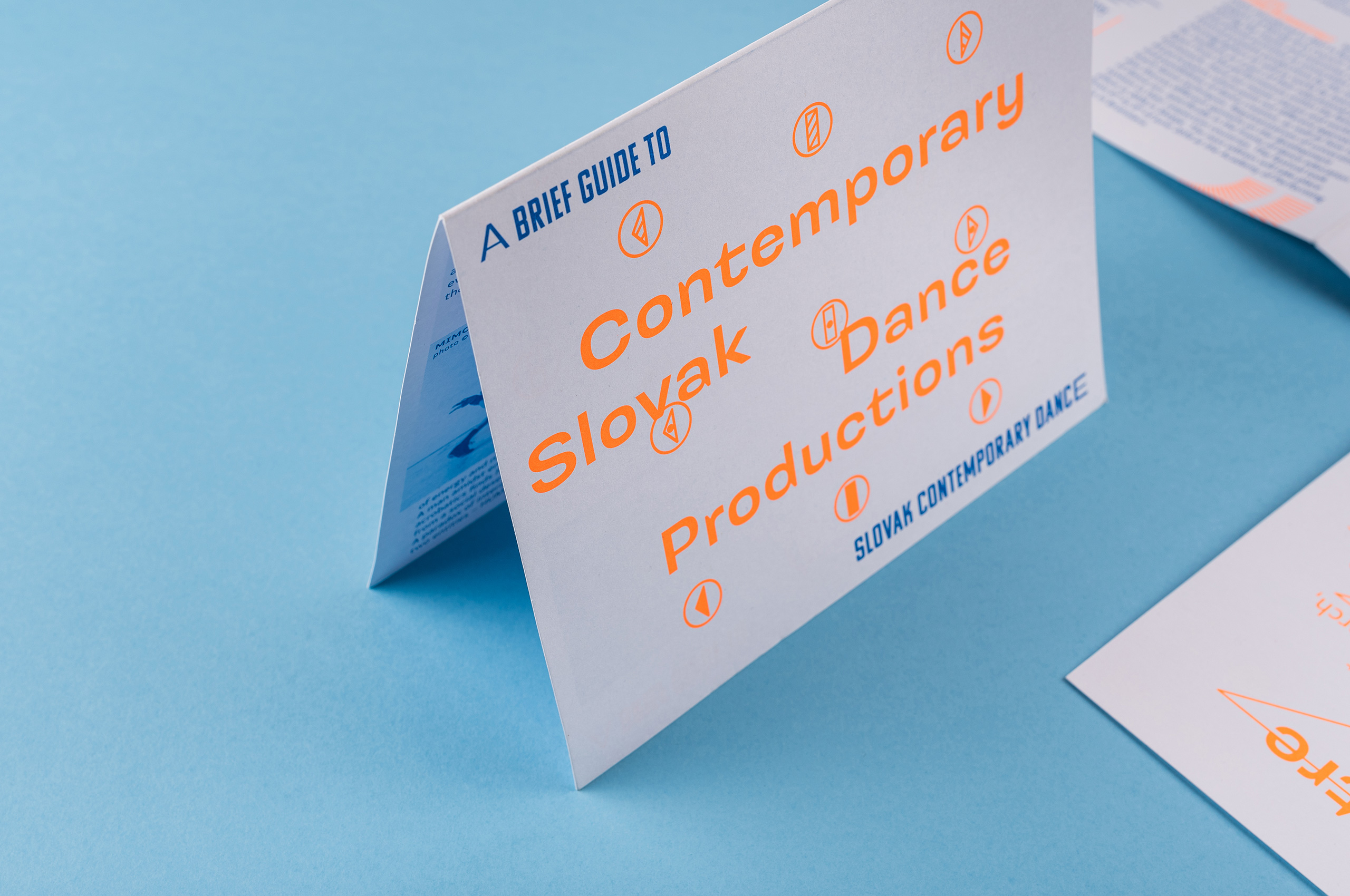
Slovak Dancevisual identity

Green Dramaeditorial design
New Drama 2019visual identity
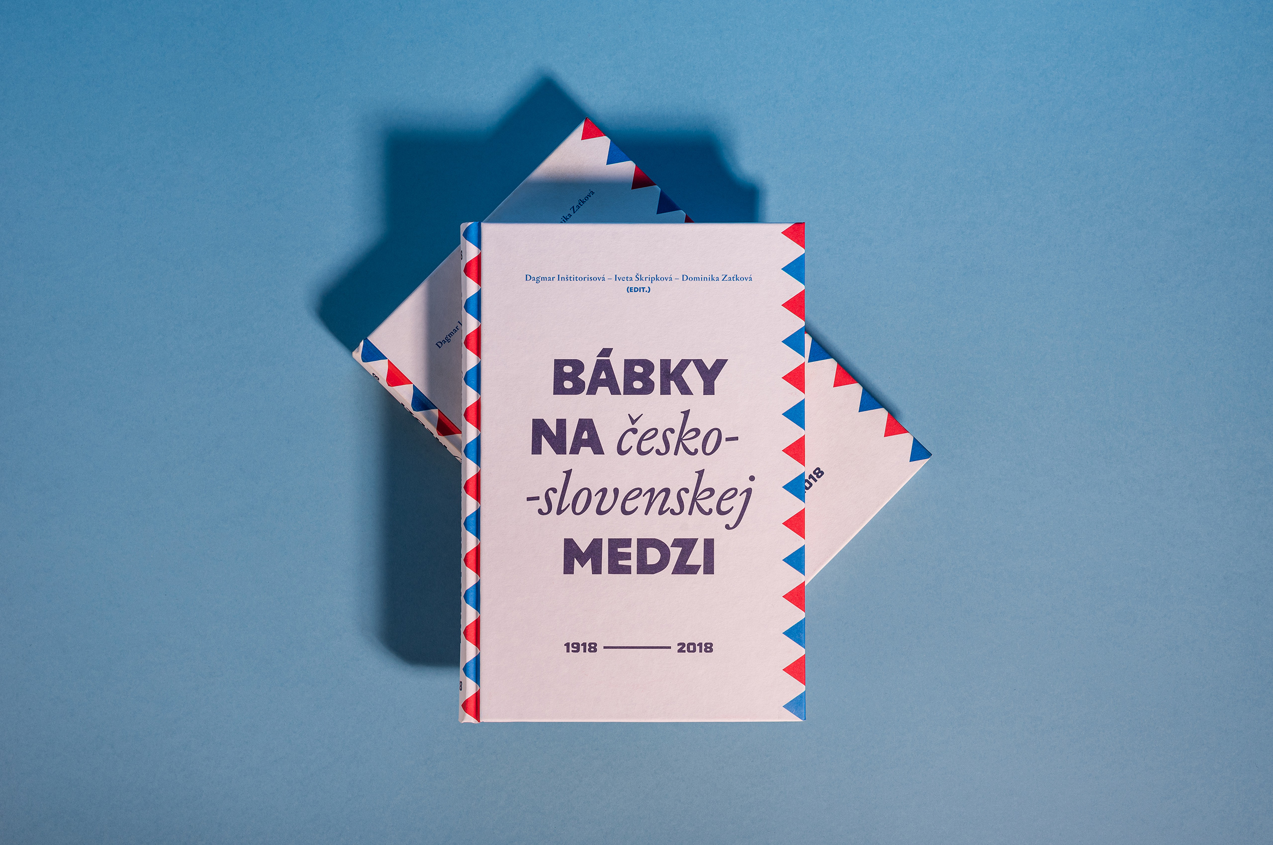
Bábky na medzieditorial design
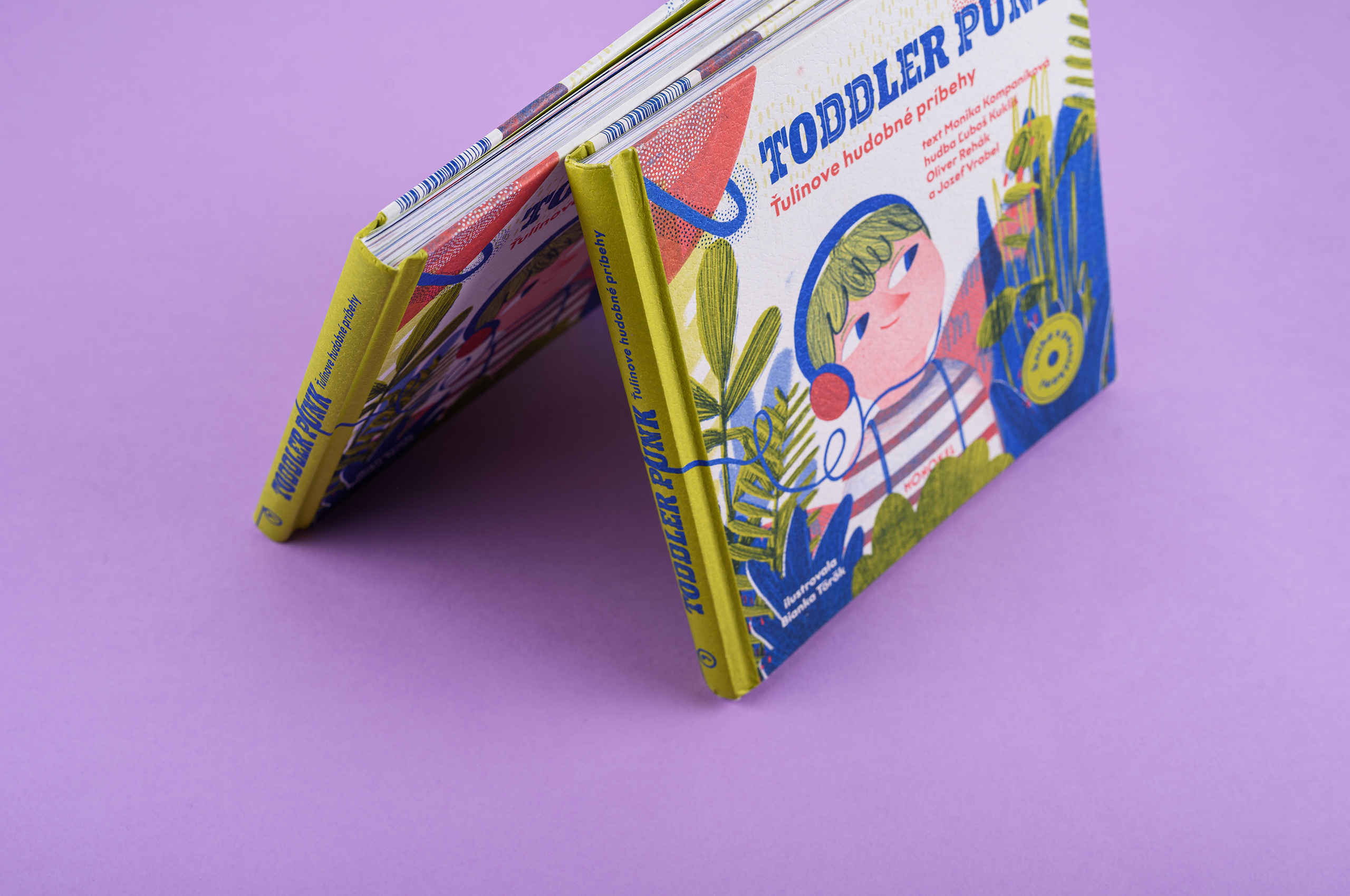
Toddler Punkeditorial design
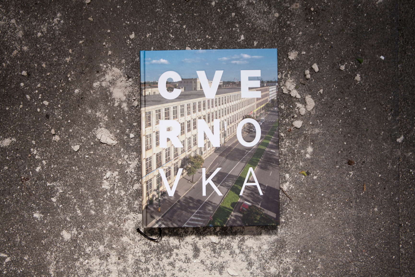
Cvernovkaeditorial design
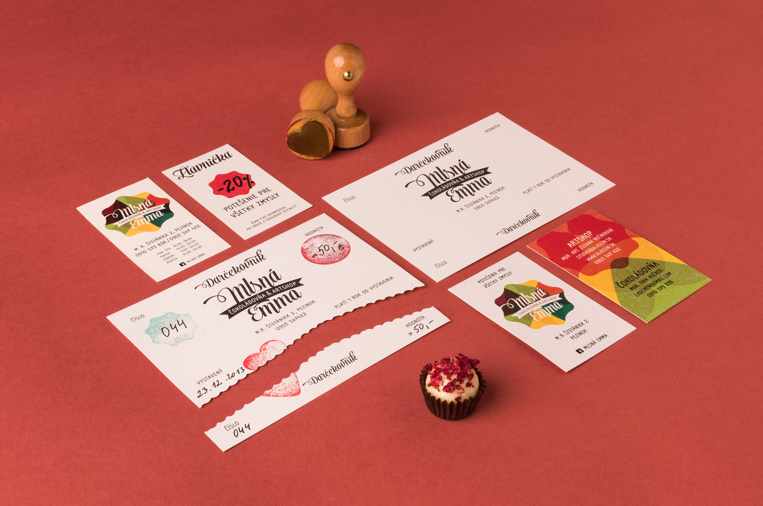
Mlsná Emmabrand identity
Let’s create something meaningful!
Mr Meadow would be pleased to discuss your project.
Get in touch at hey@mrmeadow.studio