GrandPrix New Drama
Visual identity of a contemporary drama festival Nová dráma/New Drama turns into a physical object thanks to the GrandPrix. The main award GrandPrix reflects the annual visual differences. The basic ideological and visual theme of a year is projected into a physical award.
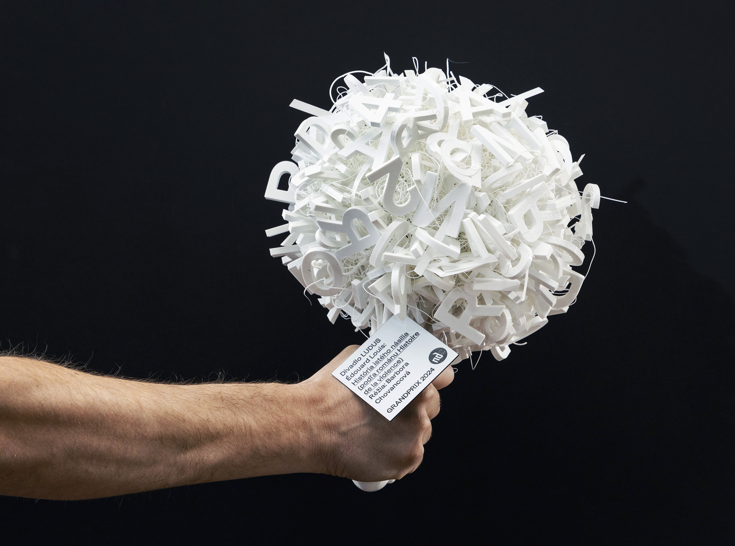
GrandPrix 2024
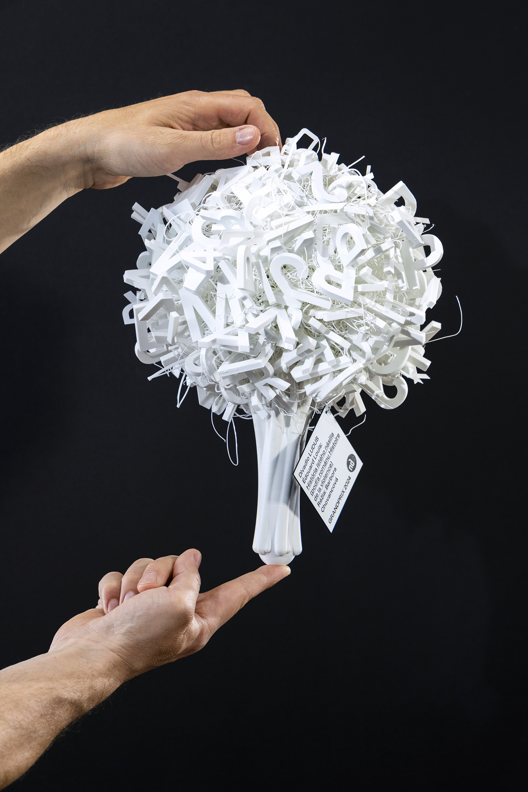
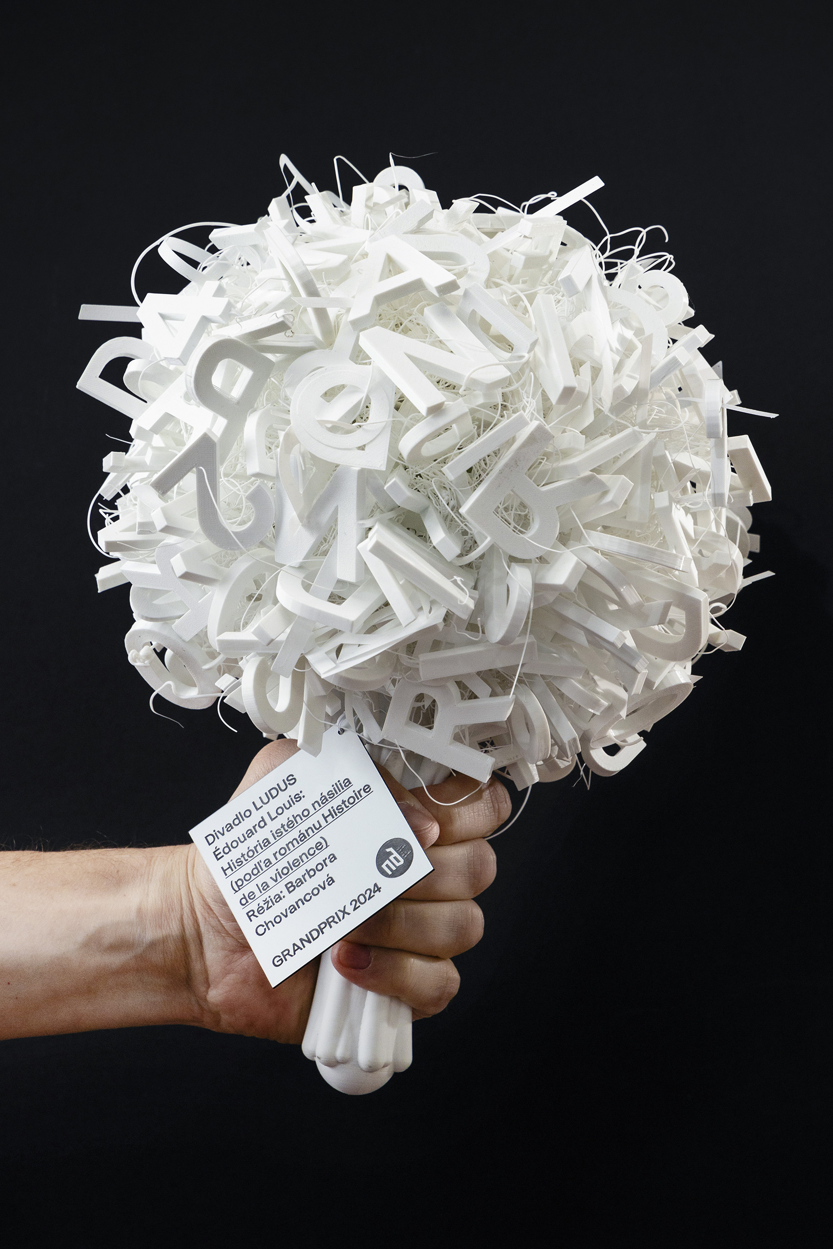
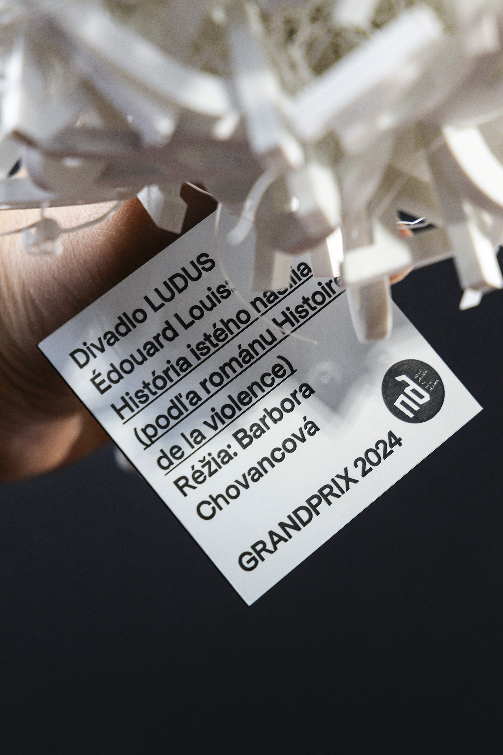
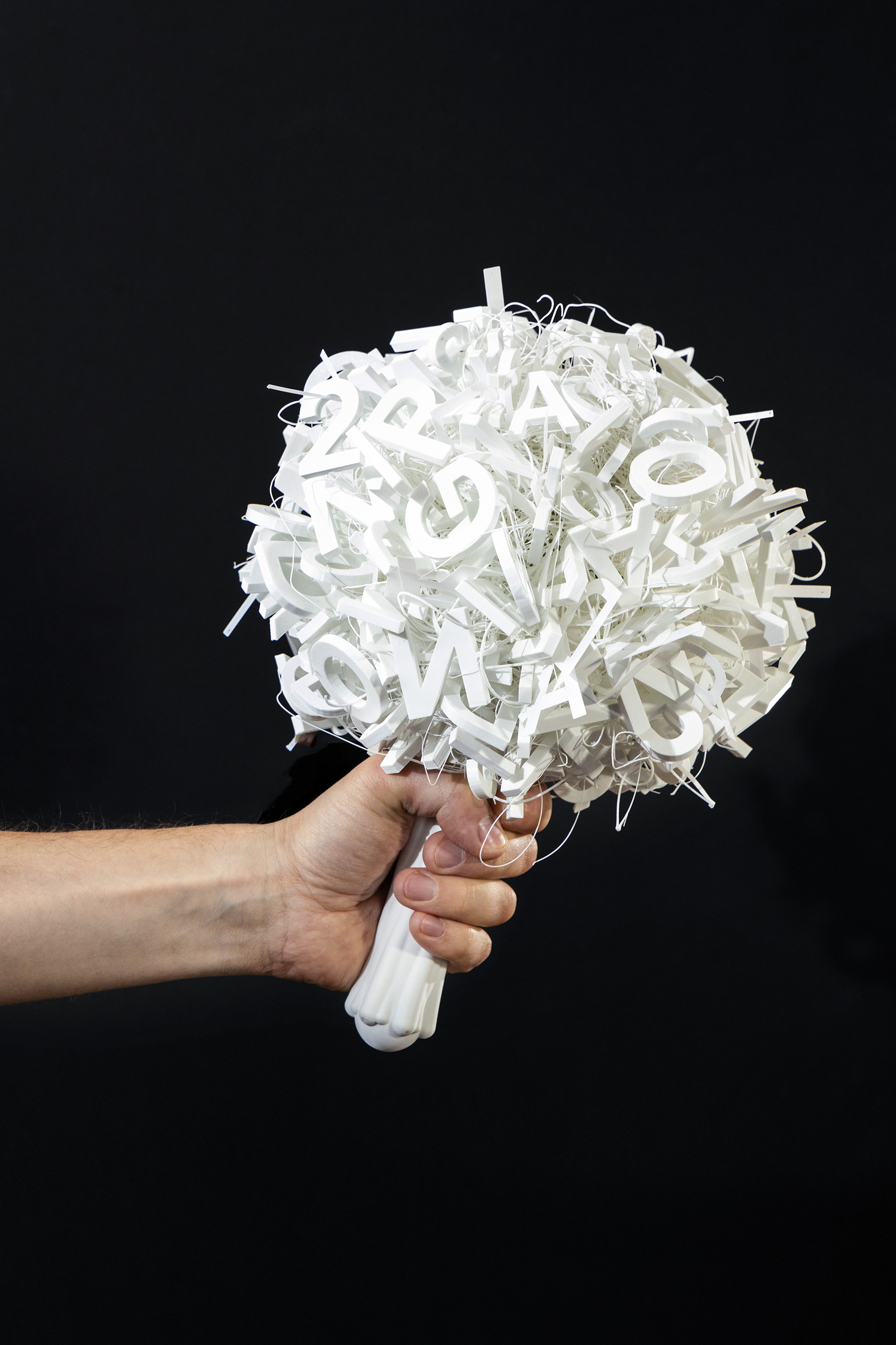
This year, for the first time, the award was not visually linked to the annual poster. The brief was to come up with a distinctive award that could be replicated each year. The main idea was a bouquet – instead of flowers it came in the form of letters. The repeating letters are randomly scattered throughout the bouquet, consisting of letters GRANDPRIX 2024 NOVÁ DRÁMA/NEW DRAMA. Letters represent the basis of theatrical works – staging texts. The bouquet also reminds us of a torch, a traveling prize given to directors, playwrights, and authors from year to year. The winner was delivered on an extra tag, tied into a pre-made wire. Same as a grateful card is placed in a bouquet.
Size of the award 20 x 20 x 30 cm. Preparation technology – 3D printing with white filament, finished with manual gluing of letters, filled in with pieces of filament leftovers. The winner was lasered into a two-tone plastic material.
execution by Lab.Café
photo © Michal Líner
GrandPrix 2023
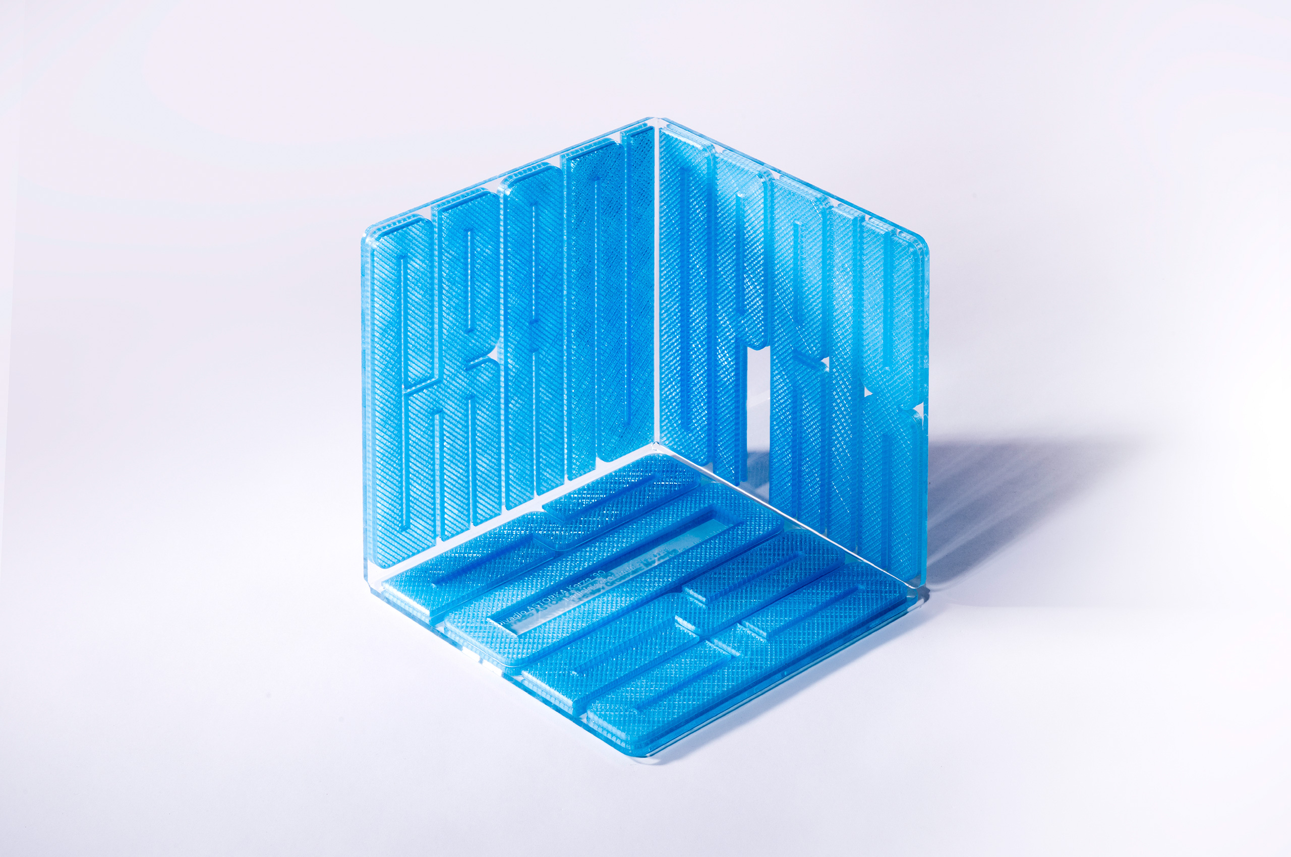
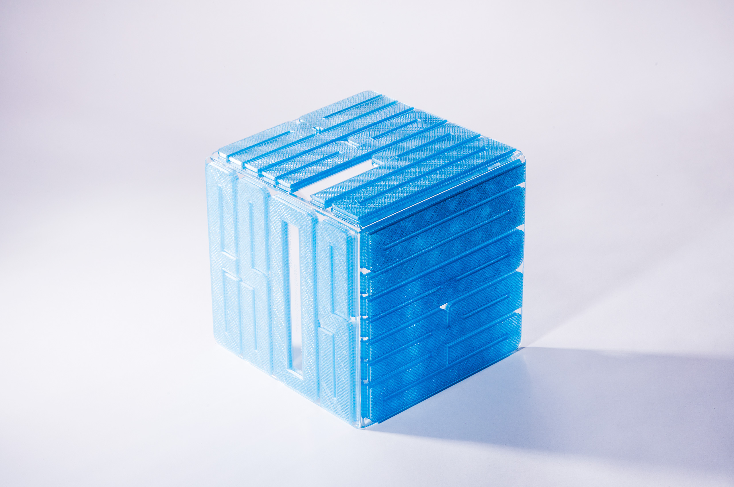
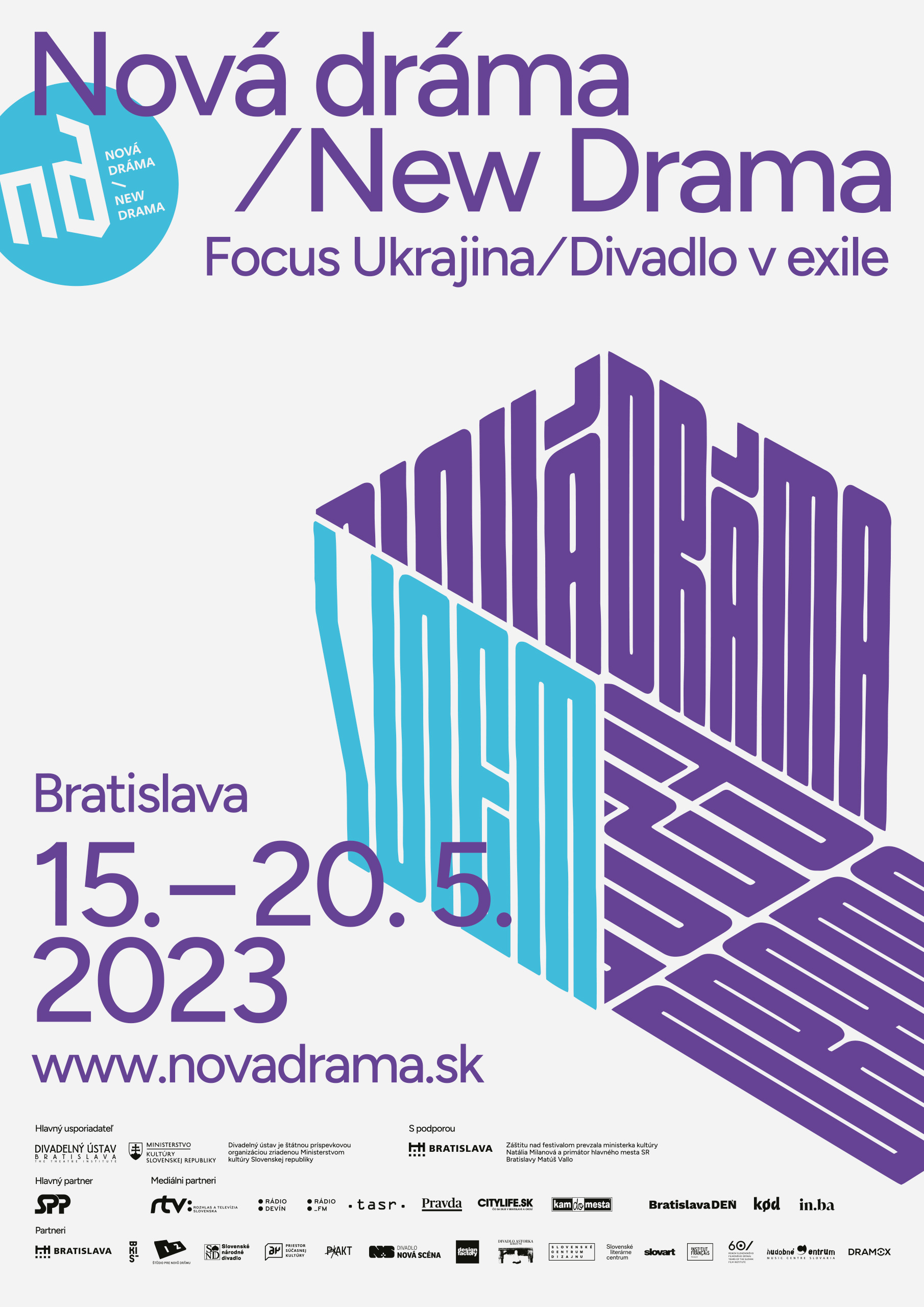
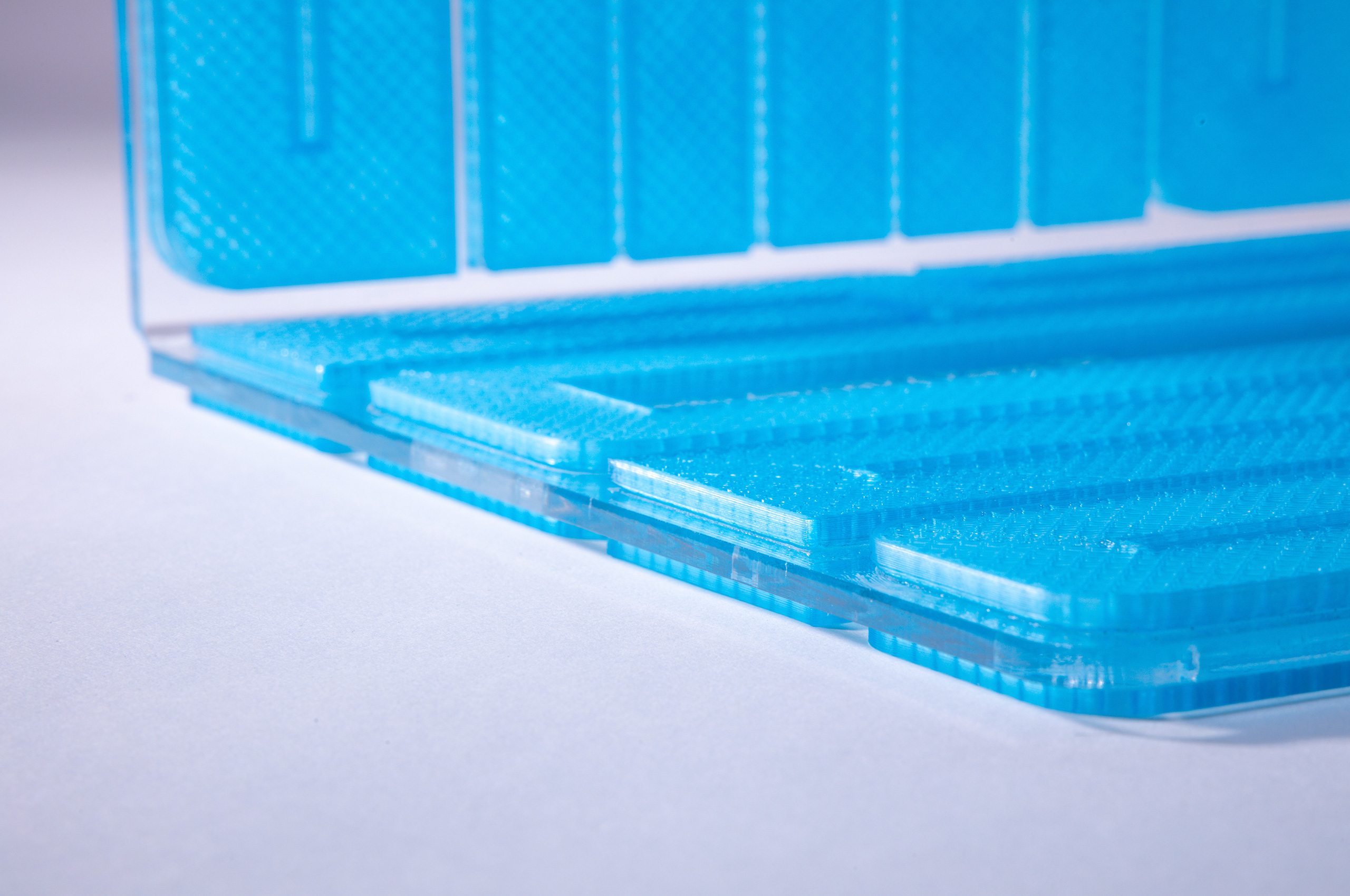
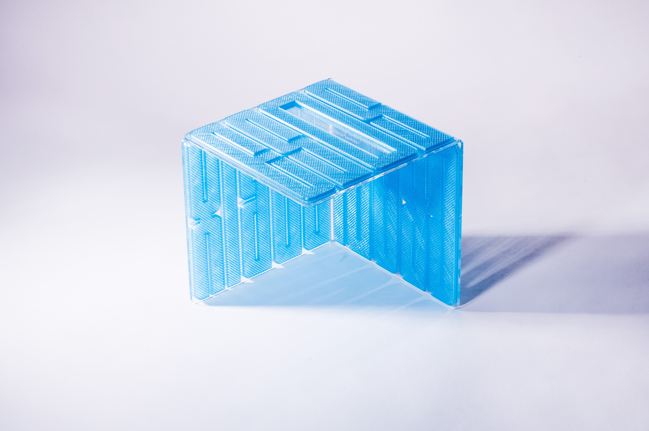
The theme of the festival was a theatre on the edge, a theatre in exile, as a reaction to the full-scale war of Russia against Ukraine. The visual materialised from the idea of an island, a physical or mental segment of reality. It depicts a sanctuary, a background against adversity. It is possible to relocalise it. The abstraction of this idea is a cube, a paraphrase of a theatre black box. The cube with re-foldable sides. A backpack, in which we carry our world/theatre and take it out where we need it.
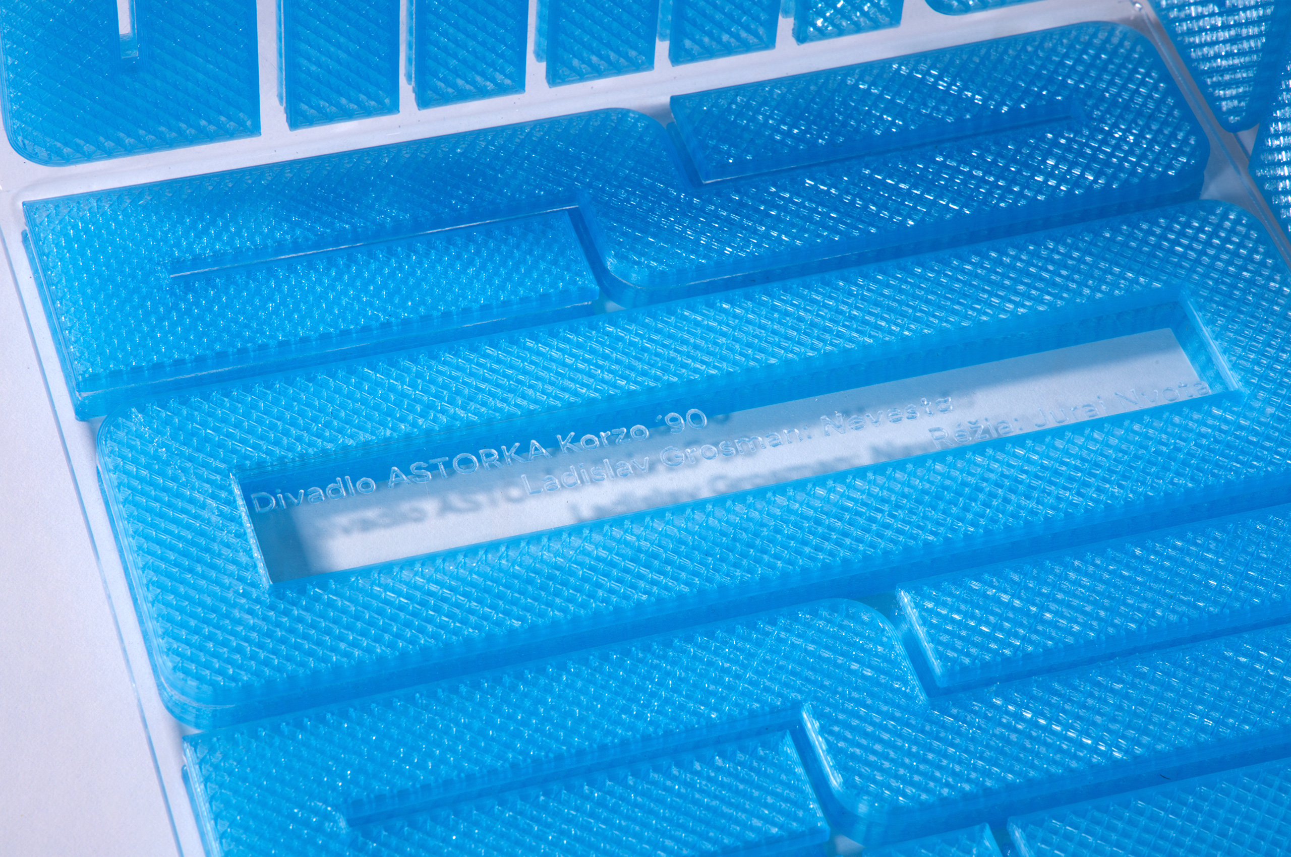
Size of the award 23 x 23 cm. Material is transparent plexiglass and 3D print with blue semi-opaque filament. The winner was engraved by a laser.
execution by Boris Belan
photo © Michal Líner
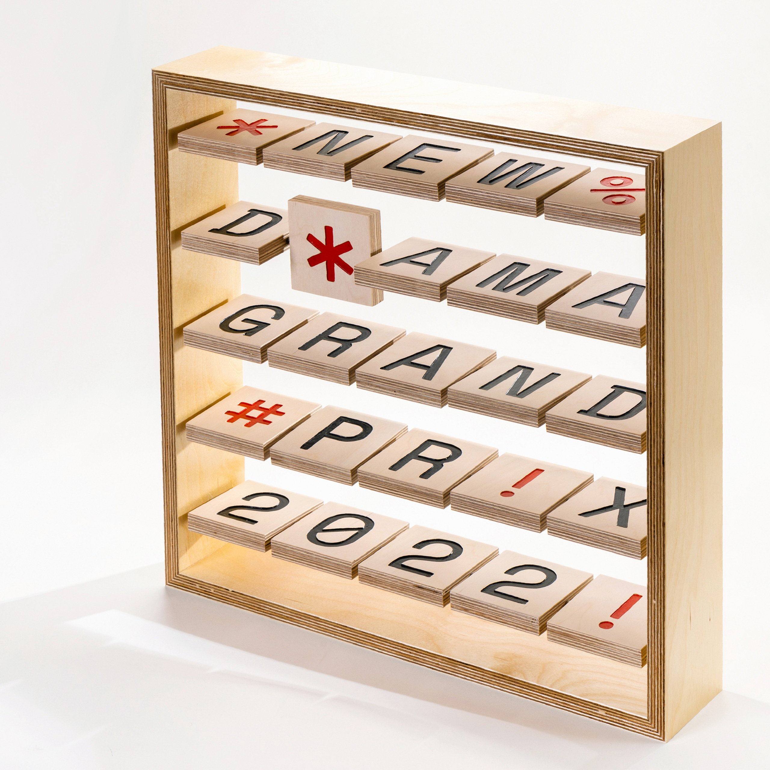
GrandPrix 2022
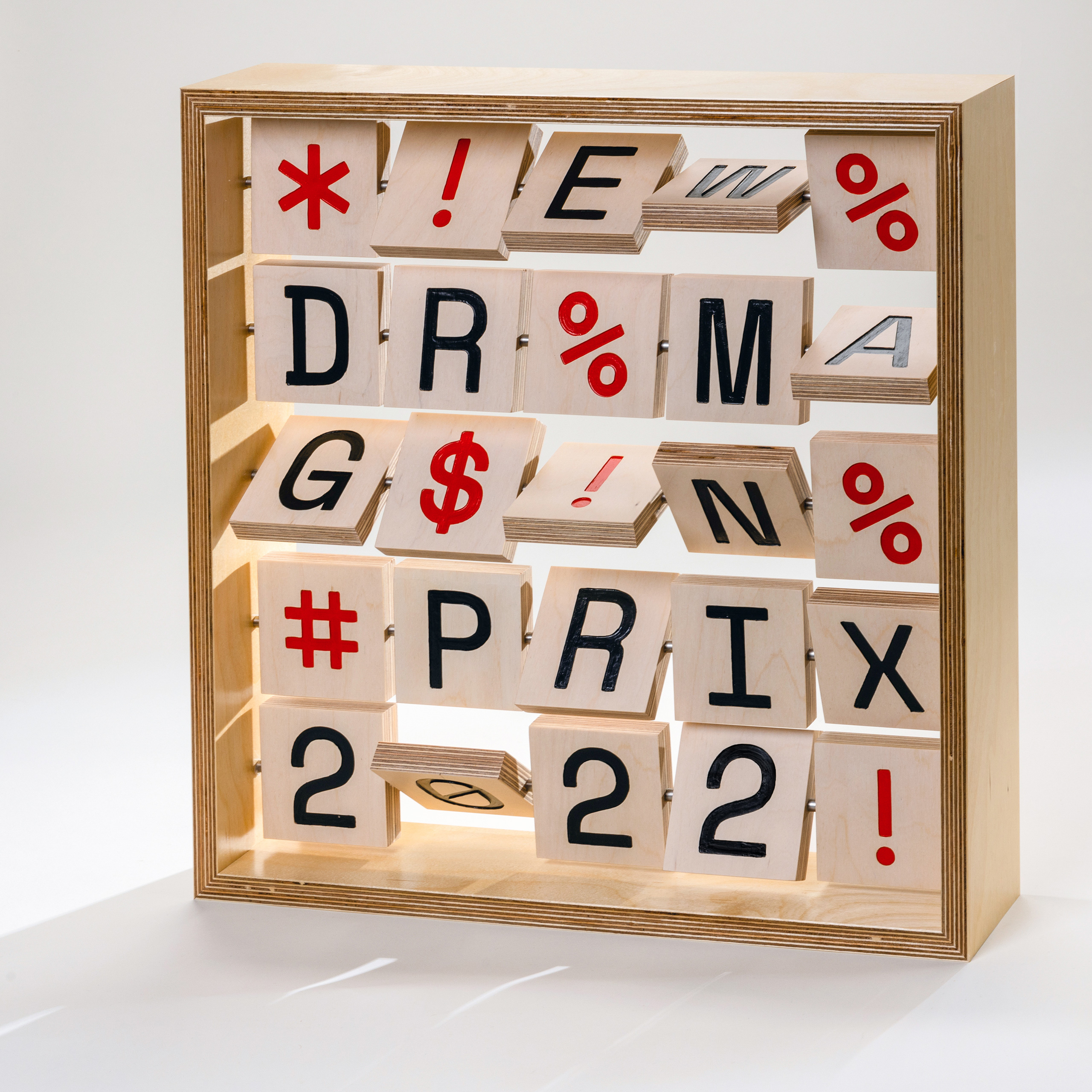
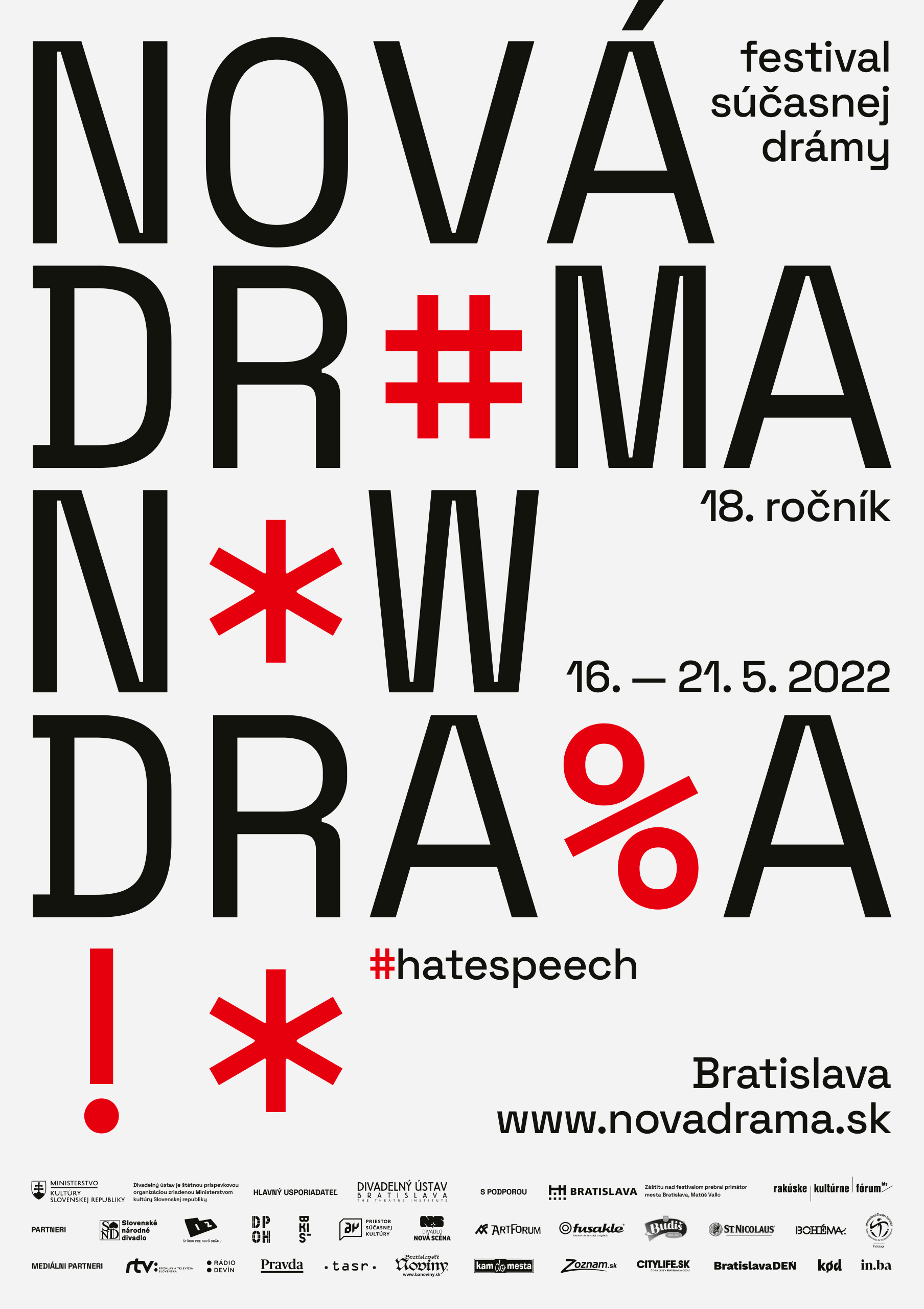
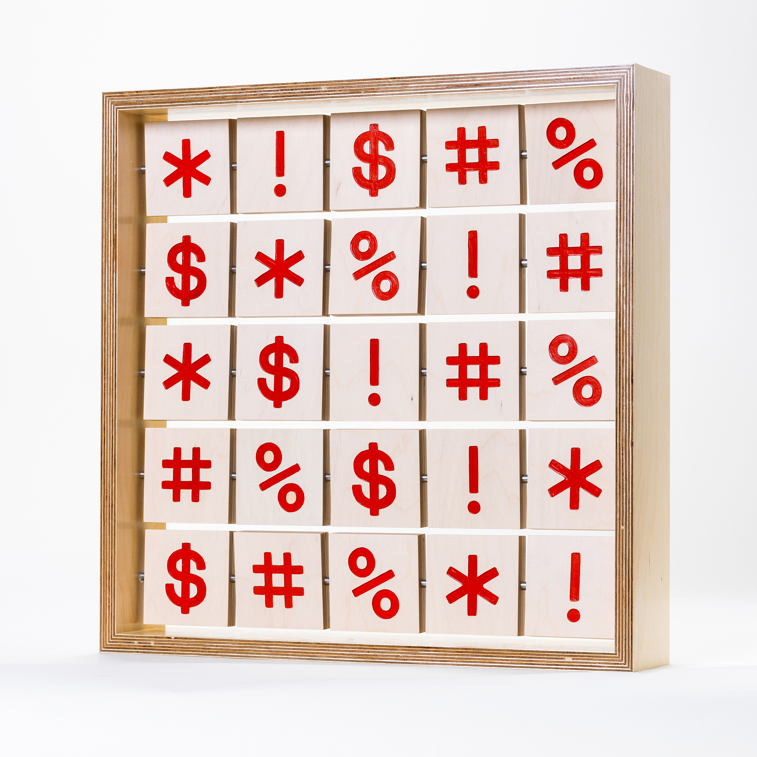
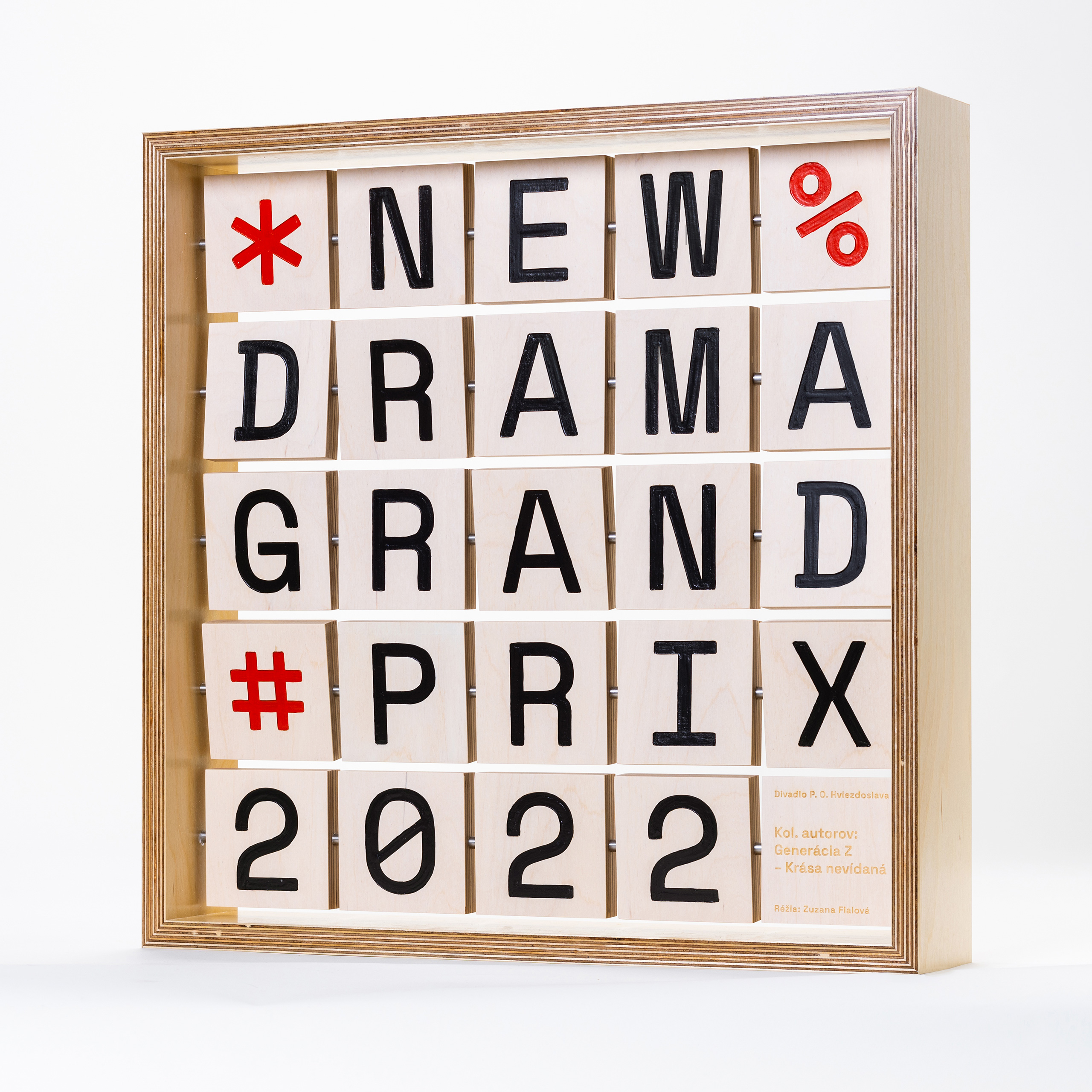
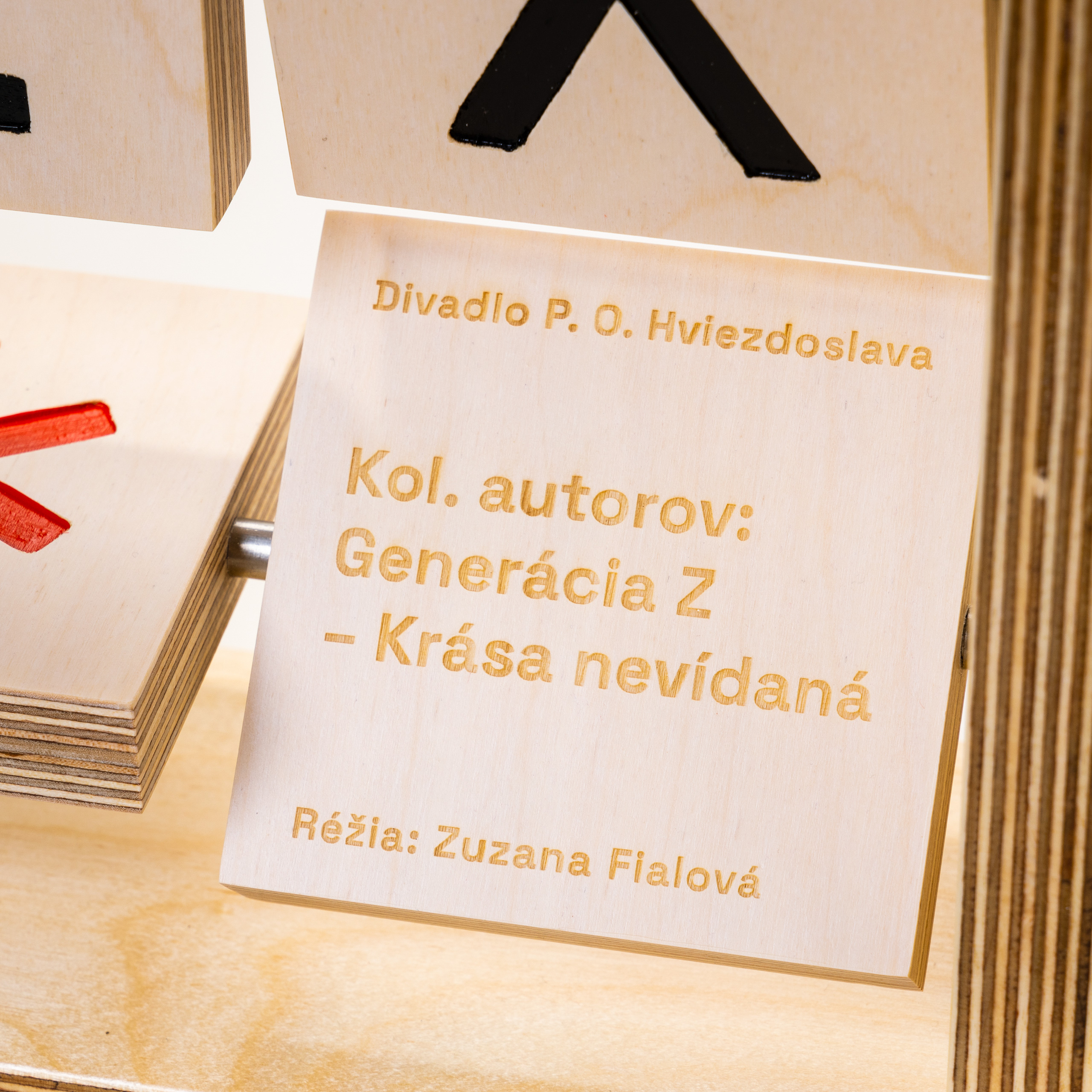
The topic of the festival was a phenomenon of cancel culture focused on hate speech in public discourse, the rise of ideological extremism, and current freedom of speech. The visual identity worked with the typeface as the main actor. The name of the festival was infiltrated by censorship, AKA bleep censors, with the help of online hate speech symbols $&#%!*.
The size of the award is 50 x 50 cm. The material of the frame as well as the rotatable letters is a plywood with cut-out hand-painted letters. The winner was cut out by a laser.
execution by Juraj Demovič, Manum
photo © Michal Líner
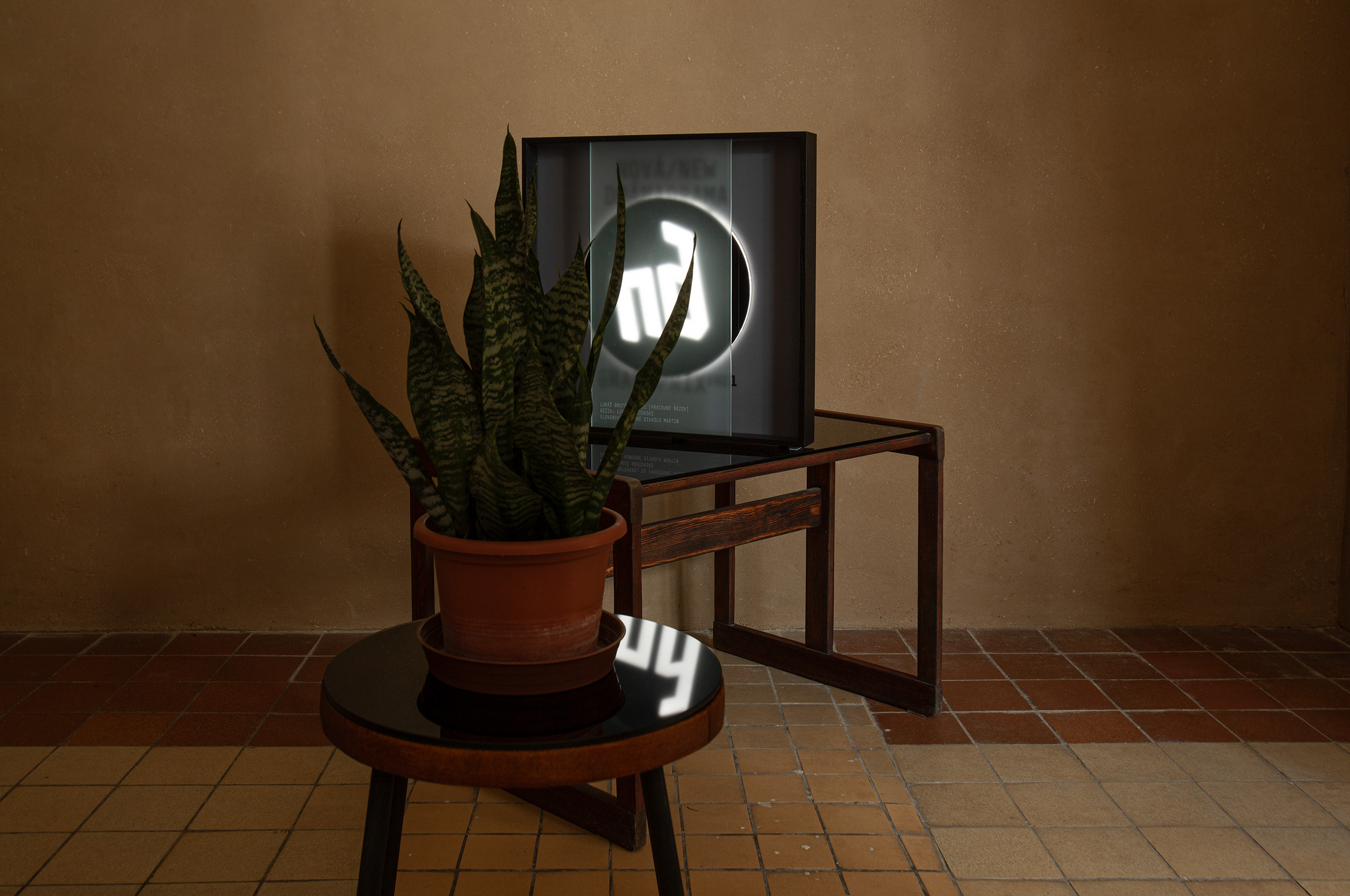
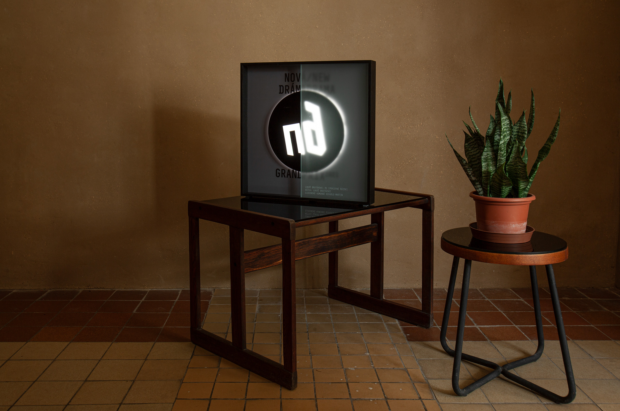
GrandPrix 2021
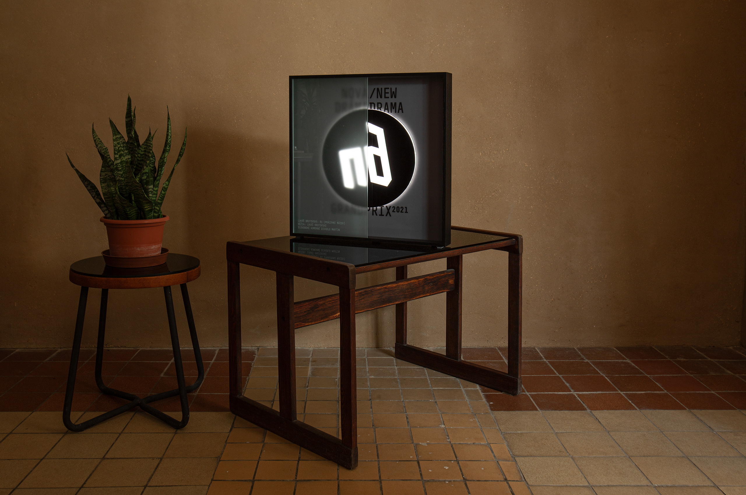
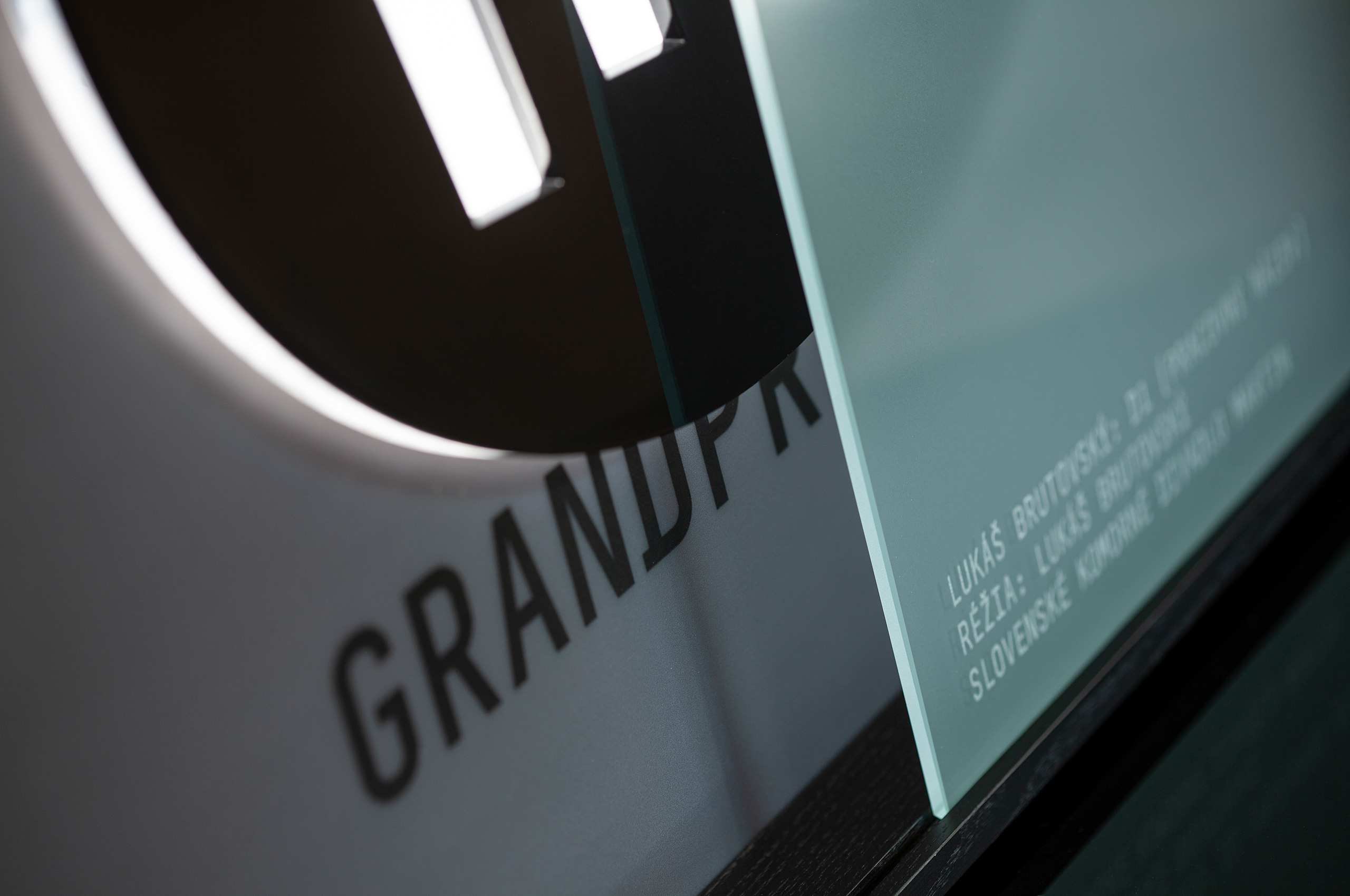
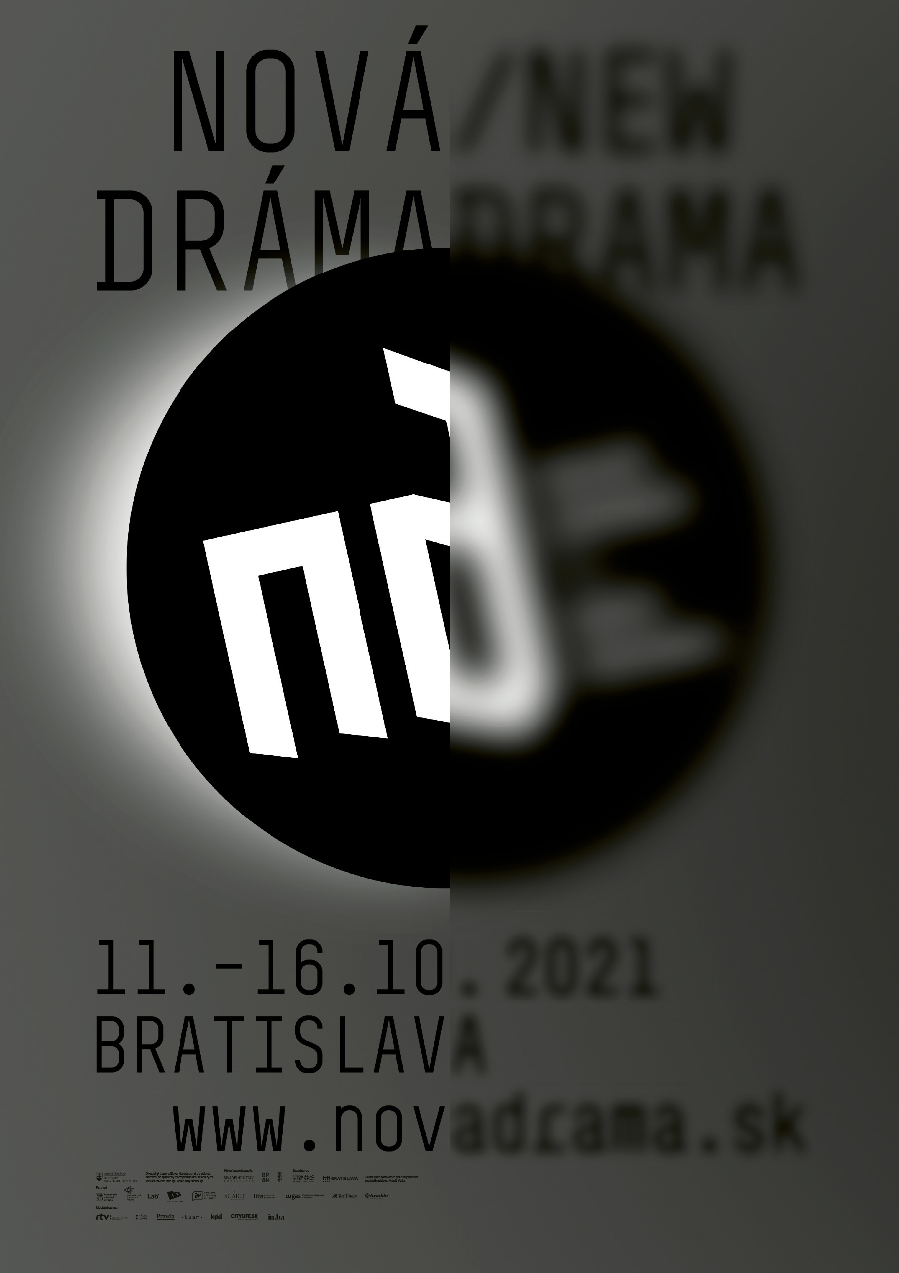
The concept of the year works with the theme of a post-pandemic restart of culture. It's been a year since the outbreak of the Covid-19 pandemic, and the theatre dares to go out of their homes again among people. The visual identity works with ambiguity – the pandemic continues with various fluctuations and unfortunately, it is not known at what stage it will be during the festival. Will we finally experience theatre together in a public space, or on the contrary, will we draw back to our homes again?
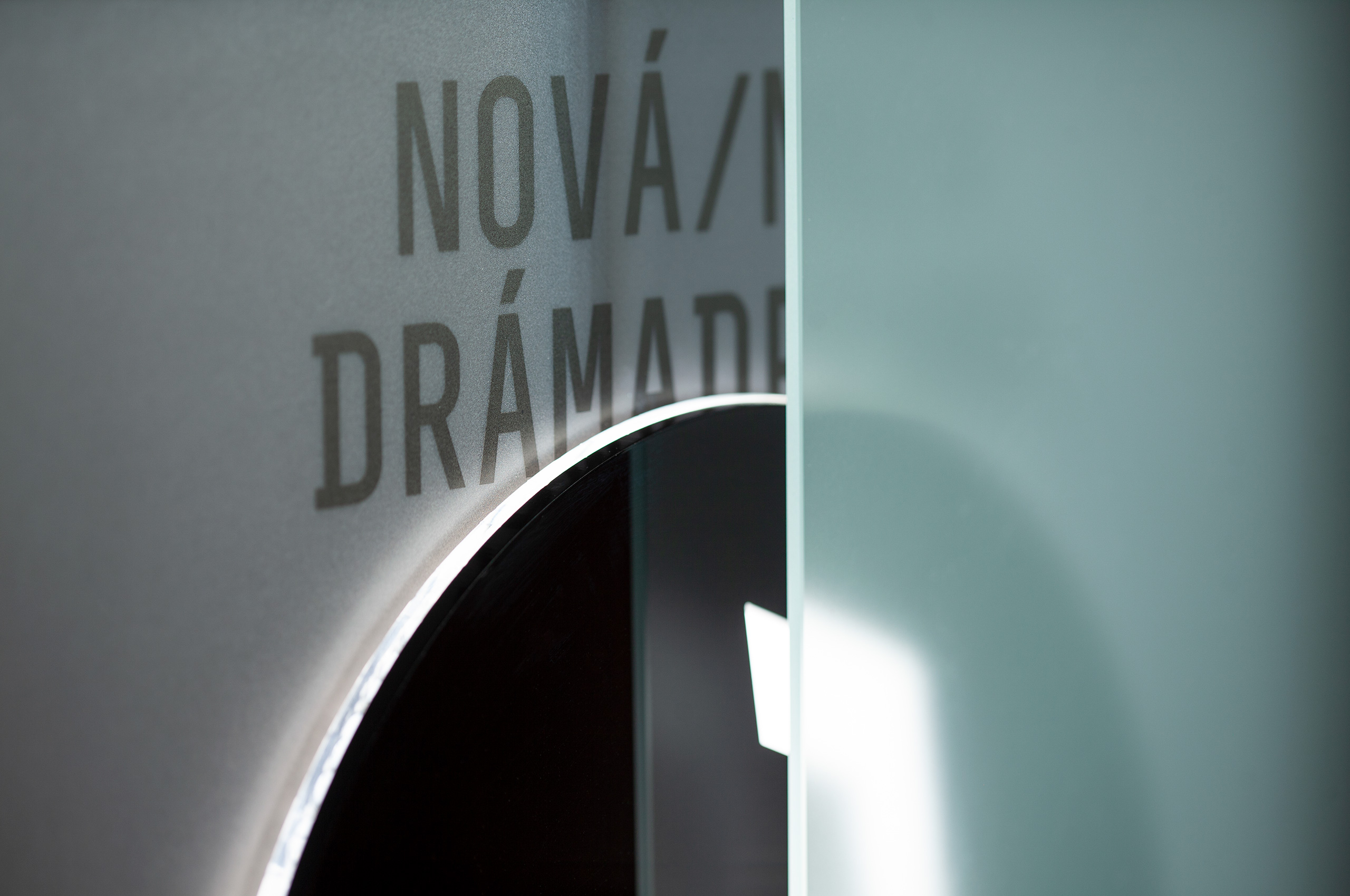
The size of the award is 50 x 50 cm. Frame material wood, inside printed Plexiglas with hidden light source. Logo composed of cut-out plexiglass circles. Milky sliding glass with engraved winner.
execution by Juraj Demovič, Manum
photo © Viktor Szemzö
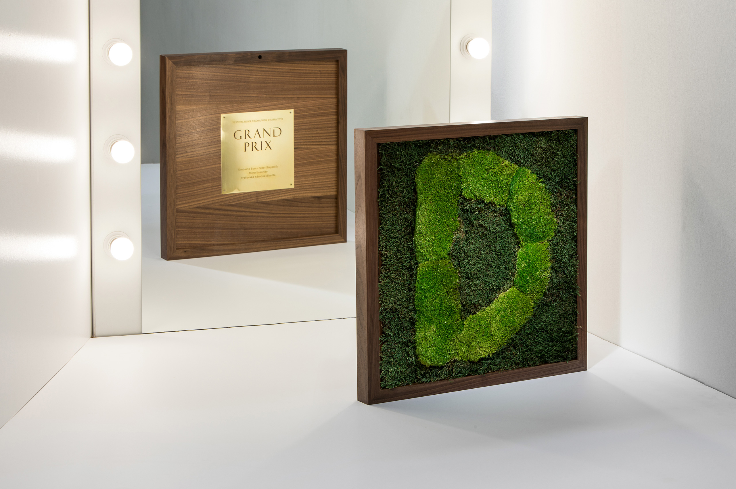
GrandPrix 2019
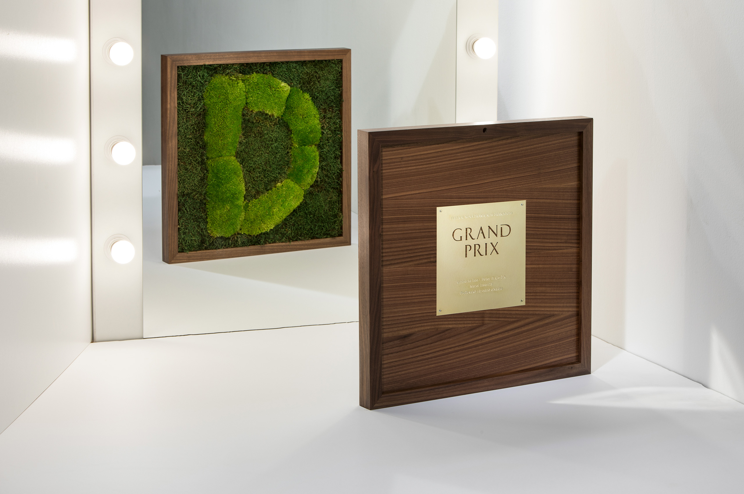
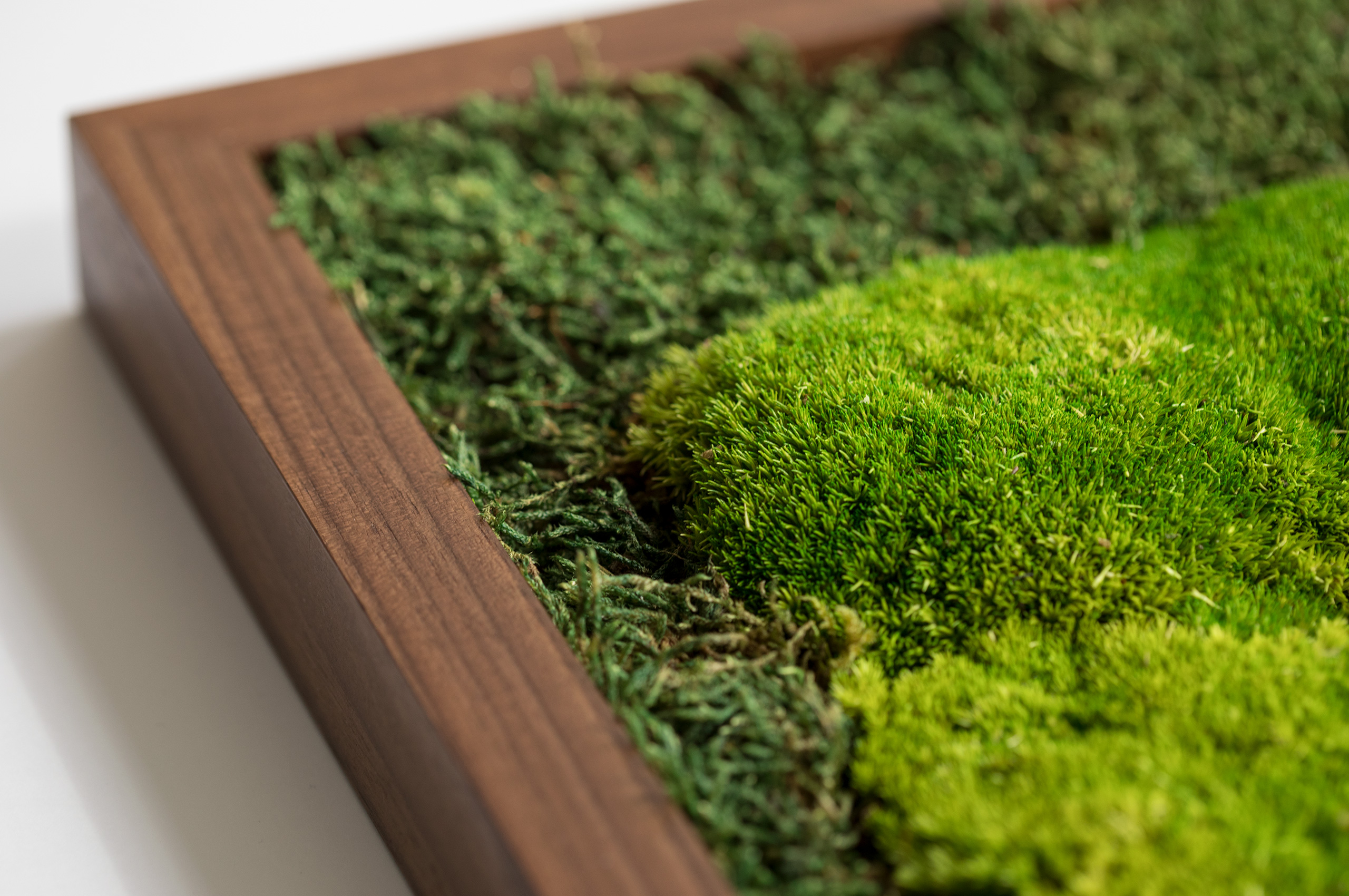
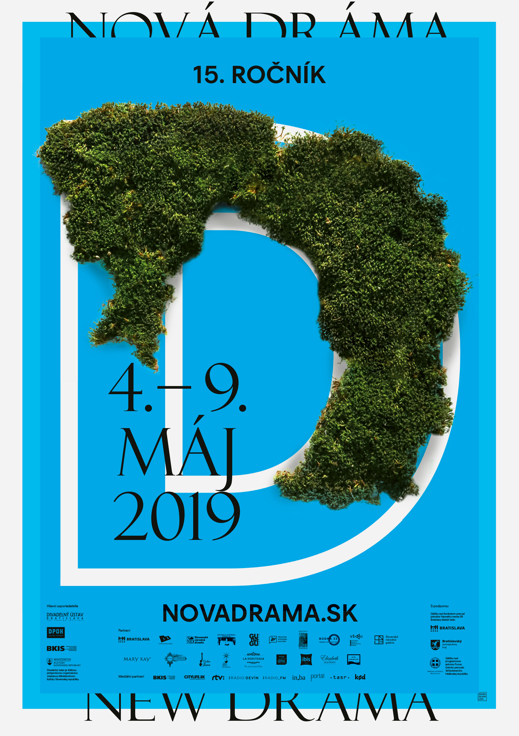
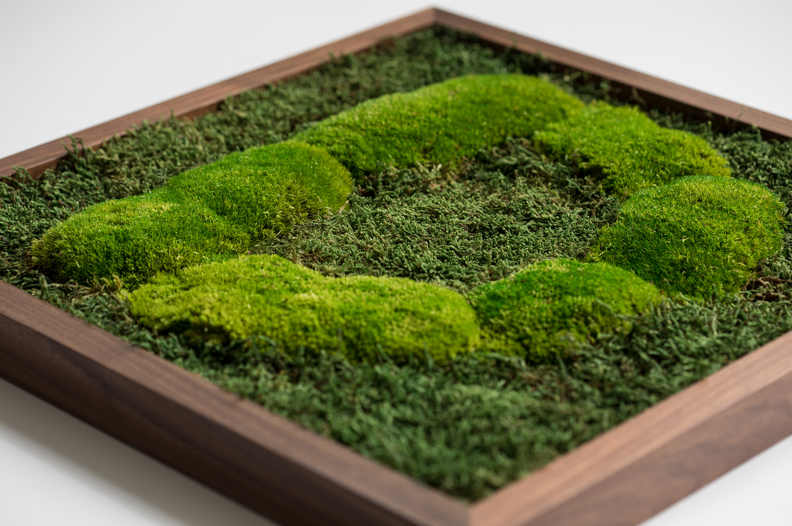
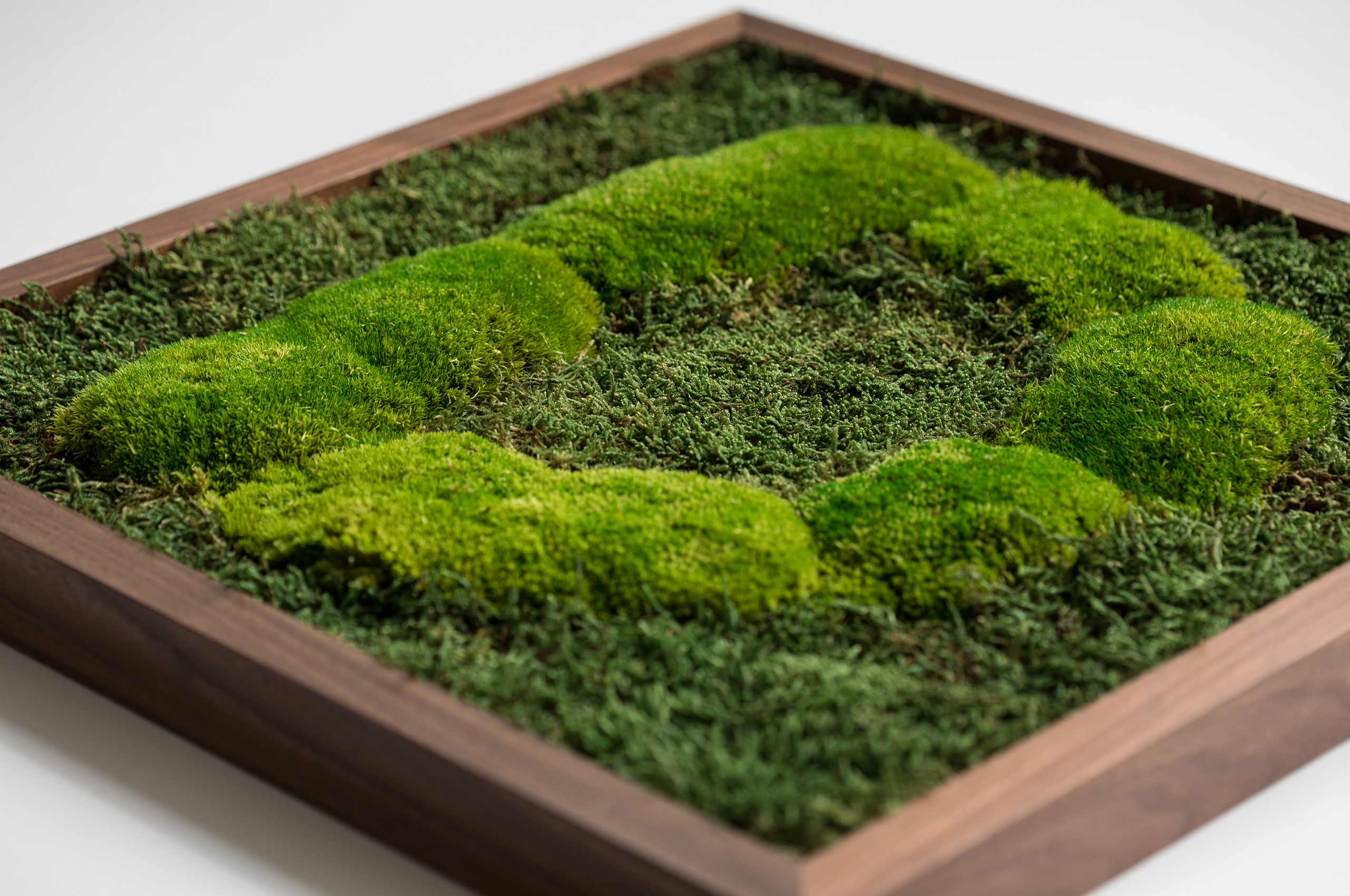
The theme of the year was green drama - recycling, ecology, sustainability. The visual works with an element of gradually expanding moss. Theatrical "D" is left to its own - a man reduces their need to intervene and leaves the stage to nature, hence illustrating its power and ability to regenerate.
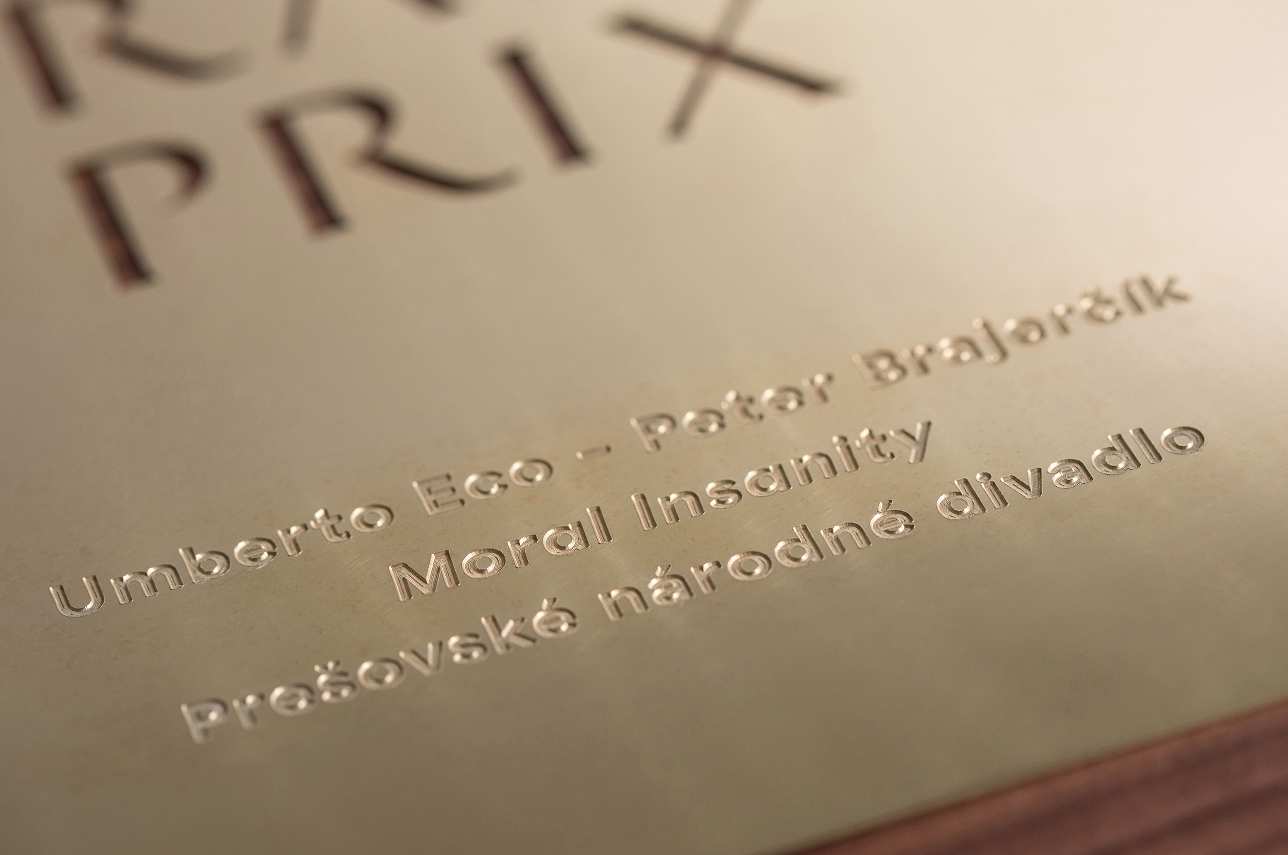
The size of the award is 50 x 50 cm. The frame material is wood, on one side is stabilised moss, and on the other is a brass plaque with an engraved winner and a laser cut.
execution by Manum, Moss Design, e-Sense
photo © Viktor Szemzö
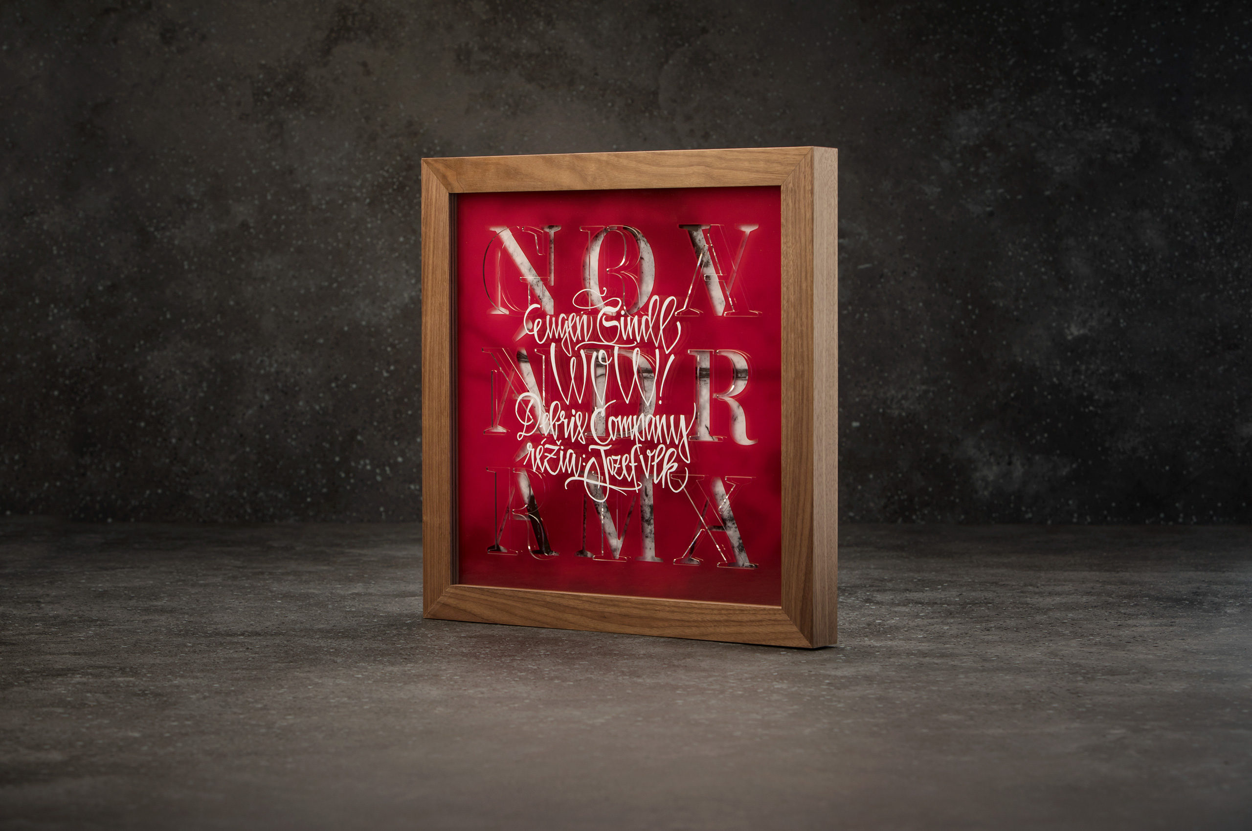
GrandPrix 2018
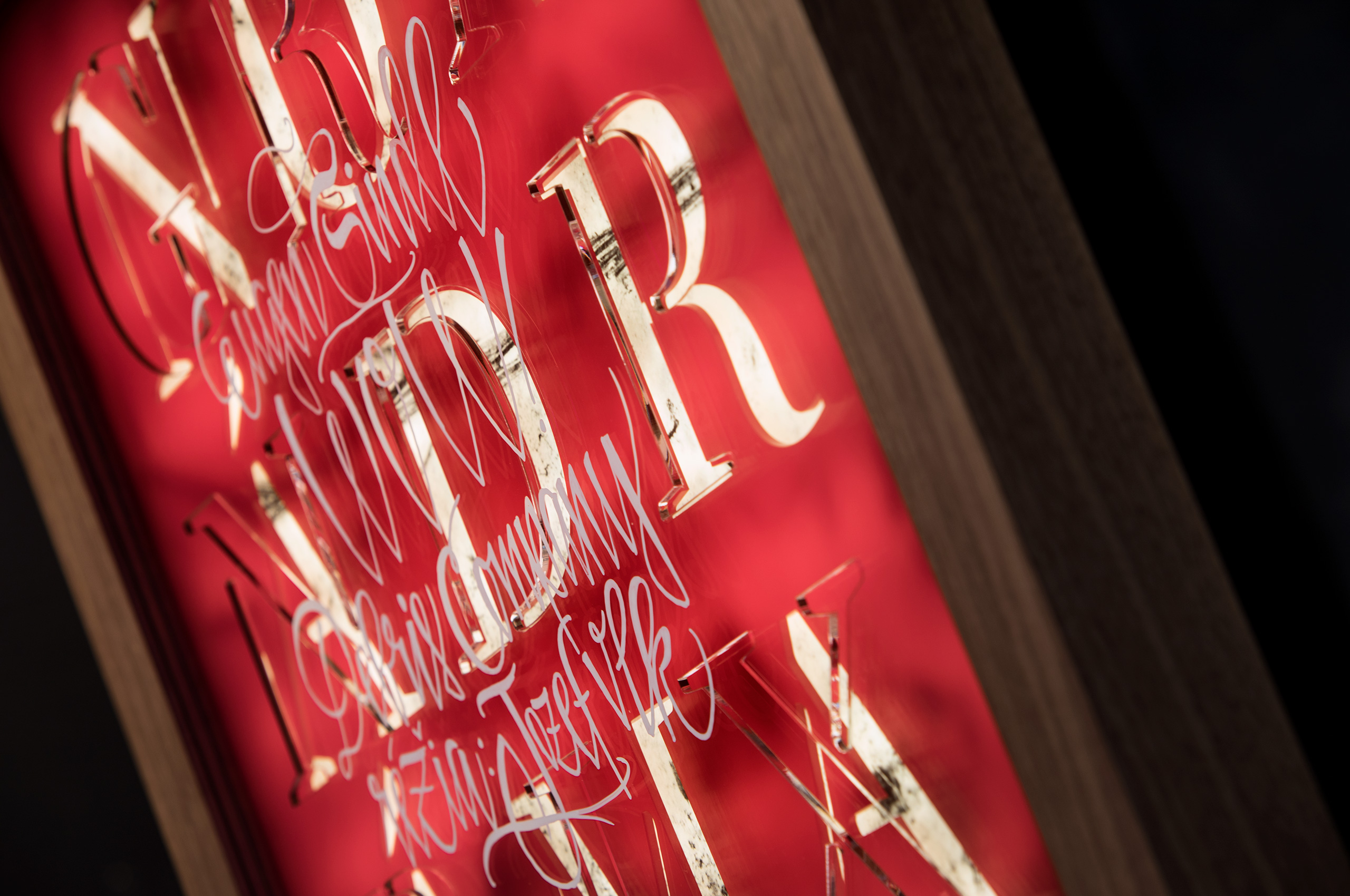
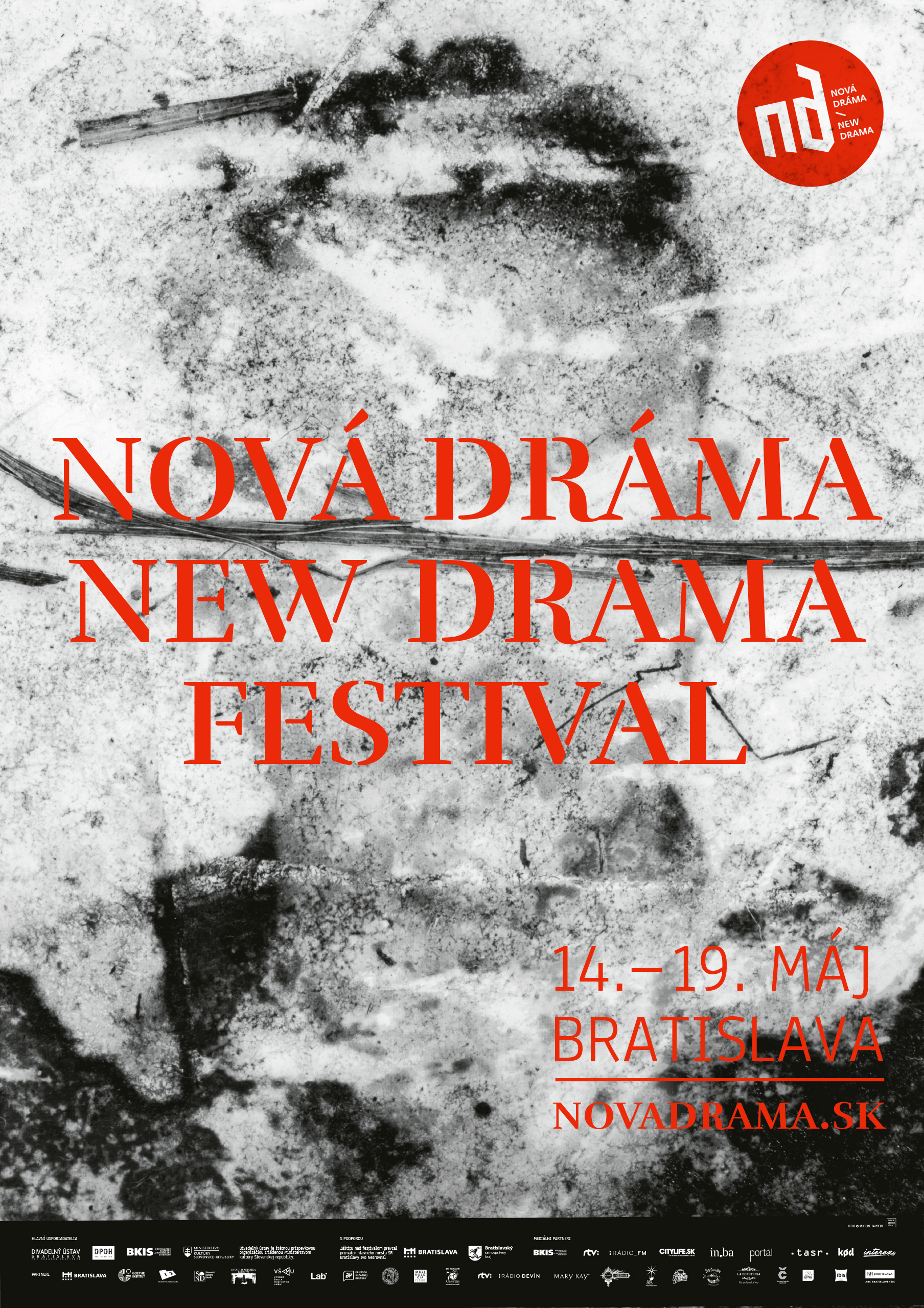
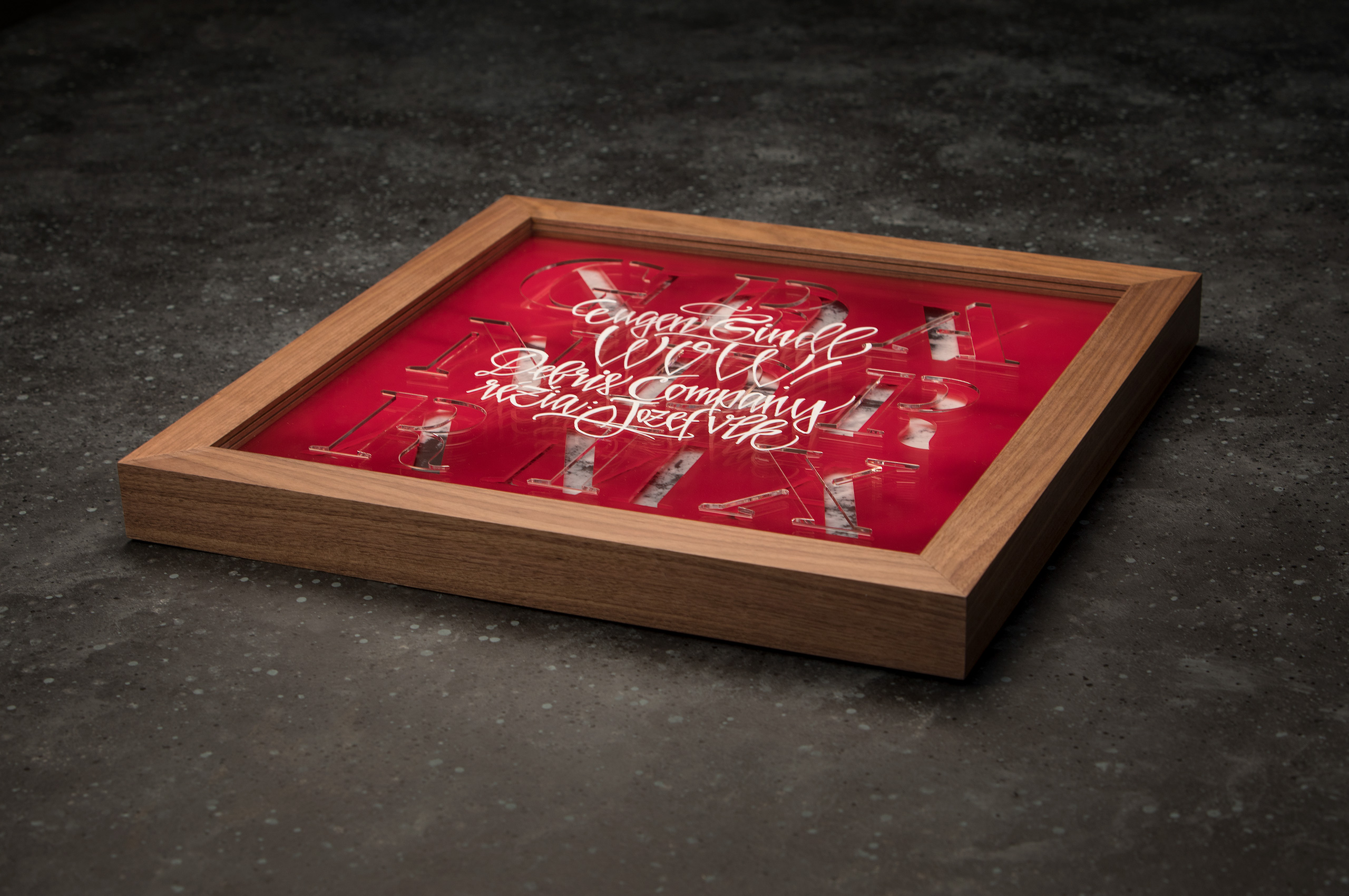
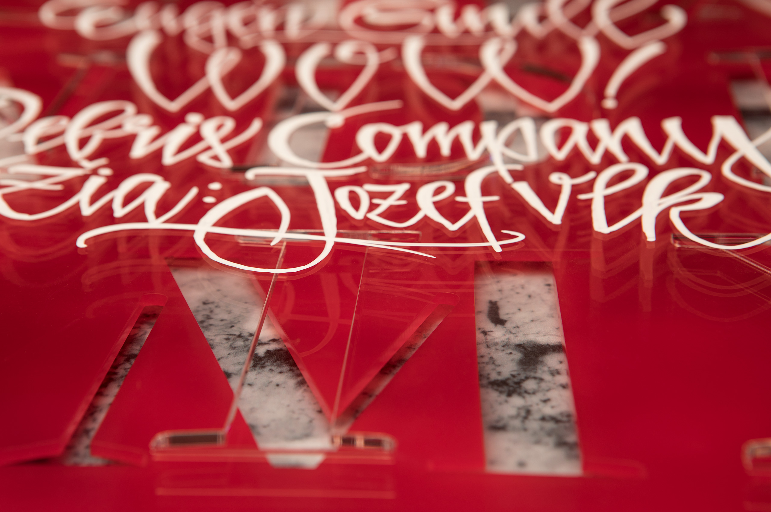
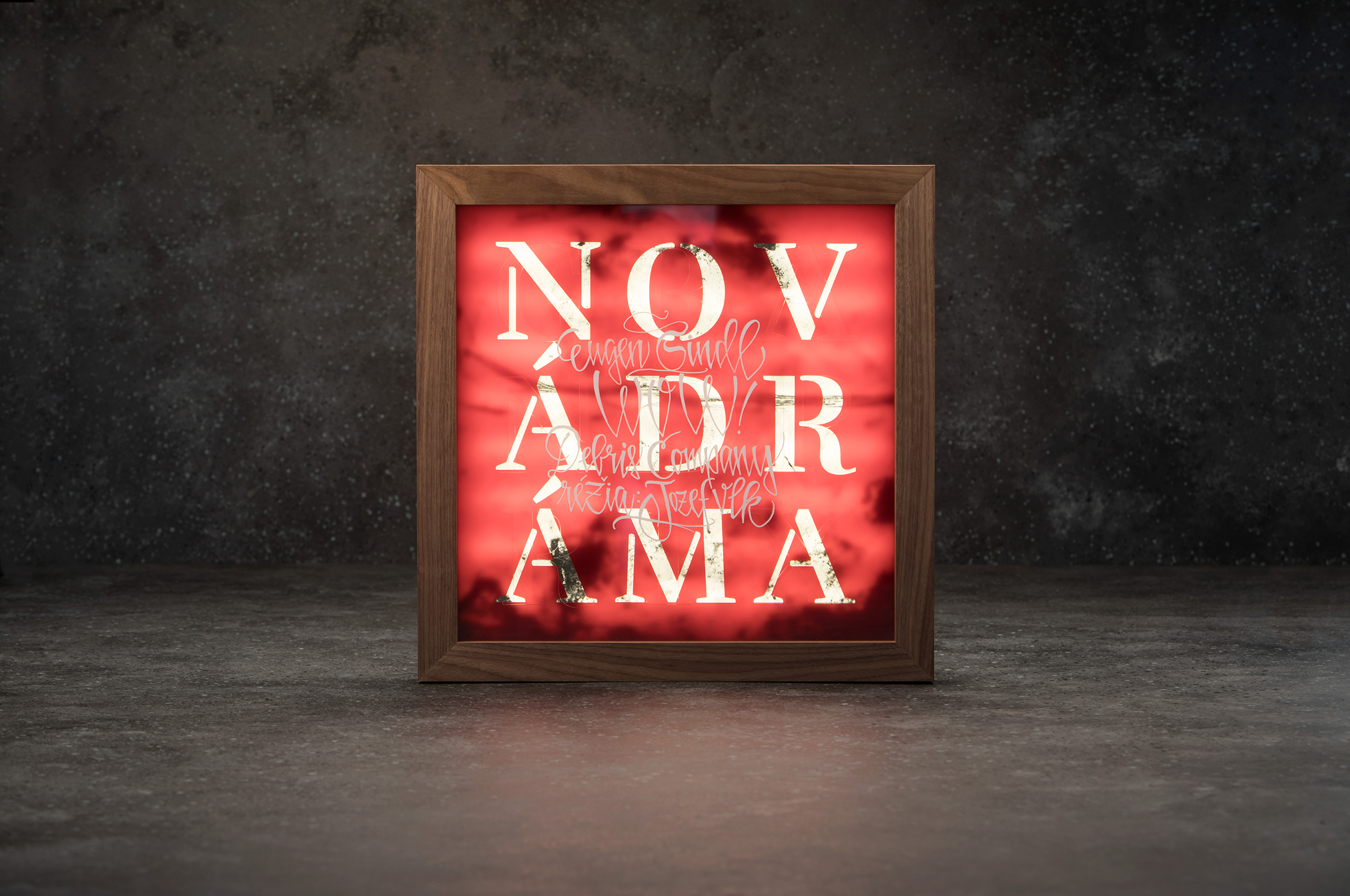
A concept of this year works with photos by Robert Tappert. The theme of identity depicts discarded passport photos by people emigrating from conflict zones. They've destroyed their own portraits on purpose to make their identification impossible. The subsequent layering paraphrases the possibilities of new lives, and the constant rearrangement of human destinies newly.
The size of the award is 50 x 50 cm. Frame material wood, inside layered from printed Plexiglas, red and translucent Plexiglas, closed with clear glass. A light source is hidden inside. The winner is written by a calligraphic inscription by Tomáš Gažovič.
execution by Juraj Demovič, Manum
calligraphy © Tomáš Gažovič
photo © Viktor Szemzö
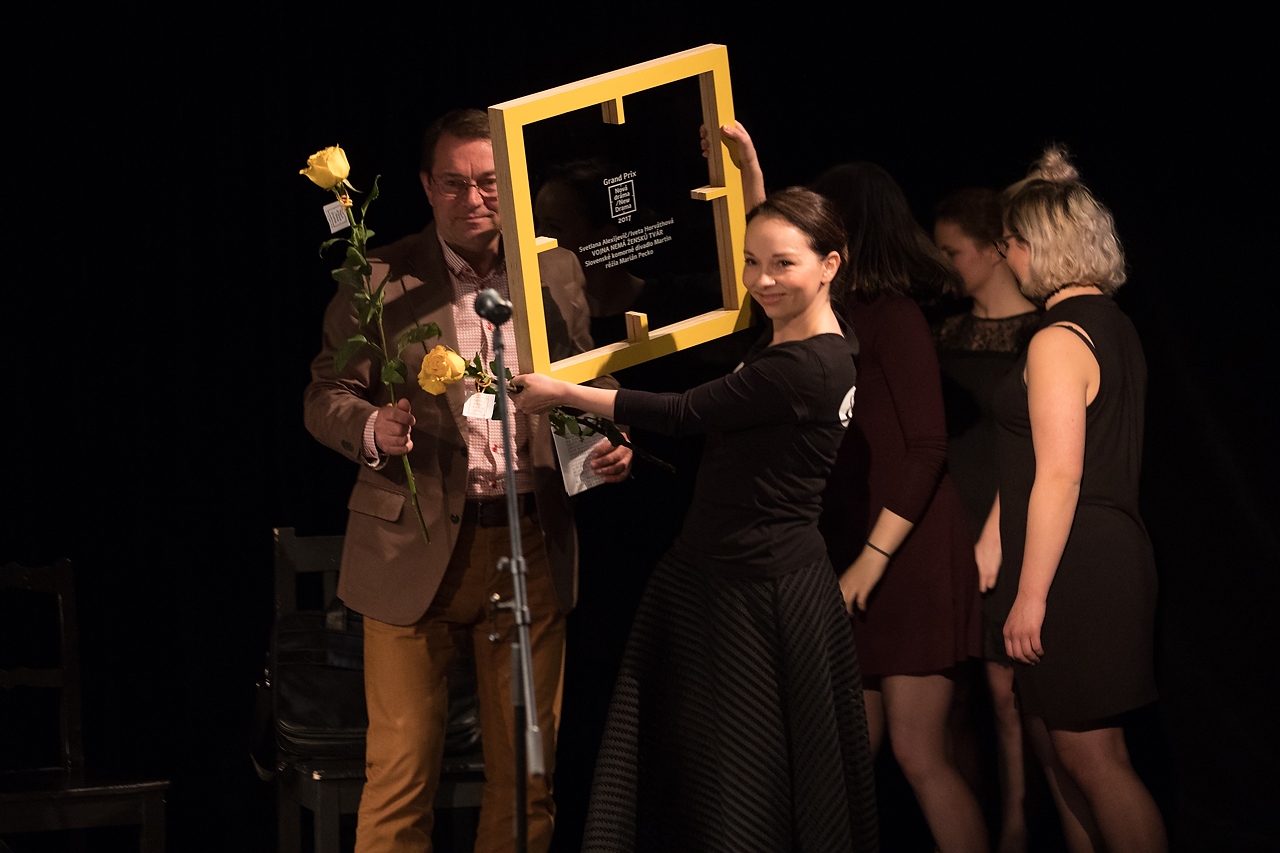
GrandPrix 2017
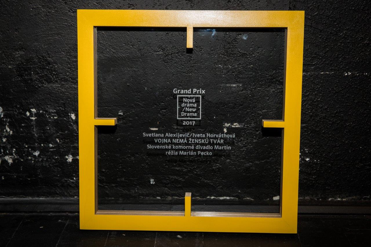
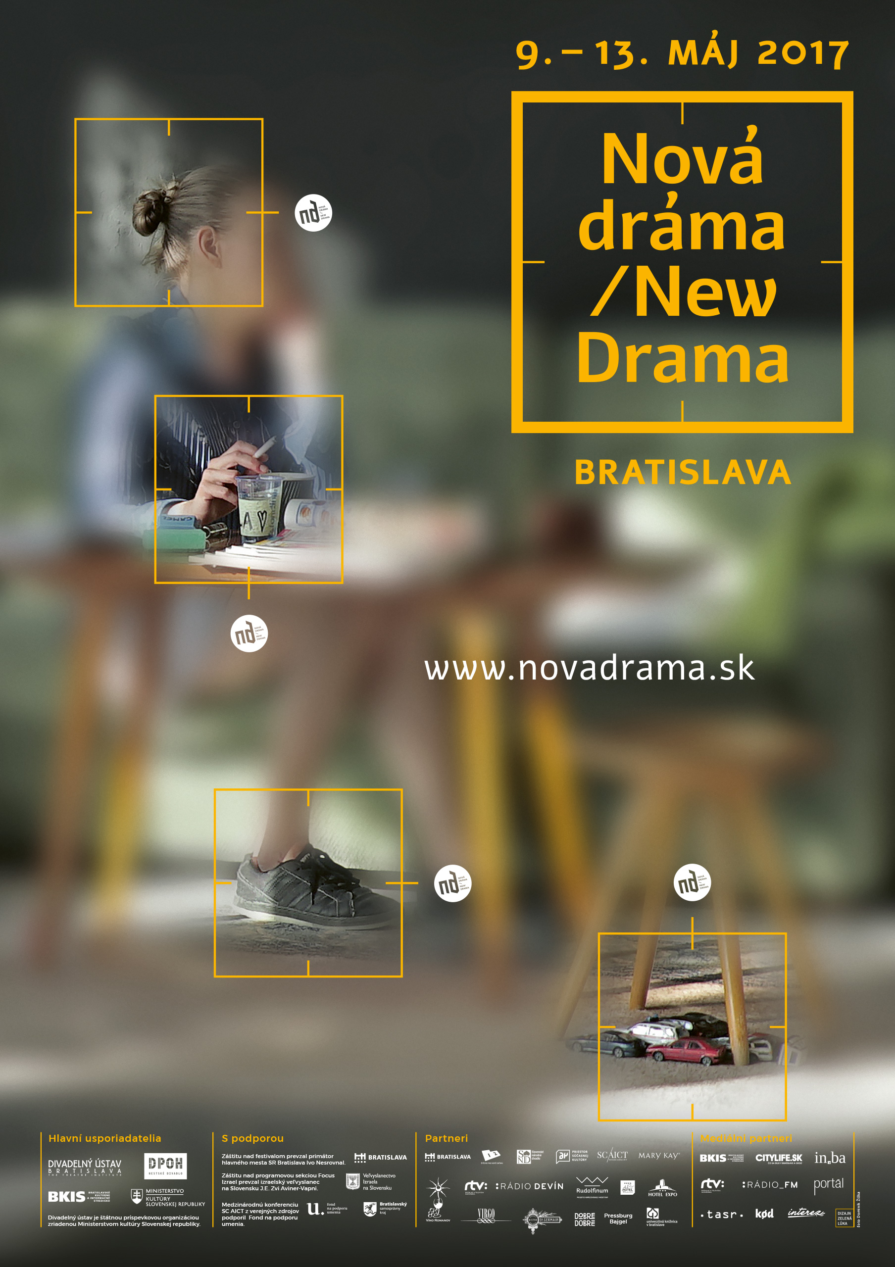
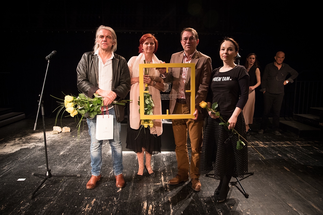
Immersive theatre became the main theme of the year. It participates, absorbs, and surrounds. It tries to convince the viewer that their presence and individual feeling is what is in the centre of the action. The focus target, as we know it from cameras, became a placeholder symbol. It focuses, centres our attention on a specific place.
The size of the award is 50 x 50 cm. Frame material painted plywood, inside clear glass with laser engraved winner.
execution by Juraj Demovič, Manum
photo © Jakub Kotian
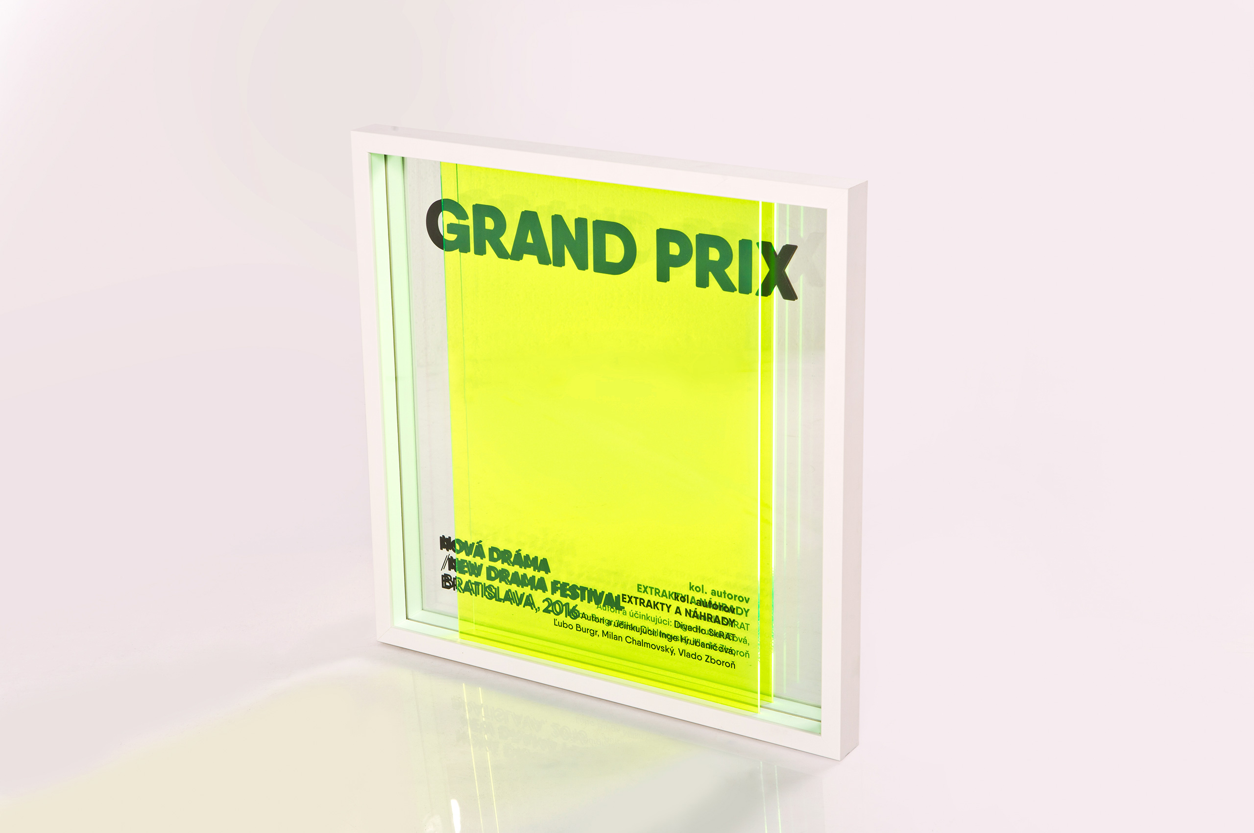
GrandPrix 2016
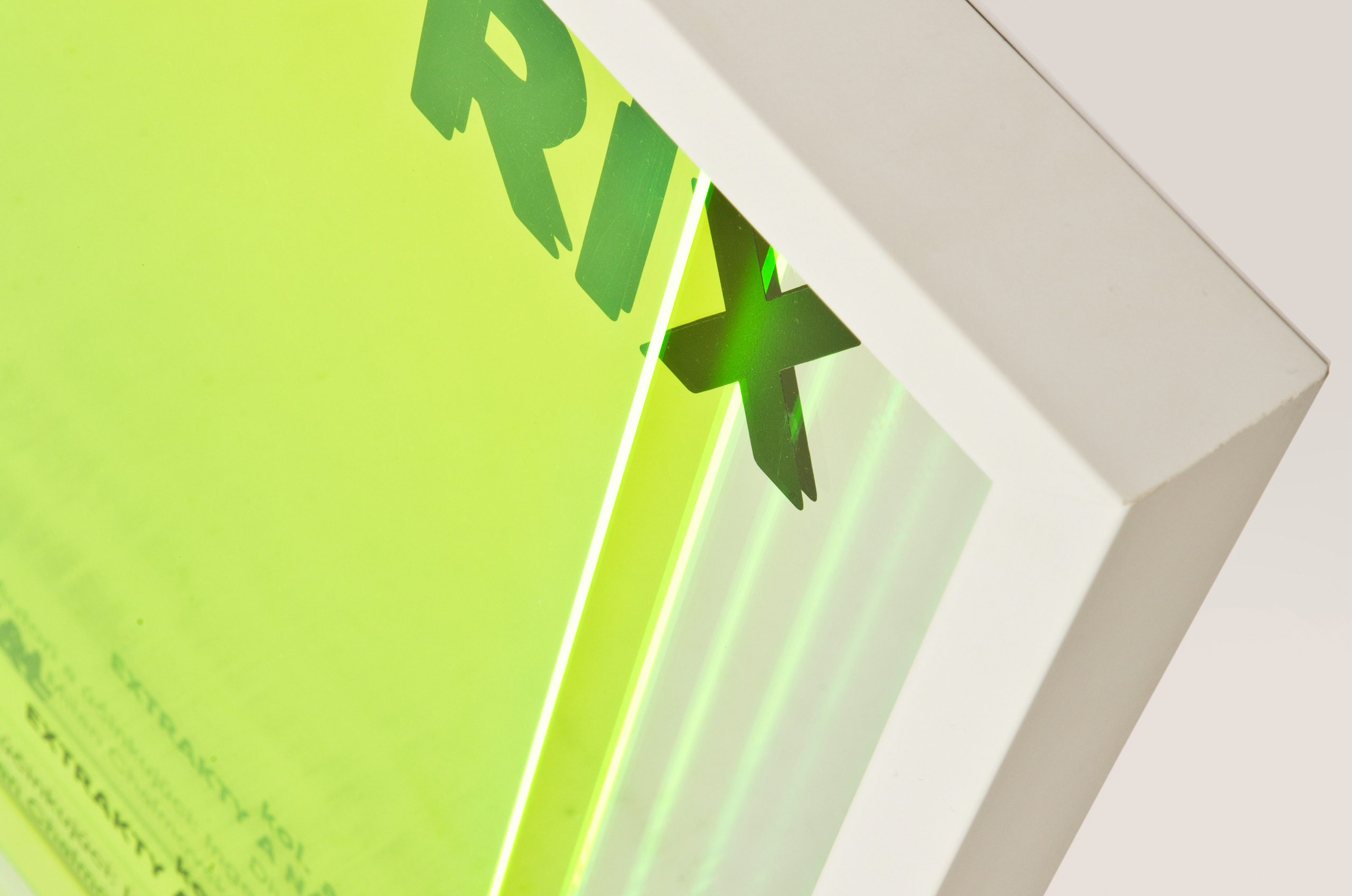
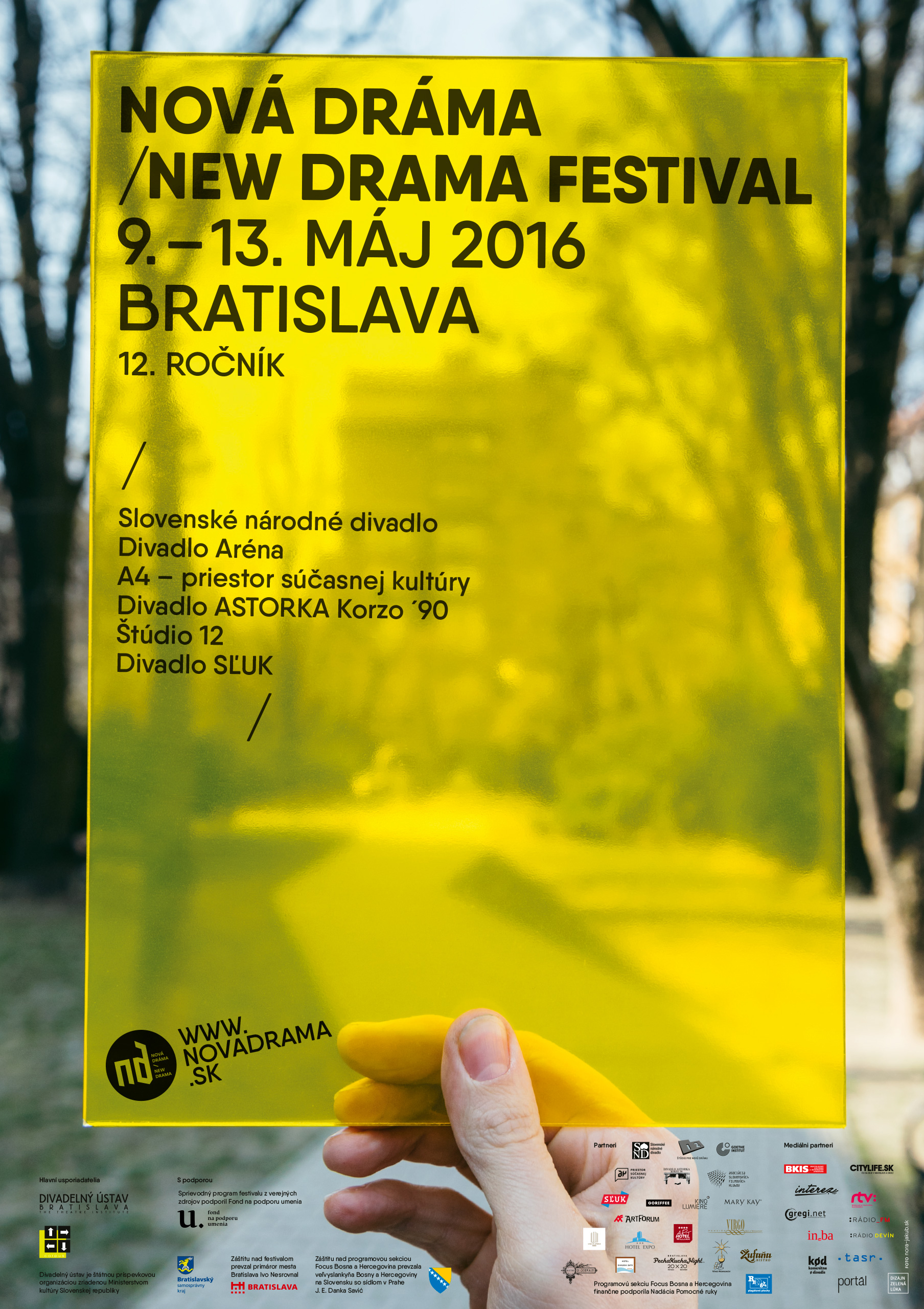
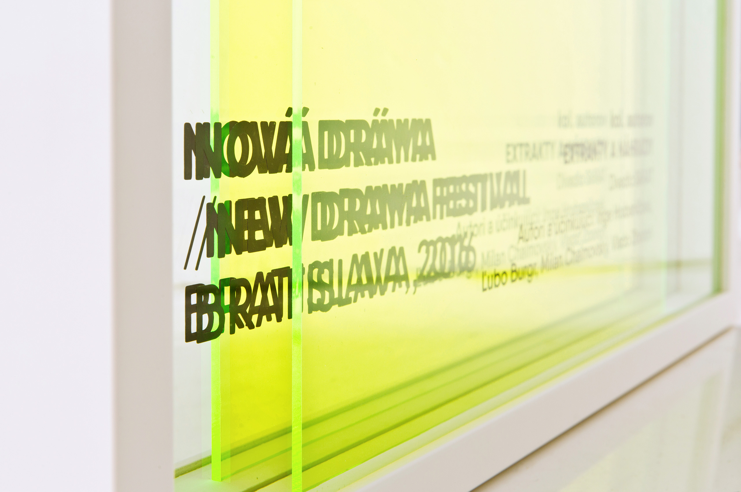
The idea of the year's visual identity plays with a theatrical slice of reality. Each person is an actor or main character of their own play, their own life. The symbol that represents this has become the yellow film, an adaptation of the spotlight. This film creates an interpretive slice of reality for us wherever we look through it. Thus, we always carry the theatre with us.
The size of the award is 50 x 50 cm. The frame material is chipboard, the interior consists of layers of mirror, colored Plexiglas, and clear glass. Winner glued from plotter foil.
execution by Peter Barut
photo © Robo Hubač
More projects
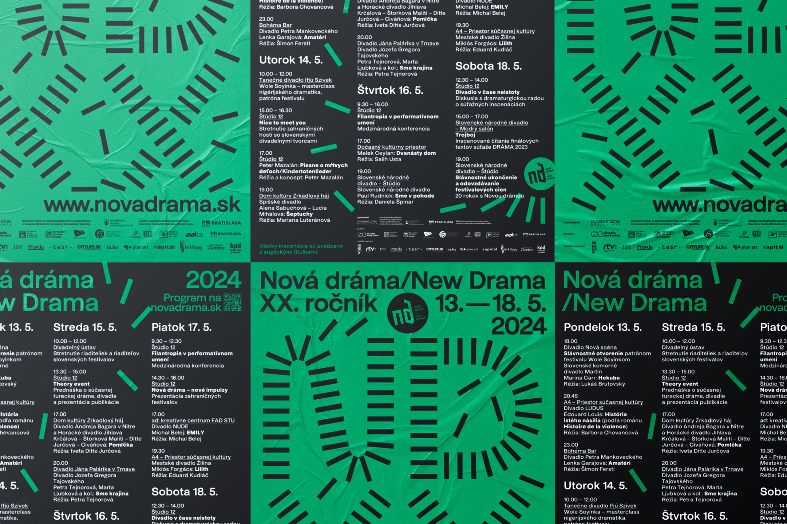
New Drama 2024visual identity
Whistleblower Officebrand identity
Festival festivaloveditorial design
Niekto sa nájdeeditorial design
Technical Networksbrand identity

New Drama 2022visual identity

Giraffe Bakeryeditorial design
New Beats on the Blockpackaging
Century of Theatrevisual identity
Piata loďvisual identity
Slovak Dancevisual identity

Green Dramaeditorial design
New Drama 2019visual identity
Bábky na medzieditorial design
Toddler Punkeditorial design
Cvernovkaeditorial design
Mlsná Emmabrand identity
get in touch at hey@mrmeadow.studio